Due end-of-day Sunday. Responses to other people’s posts, due Tuesdays.
Week 15 — Assignment “Typeface Application—Poster”
Project 4 Fontstruct— design a typeface (all the letters of the alphabet and some punctuation—period, question mark, etc.) using the modular design system in fontstruct. Expand into design applications.
1/
Discuss
Select one (1) typographic poster and one (1) typeface specimen to research and analyse, as preparation for your type poster. Review the collections at the People’s Graphic Design Archive and Letterform Archive—choose from these archives.
- What did you select? Tell us about it. Why did you select it? How does it influence or inspire you?
- Post your comments below (200 words min) and provide links to the design artifacts in the archives.Reply to others’ works.
2/
Studio
- Make more experiments—outlines, manipulate, texture—make variations of your typeface in Illustrator:
- Create a an 11 (w) x 17 (h) inch poster showing off your typeface / promoting the typeface / expressing something about the typeface. Explore language, color/form/tone, font design variations, layering, or use additional graphics, your own visual design choices.
- Package all of your Illustrator and InDesign design files. Upload the packaged folder to your folder on the drive. Include PDFs of all your work.
- ***Also very important: Download all formats of your fontstruct typeface (.otf, .ttf, and webfont) and upload these files to your drive as well.
- Write a brief description of your project as a comment below and share a link to your project on the drive.
Next week (Week 16) is our last live class meeting! We will review everyone’s fonstruct project. There will be a final assignment posted for Week 16.
*featured image Burake Teshome, 2021
Links:

Haley Brock, 2017
Oona Phillips, 2021
Gaby Mena Pacheco, 2017
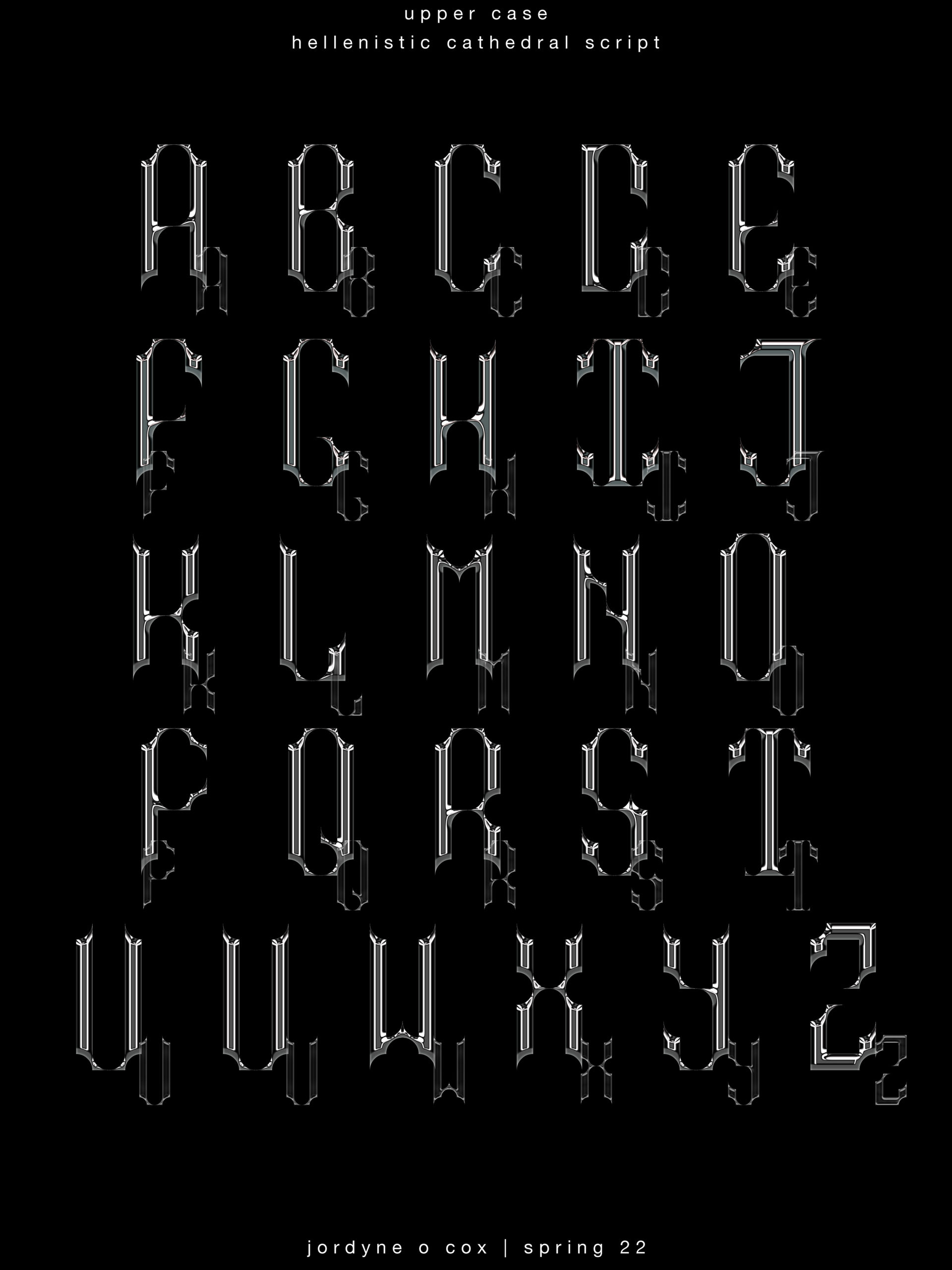
Jordyne Cox, 2022
Brian Schultz, 2022
https://oa.letterformarchive.org/item?workID=lfa_punkflyers_0142
https://oa.letterformarchive.org/item?workID=lfa_punkflyers_0034
I chose two posters, both in black and white. One is an old punk flyer, and the other a punk inspired poster, this time using a photograph instead of an illustration. Both are from the US, and are from the 70s and 80s, when punk culture was at its highest. I listen to a lot of punk music, and find myself often using the images and motifs of punk subculture in a lot of my work. In thinking about these motifs, symbols, and everything I have done so far in the year, I chose these two. They both play with the motifs I know and love, but in entirely different ways, one being much more punchy with its letters, and the other having hand written words that seem half hazardly scribbled on the paper. When I thought about what I wanted to do, I kept my concept of the phrase “Why Now?” While incorporating a picture of what punk culture looks like in this era. Young people defying what society sets for us, and being happy, doing what they want and love.
Word count: 201
I chose the Igarashi Australia poster and the typeface specimen that’s called baby teeth. I chose the poster due to the block and bold nature of the lettering and how I will take a huge bit of reference and inspiration from this due to my own typeface being so unique. The complementary colors as well as the 3d elements of the poster really stood out to me. That, as well as the solid mustard yellow background really makes the typeface pop. There are also a handful of smaller elements implemented into the typeface as well. As far as the typeface “Babyteeth” goes, it is really bold and block letters similar to the poster. The letters offer a minimal amount of negative space as the font is huge. It is also organic and geometric depending on what variety of letters you are looking at. Both the poster as well as the typeface share quite a few aspects that my own font also has.
https://uncg-my.sharepoint.com/shared?id=%2Fpersonal%2Fr%5Friley%5Funcg%5Fedu%2FDocuments%2F%5FRachele%20Riley%2Fteaching%2FS25%2FART%20341%E2%80%9301%2FJon%20Johnson%2FWeek%2D15&listurl=%2Fpersonal%2Fr%5Friley%5Funcg%5Fedu%2FDocuments&login_hint=JAJOHNSON3%40uncg%2Eedu&source=waffle
I also picked the Igarashi poster, there’s something about it where as soon as I saw it I connected with it. Definitely love yellow backdrops too so that might be another factor.
I really like your poster!! I can definitely see the similarities between it and your inspirations.
Hi Jon,
you also liked the poster that you chose; the colors worked well with it and I agree with the 3d posters standing out.
POSTER LINK: https://peoplesgdarchive.org/item/17629/one-two-three-movie-poster
I chose this poster from 1961 for the movie “One, Two, Three,” designed by Saul Bass. It immediately stood out to me because it incorporates a lot of visual elements that I really enjoy and regularly employ in my personal art. Its limited palette of bright red, black, and white is my favorite color combination of all time, and I also really liked the simple and sketch-like aesthetic of the visuals. I also liked the somewhat comedic composition of the three balloons in front of the woman’s chest. Looking at it inspired me to try and do something that’s similarly simple but effective.
–
TYPEFACE LINK: https://oa.letterformarchive.org/item?workID=lfa_posters_0041
For the typeface, I chose the one from this poster designed by Faviana Rodriquez in 2014. I really like how the letters vary in thickness and width. It makes them really interesting to look at. Because they’re all basically the same height though, it’s able to look irregular but still clean and easily legible. I particularly like the way the words “justice” and “girls” look. I think the bold and jagged look of the letters works really well for the poster’s message, which is supposed to be empowering and a call to action. I definitely would be interested in making something like this typeface in the future.
–
PROJECT LINK: https://uncg-my.sharepoint.com/:b:/g/personal/r_riley_uncg_edu/EUNgM294VMRHm6VFF43iGb4BjUnm4wU3LQrfkenAWRGOLQ?e=X8iiYP
For my project, I decided to go with a somewhat simple composition and a dark color scheme. I once again used the song title “The Sea is a Good Place to Think About the Future” and layered a bunch of pictures of the ocean and beaches in the background. I also wrote out the entirety of the song’s lyrics in my font in the background, and put a hand holding my “I” letter in 3D in the middle. I also created a black border. All the photos I used were free to use.
Hi Simon! Your final poster looks amazing! I love the detail you put in the background. Your font really matching the mysterious vibe that you have going by on.
Hi Simon! I actually saw your poster when you first uploaded it, I really appreciate you sticking with your song title and color scheme. Everything goes well together and it feels like the poster tells the story of the song you picked. Your type is also really interesting!
Great work!
Hey Simon! I really am enjoying your final poster and how you incorporated the font in both your foreground and background. The use of this in two different ways really allows for the attention to be drawn to your font and not just the supporting graphics. Overall, I feel like your poster balances the use of graphics with your typeface really well. Your limited color palette for the poster also works really well! Great job!
https://oa.letterformarchive.org/item?workID=lfa_punkflyers_0133
https://peoplesgdarchive.org/item/17163/new-york-subway-signs
Posted above are links to the two pieces of research material that inspired me for this week’s assignment, or at least I’m trying to convince myself of it, as usual I got kinda lazy and ended up ignoring the research to do my own thing that has inspiration in my head I can’t exactly source, but assignments are assignments, so it’s best I at least explain my connection to the two pieces I found. For the first, like most print nerds I do find myself attracted to punk designs and ethos, but I also liked how most of the page is filled by text so I thought it would make a good point of reference for creating a construction out of purely text and the other one for it’s big blocky letter would be good for scaling for visibility’s sake.
As for my actual studio work this week, as I was finishing up my font I couldn’t decide which idea to lean in on, so I kind of split my one font into two fonts and then made some posters for it, giving it branding with an earthy vibe and tones.
Hey Finn, you really pushed yourself with this and yet paid off beautifully. Your work this semester has been really interesting. It’s been wonderful to watch your work grow!
Your posters are really awesome! I like how you made different variations and played around with it.
What did you select?
For the poster component, I chose a typographic poster by Igarashi Takenobu that was commissioned for the Type Director’s Club of Australia. As for the type specimen, I chose the British Rail Alphabet.
Why did you select it?
The poster features many elements that I find pleasant to look at. It’s color schema is primarily tritone. It uses the illusion of 3d extrusion, noise as a selective surface treatment, as well as a sense of an object suspended in free space.
The British rail alphabet on the other hand, has always been something I admired for its ability to
convey a supremely modern aesthetic while maintaining classy, simplified forms.
How does it influence or inspire you?
The Australia poster is inspiring to me in that the exposed wire frame elements add that ‘under construction’ feel I aspire to in some pieces. I also appreciate the forms being extruded in two axis
to create many different points of visual interest.
The British Rail font inspires me to do more with less, or at least to seek more impact with smaller
changes. I feel that the poster and the type specimen appeal to polar opposites with respect to how I want to progress my own works.
Australia Poster:
https://peoplesgdarchive.org/item/9259/australia-poster
British Rail Alphabet:
https://peoplesgdarchive.org/item/970/british-rail-alphabet-1965
For my studio I attempted to remedy any readability issues with my original design. I created a new version of the extruded text and set the depth to near zero ( near zero as to allow for better light interaction as opposed to zero). This allowed me to assign a new 3d material to only the front faces of each form. I feel this dramatically improved readability while adding new colors into the mix as well.
For an alternative, I colorized the font and suspended it atop a image of city skyline. The image has motion blur applied to create the appearance of lens flaring. This layer is duplicated, sandwiching the type face in a way to better integrate it.
I also explored the illusion of the image being a decollage graphic on a exterior wall. I used this as an opportunity to digitally paint the wall. The piece I made imitates the wire like protrusions from the font. Because these eroded versions diminishes readability, I added a secondary text element for the viewer to latch on to and perhaps guide the eye when deciphering the larger form.
link to studio (all images in pdf):
https://uncg-my.sharepoint.com/:f:/g/personal/r_riley_uncg_edu/EmbhWUetOgFNigEOM8Zsy6kB1E1PB–p2w7_vkhGsMLIoA?e=UzFCDp
Hey Zeus, I have been very interested in your work over the course of the semester. Your ideas and creativity will give you plenty of opportunities in future.
Hi Zeus,
I like your alternative; the added effects like motion blur make it stand out very well.
Type specimen: https://oa.letterformarchive.org/itemworkID=lfa_type_0148&targPic=lfa_type_0148_001.jpg
Poster : https://peoplesgdarchive.org/item/12506/design-no-163
For my type specimen selection, I chose the Ghent type by designer Emily Kolodny from 2010. I gravitated towards the personality driven graphics and text with this one. It showcases where it came from and how the designer explores this type in different ways. How the pages are spread out and the little illustrations that accompany it influences my way of thinking about design. Moreso if designs can be more simply and the text shine more. For the poster I ultimately chose Design No.163 by Koji Kusafuka 1972. I really enjoy the layout of both designs as well as the colors. The text takes a step back on this one with the illustrations speaking more. For myself I am thinking about incorporating elements of the second design into my poster design. I really do love the cover page with all the colors and overlapping with the design. But I feel for this project if I tried to solely get inspiration from the cover I would overthink. But one day I would love to accomplish a design like that without overthinking it and just doing it. Going into the studio aspect of this project I am trying to think about simple and effective designs. While also wanting to embrace more complex ideas if they come while doing this poster. For my posters I first did a simple type specimen poster. I wanted to do a phrase with my typeface, and I went with “You are my Dream”. I still wanted the poster design to be simple but struggled with how simple I wanted it. While wanting to showcase the typeface itself with its depth I came up with two different designs with more graphics that resemble the inside of the letters while the other one does not have any graphics.
Week 15 Type Poster1 [Recovered].pdf
Week 15 Posterv2 2.pdf
Week 15 Posterv2 2.1.pdf
For my typeface specimen I chose Paula Scher’s Champion’s Beautiful Faces and Color Collection. This piece in particular samples 38 typefaces which are personified through different archetypes. Scher also used different types of paper when printing each typeface. The overall style has its roots in Art Nouveau and Art Deco along with a clear influence from phases, song titles, and books. What drew me to this specimen were the illustrations that accompanied the typefaces. I think they are a nice addition especially when trying to convey the personality of a typeface. I also really like the combinations of the typefaces and the vibe they convey. I specifically enjoyed looking at the combo of Phyllis and Dolmen Black because of the repetitive pattern of the background. I think it complements the two typefaces by leading your eye to the center. I wanted to take influence from the simplicity of shape and the incorporation of non-textual elements.
The typographic poster I chose was Charles Paine’s Uxbridge Travel Poster. It was used as an advertisement in the London Underground. I chose it because of the use of complementary colors along with the use of simple shapes that convey movement. The sense of movement was something I wanted to convey in my piece because of how movement focused my typeface is. I also took influence from the limited color scheme and the openness of the border.
For my final piece I went through multiple variations trying to manipulate the typeface. I found that making a pattern with the individual pieces of my typeface helped emphasize that they look like tadpoles swimming through water. I also wanted to “hide” letters within the school of tadpoles as they are the ones making up the letters.
Typeface Specimen Link: https://peoplesgdarchive.org/item/9216/champions-beautiful-faces-and-color-collection
Typeface Poster Link: https://peoplesgdarchive.org/item/4331/uxbridge-travel-poster
Studio Link: https://uncg-my.sharepoint.com/:f:/r/personal/r_riley_uncg_edu/Documents/_Rachele%20Riley/teaching/S25/ART%20341%E2%80%9301/Mar%20Alvarado-Escobar/Week%2015?csf=1&web=1&e=rwtwmg
Discuss:
I chose the CalArtsBulletin Poster and the “Oakland” typeface as my inspiration for this project. The CalArtsBulletin was created in 1989 for the purpose of advertising. It features soft vintage photographs of landscapes. The inspirational quote reads as follows:
The way
I see it,
the California Institute
of the Arts
is a dream so
powerful it had to become a reality.
The founders imagined…
I was inspired by the idea of using format to strengthen the power of the individual words. For the typeface, it also reminded me of the font of a digital clock, much like the typeface I created. Although it looks more digitized, it has the same crisp & legible look. Particularly the letter “V” from the “Oakland” typeface looks almost identical to the one I created. I used both of these factors as inspiration for my poster. I created a spiraling design where words bounced across the page to influence how one would read the quote. I also chose an inspirational quote much like the CalArtsBulletin. Both the typeface and poster helped aid me in the process of creating my original templates. However, towards the end of the project, I veered off into my own creative interpretation.
Link to CalArtBulletin:
https://peoplesgdarchive.org/item/3728/calarts-bulletin
Link to “Oakland” Typeface:
https://peoplesgdarchive.org/item/930/oakland-typeface
Studio:
For my project, I used the CalArtsBulletin poster and the “Oakland” typeface as inspiration. I did put my own artist flair into the poster I created. It has a spiraling effect and has drawings all around of little decorative objects. Overall, I had a lot of fun experimenting and learning more about Adobe Illustrator. I do wish my design was a little less busy. If I were to do this project over again, I would opt for a modernized theme to better match the style of my typeface and to improve the overall legibility.
Link to Poster:
https://uncg-my.sharepoint.com/:b:/g/personal/r_riley_uncg_edu/EZQRa8R-Z-dNjunH3YGCcsIB8nrNlM5xRI4bjNHfc9doRw?e=IiMgyQ
Your poster is fun, very graphic design-y. The smear coming from the words is fun, very paint-like. The business helps add to the whole picture of a busy galaxy – think shooting stars and racing comets. Perhaps the background could be darkened to let the words and embellishments stand out more. Other than that, I like your font as well.
I chose “The Godfather” poster from the People’s Graphic Design Archive. It caught my eye right away because it feels dark and powerful but still pretty simple. It is straight to the point. The black background makes the white letters and figure stand out clearly. It’s cool how the puppet string image above the title shows control in a way if that makes sense. It gives a hint about the story without spoiling it. I really like the small red rose too. It adds a little bit of color that makes the whole poster more interesting. It’s like one tiny detail that makes you curious about the bigger picture. It makes you want to know more about the movie and story behind it (even though I have already seen it.) The way the letters and images are placed makes it easy to look at. I can learn from this when designing my own type poster by using clear contrasts and smart placement.
For the typeface specimen, I picked the Techni-Process type specimen from 1969. It’s basically a booklet showing lots of different letter styles and fonts. It’s cool because it’s from a time when people had to put letters together by hand. When I look at it, I imagine how much work it was to set each letter into place. It makes me think about slowing down/taking my time, and really looking at the details when I make my own letters. The styles in the specimen are bold, clean and easy to read but are still interesting. It inspires me because it shows how letters can be strong without being too overly complicated.
Link to my project (2 versions):
https://uncg-my.sharepoint.com/:f:/g/personal/r_riley_uncg_edu/Eg1J4M8WgBFCrubaBi1BQesBccq0O31smQiiEotgRmaXFw?e=UR4NlJ
Hey Clint, we’ve been in a few groups together and I always love seeing your work. This weeks’s work has been super interesting, I’m in love with your second version. Keep up the great work!
Hey Clint! I love the multiple variations of your posters for this week and believe that your use of graphics along with your text makes the piece even stronger! I would say that I like your second variation of the poster slightly more, however both are strong for multiple reasons. This virus type of look that you achieved is super intriguing and matches your heightens the effectiveness of your typeface! Great job!
For this project, I chose one typographic poster and one typeface specimen that really speak to my style—especially when I’m in that grunge design mindset.
Poster: “Now is the Time of Monsters”
This poster immediately caught my eye because of its raw, fragmented look. The type is broken, scattered, and almost uncomfortable to look at—which is exactly why it works. It has that gritty, distressed energy that reminds me a lot of grunge aesthetics. There’s a roughness to it that feels honest and emotional, like it’s not trying to be perfect. I love incorporating that kind of texture and tension into my own designs from time to time, because it makes things feel more alive and human.
Typeface: “Platform 4 Chaos”
This typeface has that same unpredictable, imperfect vibe. The letters feel like they’re barely holding it together—and that’s what makes them so visually interesting. It’s a great example of how even something as structured as type can have personality and mood. It totally aligns with the kind of gritty, layered work I like to create when I’m leaning into that grunge influence.
Both of these designs remind me that type doesn’t have to be clean or polished to be beautiful—it can be messy, emotional, and still make a strong impact.
You can check them out here:
Poster & typography collections: People’s Graphic Design Archive
Typeface specimens: Letterform Archive
https://uncg-my.sharepoint.com/:f:/r/personal/r_riley_uncg_edu/Documents/_Rachele%20Riley/teaching/S25/ART%20341%E2%80%9302/Chris%20Pierce/Week%2015?csf=1&web=1&e=t8m1ny
Hey Chris! I really like the colors you chose for the background of your “Object of Desire” posters. The words themselves feel like they’re coming out of the screen, especially with this specific design and the metallic color. I think it would be really cool to see more of that dripping effect throughout your whole design, but great job!!
https://uncg-my.sharepoint.com/:f:/g/personal/r_riley_uncg_edu/Eodih3v0eFdPvNViE6C9i4kBZhVPWPNXqFvMr_tYhzEXNA?e=Dc3VR9
https://peoplesgdarchive.org/item/17137/typography-a-manual-of-design-by-emil-ruder
https://oa.letterformarchive.org/item?workID=lfa_type_0120
I chose Emil Ruder’s Typography: A Manual of Design because of its clean, intentional design. Every page feels like a masterclass in using space, rhythm, and simplicity to create impact. Ruder approaches typography as more than just style—it’s about clear communication. His emphasis on legibility and purposeful design has profoundly influenced my understanding of typographic hierarchy and the importance of white space. This manual serves not only as a technical guide but also as a philosophical treatise on the role of typography in visual communication. It inspires me to approach my designs with intentionality and to consider the reader’s experience at every step.
For the typeface specimen, I chose The Developing Univers. These typefaces showcase his dynamic and unconventional designs, reminding me that type can be expressive and energetic. This work encourages me to not be afraid of incorporating movement and emotion into my own typographic designs, even if using a common font.
Both of these works have significantly shaped my perspective on typography. Ruder’s manual provides a foundational understanding of typographic principles, while The Developing Univers specimens offer insight into typeface development and application. Together, they inspire me to create designs that are both aesthetically pleasing and functionally effective.
For my research, I selected Typography 22: The Annual of the Type Directors Club and Just My Type: A Book About Fonts from the People’s Graphic Design Archive. Typography 22 immediately caught my eye because it showcases a wide range of typographic styles from designers around the world. It’s bold, clean, and shows how much emotion and movement type can have even when it’s organized on a grid. It is very interesting to observe the different types of fonts these posters have. Seeing how type can be both functional and expressive made me rethink how I approach layout and the amount of typography there is. Another thing I notice about the typography of 22 is that it is almost telling you a story. Throughout the years, typography has improved/changed, and this is an example of the many ways typography has been throughout history.
For my type specimen, I chose Just My Type. It’s technically a book about fonts, but it’s filled with examples of typefaces in use and the stories behind them. I chose it because it makes typography feel personal and full of history, not just a design choice. It showed me that picking a font isn’t just about what looks good, it is also about what feels right for the message you are trying to send to the audience. Both pieces inspired me to think more carefully about my type choices for the poster, not just for style, but for meaning.
Typography:
https://peoplesgdarchive.org/item/1731/typography-22-the-annual-of-the-type-directors-club
Typeface specimen:
https://peoplesgdarchive.org/item/17783/just-my-type-a-book-about-fonts
My poster: https://uncg-my.sharepoint.com/:f:/r/personal/r_riley_uncg_edu/Documents/_Rachele%20Riley/teaching/S25/ART%20341%E2%80%9302/Cindy%20Ortiz/week%2015?csf=1&web=1&e=GtEOWu
Hi Cindy! I love your final posters! Both of them give me a video game feel, and I love it. It really compliments your font and it looks very nice all together.
Hey Cindy! I really love your overall color scheme and message with your poster. It’s really interesting you found inspiration using type to tell a more personal and meaningful story. It really shows with your poster. I really enjoy both versions but the one with the image does bring the theme forward a bit more. Great work!
Typeface specimen: https://peoplesgdarchive.org/item/17555/babyteeth-typeface
Typographic Poster https://oa.letterformarchive.org/item?workID=lfa_foxwang_0034
I selected one typographic poster from the Letter Form Archive and one typeface specimen from the People’s Graphic Design Archive. My typographic poster that I decided on is titled “End Pollution: Bomb the Pentagon” and it was created by Mark Fox. This poster caught my eye because of the various uses of text while still maintaining readability. I also enjoyed this poster because of its reduced color palette and the combination of type and additional supporting graphics. The typeface specimen that I chose is titled “Babyteeth Typeface” and it was designed by Milton Glaser. This specimen stuck out to me in particular because of its simplistic design and its ability to achieve a lot by working with very little. I found it very impressive how one line can make all the difference to form the entire alphabet and how it doesn’t take much for our brains to differentiate letters. I think this speaks to how you shouldn’t always be scared of simplicity when it comes to design, but also don’t allow that to be a crutch. These two things inspire/influence me in my design process this week by wanting to use a reduced color palette and wanting to have a combination of supporting graphic imagery along with my words.
My project for this week manifested in the form of a poster of my brother’s new car that he recently got. I was home for the weekend and got to spend some time with him so I wanted to make something that related to him and his interests. He has always been a big car guy and loves working on cars and making modifications in anyway he can. I decided to make an Audi S4 poster that highlighted the sleek design of his vehicle while also bringing the main focus to my typeface in an interesting way that I hadn’t thought of using it prior. I didn’t exactly envision my typeface being used in something related to cars but I feel as if it matched the overall sporty/sleek aesthetic that is found in his car. Overall I am happy with what I made this week but am really looking forward to making something that focuses more on the type itself and more of a phrase this coming week.
Link to my week 15 poster design: https://uncgmy.sharepoint.com/:b:/g/personal/r_riley_uncg_edu/EdjcUF10XmdGp-cfwBh05dsBRcMp1G21EXt6g6l8ZLuuWw?e=icpEpN
Thank you for sharing your poster, Hayden! Last week, when I saw your font I didn’t necessarily see it associated with cars either, BUT I think it works really well with the way you incorporated it in your poster. The colors and the lighting on the vehicle itself contrast really well. I would’ve thought this was an actual Audi poster, nice job!
Hey Hayden!
Out of all the amazing works I’ve seen you’ve done, this is by far the best one yet! I absolutely love the look of this poster, and your typeface definitely matched the overall sporty/sleek aesthetic with your brother’s car. There’s so much detail brought into this design, from the reflection of the Audi S4, to the various shots of the car spread throughout the poster, and just the overall balance between all these elements. I could easily see this as an actual poster hung up on the wall to advertise cars! If you were to add more to this, I think it’d be cool to see if you changed the texture of your fonttype to match the sleek metallic look of the car. Fantastic work!
The typographic poster that I chose is called “Typography 22: The Annual of the Type Directors Club”. In this poster, there is an array of different buttons with different letters and symbols on each one; it somewhat resembles a collage or one of the old iSpy books that you would find. That was one of the main driving points as to why I chose this poster to talk about as I used to have a ton of those books as a kid. It also is just so interesting to see the different fonts used for the different buttons and it feels you could sit there for hours and dissect each one. The typeface specimen that I found is called “Narly Typeface” and this one stuck out to me just because of the creative idea for what the typeface itself looks like. I like the lines and sections throughout the letters because I feel that it makes it stand out more and have a bit more identity with its presentation. The colors used for the different fonts also make it pop out a lot more and it makes you not want to look away; this is also the same feeling I had with the first poster.
Hi Anthony, can you share the links please?
For my chosen typeface specimen I have chosen a piece from a quad-fold brochure. This was created by Beaur and Jost, Heinrich. The word “Beton” is typed repeatedly on the page in a stacking way. Beton as I understand it is a typeface which I partially find interest in. I have also liked bold typefaces like Gotham. I like the way that bold typefaces look on screens like in movies. Cinematic typefaces look clean on social media and in movies which is why I have learned to like bold fonts. This graphic is an example of one. I also like the variation of the font here. Going from a thin line to a bolded line, then reversed. It is built like a staircase meeting in the middle then working its way downward. For my typographic example I have chosen the HOPE Barack Obama campaign poster from 2008 by Shepard Fairey. This poster is a prime example of the kind of posters I enjoy looking at. The bold font alongside the bolded yet simplistic design of the poster is how I want my project to look. It is simple enough for a viewer to look at it and instantly understand what it is about. There is no need for more elements for this poster, because showing the USA Flag colors alongside Obama is plenty.
https://oa.letterformarchive.org/item?workID=lfa_type_0658
https://peoplesgdarchive.org/item/1497/hope-barack-obama-campaign-poster
For this part of the final project I wanted to explore a creative way to show my font. I messed around with the radial effects in Illustrator in order to come up with this concept. I decided to type my name as a way to show multiple characters of my typography. Once I decided to have my name be the text in my poster, I had to figure out a way to showcase my graphic. I struggled with this as I could not come up with a way that I liked. This was when I found the radial effect. At first it came out looking like a sun shape which I thought was too basic for this concept. I decided to develop a flower instead. I also decided to use the 3D effects to help make my design pop out more. I am interested to see how we are going to pull everything together for our final piece for this class. I hope we get to showcase our work some more, and get valuable feedback. Overall I enjoyed making this once I got my ideas together, and I am excited to see what others have created for this part of the final project.
https://uncg-my.sharepoint.com/my?remoteItem=%7B%22mp%22%3A%7B%22webAbsoluteUrl%22%3A%22https%3A%2F%2Funcg%2Dmy%2Esharepoint%2Ecom%2Fpersonal%2Fwagentry%5Funcg%5Fedu%22%2C%22listFullUrl%22%3A%22https%3A%2F%2Funcg%2Dmy%2Esharepoint%2Ecom%2Fpersonal%2Fwagentry%5Funcg%5Fedu%2FDocuments%22%2C%22rootFolder%22%3A%22%2Fpersonal%2Fwagentry%5Funcg%5Fedu%2FDocuments%2FART%20341%E2%80%9302%22%7D%2C%22rsi%22%3A%7B%22webAbsoluteUrl%22%3A%22https%3A%2F%2Funcg%2Dmy%2Esharepoint%2Ecom%2Fpersonal%2Fr%5Friley%5Funcg%5Fedu%22%2C%22listFullUrl%22%3A%22https%3A%2F%2Funcg%2Dmy%2Esharepoint%2Ecom%2Fpersonal%2Fr%5Friley%5Funcg%5Fedu%2FDocuments%22%2C%22rootFolder%22%3A%22%2Fpersonal%2Fr%5Friley%5Funcg%5Fedu%2FDocuments%2F%5FRachele%20Riley%2Fteaching%2FS25%2FART%20341%E2%80%9302%2FAlex%20Gentry%2FWeek%2D15%22%7D%7D&id=%2Fpersonal%2Fr%5Friley%5Funcg%5Fedu%2FDocuments%2F%5FRachele%20Riley%2Fteaching%2FS25%2FART%20341%E2%80%9302%2FAlex%20Gentry%2FWeek%2D15&listurl=%2Fpersonal%2Fr%5Friley%5Funcg%5Fedu%2FDocuments
The first image I selected from the People’s Graphic Design Archive was titled ‘Windows 3.1’. It is a screenshot of the Windows operating system that was released in 1992. The image is of an old computer screen with multiple windows open at once; the clock, program manager, calculator, minesweeper, and solitaire. I selected this image because the typeface I created reminded me of text on a computer and the image is of a user interface. It has given me a lot of inspiration for my poster design, I really like the image having multiple different windows open on a computer screen. The second Image I chose was of a typeface named “Oakland”. The text is black blocks/pixels on a white background that was created by Zuzana Licko in 1985 for Emigre Magazine. This typeface influenced my computer idea because of the blocky bitmap design of the typeface, as well as the fact that the typeface was made for a magazine known for fonts that were used in the Apple Macintosh 128k.
Typographic Poster/Image: https://peoplesgdarchive.org/item/16223/windows-3-1
Typeface: https://peoplesgdarchive.org/item/930/oakland-typeface
Discussion:
I selected “Typography 22: the Annual of the Type Directors Club” (2001) with a cover designed by Gail Anderson. I was immediately drawn to this cover because of its playful and chaotic composition. It’s filled with bottle caps and buttons stamped with a different letterform or image. It feels alive and gives a message of celebrating typography’s diversity. There are so many colors, and everywhere I looked there was something different to see – to analyze. I chose it because it doesn’t present type in a clean or expected way. Instead, it mixes textures, styles, and even cultural references. This cover shows how typography can break out of a 2D environment and become a part of a bigger conversation. It inspires me to think about type as a tool to experiment with and something that could be brought to life versus something used for communication. The cover is a reminder of my own work to try different things and see what the outcome might be. It also inspires me to be unexpected in my own work and embrace the imperfections and playfulness and how that might be presented to an audience. Overall, I really enjoyed how this was put together, and it definitely made me stop in my tracks.
https://peoplesgdarchive.org/item/1731/typography-22-the-annual-of-the-type-directors-club
Studio:
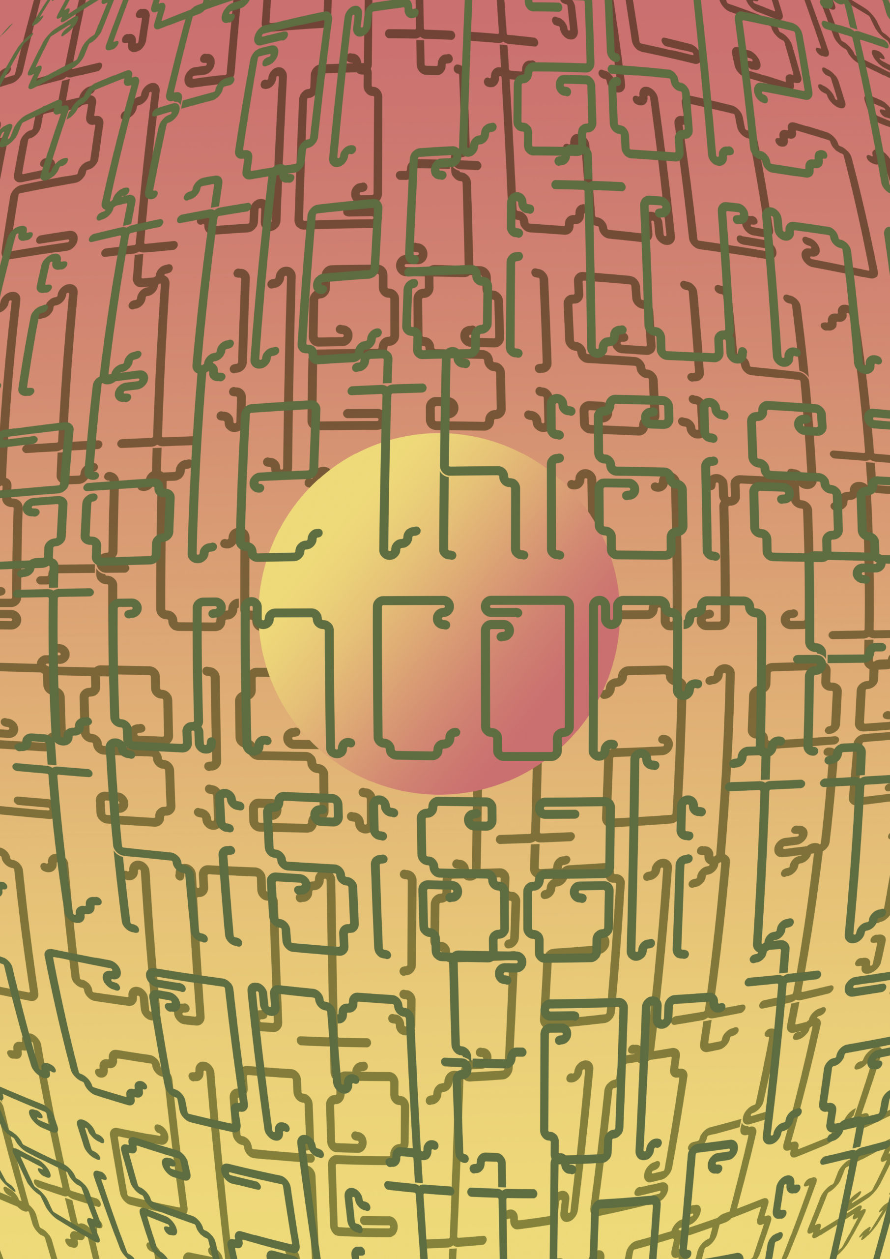
I used my second Illustrator experiment as a base ground for what I wanted to use in this. I kept the wording the same and changed the colors so they could contrast more. I also made the reflected line of the word “alone” more blurry so it was unreadable compared to the main “alone.” I added my whole alphabet typeface in the background, in small letters, and I added the word “alone” in red to pop out through the scrambled alphabet. I did the alphabet in black, green, and purple, to contrast and make a glitchy effect in the background. Lastly, I added extruded question marks in random places to fill out the background.
https://uncg-my.sharepoint.com/personal/r_riley_uncg_edu/_layouts/15/onedrive.aspx?ga=1&id=%2Fpersonal%2Fr%5Friley%5Funcg%5Fedu%2FDocuments%2F%5FRachele%20Riley%2Fteaching%2FS25%2FART%20341–02%2FChristina%20Kibler%2FWeek%2015%2Falonefontproject%5FFolder%2Falonefontproject%2Epdf&parent=%2Fpersonal%2Fr%5Friley%5Funcg%5Fedu%2FDocuments%2F%5FRachele%20Riley%2Fteaching%2FS25%2FART%20341–02%2FChristina%20Kibler%2FWeek%2015%2Falonefontproject%5FFolder
Hey Christina. I like your work. I love the idea of adding your whole typeface to your poster! This really lets the viewer see your full creation. Great idea!
I chose this poster from “The People’s Graphic Design Archive” because it immediately caught my eye with how bold and playful it is. The repetition of the word “Helvetica” in different colors and styles really stood out to me. Even though it’s the same word over and over, the way the designer shifts the letters slightly, tilts them, and plays with spacing gives the poster so much life and energy. What really inspired me was the way the colors were used – starting with bright reds, moving into softer pinks, then cooler blues, and ending with warm golds. It creates a feeling of movement and rhythm without even having to use any shapes or extra images. The boldness of the colors and the way the letters almost feel like they’re dancing across the page taught me a lot about how color choice can totally change the mood of a piece. Also, I was inspired by the idea of “plagiarism” in this work – not in a bad way, but more in how the designer borrowed such a simple, classic word and made it their own through color and form. It made me realize that design doesn’t always have to be complicated to be powerful. It’s about how you use what’s already around you and transform it in a way that feels personal and expressive.
For this piece, I wanted to create something that felt bold, loud, and undeniable. The font I designed is thick, heavy, and in your face because I wanted the words to shout, just like the message behind it. This isn’t just text — this is a statement. It represents strength, pride, legacy, and everything that of course, John Cena stands for as a 17-time world champion. “THE LAST REAL CHAMP” needed to look as powerful as it sounds, and I made sure every letter carried that energy. I had a lot of fun playing with the colors too. I used a gradient background to add more life and movement, mixing warm and cool tones to create a feeling of energy, excitement, and momentum. The silhouette of the champ holding up the belt ties it all together, making the meaning crystal clear — this piece is about greatness. It’s about legacy. It’s about being the last one standing when everyone else falls. Overall, I wanted this design to feel strong, confident, and full of pride. This piece is built to stand tall and make sure it’s heard. I had a blast creating it, pouring everything into the font, the colors, and the overall attitude.
After looking into the letter archive I looked into I decided on Aldo Novaresse’s “Stop” typographic publication from the 1970s. I felt it was important to complete a poster that showcases the font and elevate it. My font was a rounded font that had beaded legs that and I wanted a poster to reflect that. I previously made posters based on a 1980 feel and I think that while my font can work for that decade the 60s and 70s are also avenues for seeing how my font can be nurtured. The “Stop” publication is something that I think encapsulates the feeling of the 70s and 60s and gives a crisp and colorful feel to the letters. I made a couple variations with the publications in mind and I wanted it to be very on the nose with the variations. I took some of my favorite letters from my font and in turned created posters based on the publication. This was a lot of experimenting with coloring and layering to create a new poster that had a retro feel. I think I accomplished it by making sure that I had the positioning of the letters than the color and styling. I would love to dissect the original’s publications font more as there are differences between the two that change the posters.
Hey Raquel, I really love how deeply you’ve connected your typeface with historical references
It shows a lot of intention and care behind your design choices. I believe you made a good choice, especially since your font has that rounded, beaded-leg style that naturally feels at home in the 60s and 70s aesthetic. Great job!!!
I chose Milwaukee Transit Ticket 1940 No. 36 and Vanitie Roman. I chose Vanitie Roman because I get drawn to simpler styles. The poster has a background that was just one color and black text. In this poster I think the font carries the poster and it’s very nice to look at overall. I chose the Milwaukee Transit Ticket because I love the “cartoon” style, the worn out colors, and the simplicity overall! I chose both of these as inspiration to what I wanted my final poster to look like. Since my font was on the simpler side, I wanted the poster to be as simple, but still look interesting. That’s why I tried making my poster look like a ticket just like the Milwaukee Transit Ticket. I was definitely more inspired by the Milwaukee Transit Ticket when it came to the colors and the overall aesthetic. I wanted to add a gradient effect to the poster because I felt like it was too simple, but It wasn’t giving the effect I wanted my poster to look like, so I decided to leave it as it is now. Like I mentioned, I was scared that my final design was going to look too simple, but I think that’s okay because I think that’s just what designs I prefer. Even looking at the posters I chose you can see that I prefer simpler styles!
https://uncg-my.sharepoint.com/shared?id=%252Fpersonal%252Fr%255Friley%255Funcg%255Fedu%252FDocuments%252F%255FRachele%2520Riley%252Fteaching%252FS25%252FART%2520341%E2%80%9302%252FXimena%2520Perez%252DChavarria%252FWeek%252015%252FWeek%252015%2520Folder&listurl=%252Fpersonal%252Fr%255Friley%255Funcg%255Fedu%252FDocuments
Here is the link to my poster, def my favorite project yet.
https://uncg-my.sharepoint.com/:b:/g/personal/r_riley_uncg_edu/EcKGne-5v9lKlj9bG3pA4ZYB-8wS6a7-ckplNLjxCWkw_Q?e=a4mV8o
Aww cute! Your font looks like how houndstooth would feel.
Typographic Poster: Arabic Toy Typography Research: https://peoplesgdarchive.org/item/18419/arabic-toy-typography-research
Why I selected it/ how it influences me: I selected this set of toy ads originally because the Barbie ad caught my attention first. I love anything feminine: soft pastel colors, cursive/curvy typeface, and glamor! This ad has the entire package. That’s when I realized that this was an analysis of advertising to girls vs. boys in Arabian culture circa 1980s. The analysis points out that marketing towards girls typically features softer colors, suggesting a relationship between girlhood and fragility. The page next to that is an ad for comics, showcasing bright colors, action, and sharper calligraphy, suggesting a relationship between masculinity and action/strength.
I don’t even care about that; I just love stereotypical displays of femininity which are often reflected in my illustrations. If the barbie ad was just a poster, I’d put it in my room!
Typeface Specimen: Churchward Aoteraoa Purarangi Alphabet Poster: https://peoplesgdarchive.org/item/18426/churchward-aoteraoa-purarangi-alphabet-poster
Why I select it/how it influences me: This typeface looks so fun and whimsical; something reminiscent of Alice In Wonderland. The typeface, defined by Joesph Churchward, appears to be drawn on by the influence of his Samoan-New Zealand cultural roots. I thought it was so cool that the typeface draws inspiration from tā moko, the traditional tattoo style of tattoo in Maori culture. Oftentimes, culture influences art.
My Work: https://uncg-my.sharepoint.com/:f:/g/personal/r_riley_uncg_edu/EnuCJHOGVq1PpopCe4crQYkBjfaR8UzMGj_4ZtJYnlojYg?e=FbwRCK
This week I wanted to play with a radial pattern. The phrase “Everything comes full circle” popped up in my head and I went with that! Due to the color choice my project came out with a very futuristic/sci fi feel. I played with warping effects as well. Fun tidbit: If you zoom in, it’ll feel like you’re being sucked into the center.
I chose an artwork that echoes traditional Mexican embroidery while adding a contemporary twist through the inclusion of a luchador (wrestler) and ritualistic instructions. The vivid image showcases pixelated flowers and borders that mimic cross-stitch patterns. At the center, a robust wrestler adorned in a red mask and blue outfit sits with a powerful yet meditative posture. The accompanying text, written in Spanish, describes a magical ritual designed to assist the practitioner in overcoming competitors: by tying knots in a strand of hair, scorching it with herbs, and invoking the name “Scheva.”
I selected this piece because it humorously yet meaningfully merges folk traditions with modern culture. The format evokes feelings of domesticity, craftsmanship, and heritage through its embroidery aesthetic, while the luchador and magical ritual shift it into a playful and empowering domain. It highlights how deeply ingrained rituals, symbols of protection, and triumph are in popular and collective consciousness, even today.
This work inspires me as it depicts the evolution of ancient traditions, showing their relevance in contemporary identity and challenges. It serves as a reminder that true strength encompasses the physical, spiritual, and creative realms. I admire the artist’s use of recognizable visuals to craft something unexpected, humorous, and culturally rich. This encourages me to consider how art can connect generations, aesthetics, and ideas in a broader sense.
https://peoplesgdarchive.org/item/4334/to-triumph-over-your-rival
.
.
.
https://uncg-my.sharepoint.com/:f:/g/personal/r_riley_uncg_edu/EtS8P3nNgr5AqUFumcyuwm4BOHrscTaam5W1YdjKPguKPw?e=jSXpLd
For Week 15, I explored the world of 3D more. Each piece reflects a distinct theme: “fractured” is represented with scattered, broken letterforms; “deep thoughts” uses a soft gradient and a distorted, drifting font to evoke introspection; and “broken” features a fragmented style to emphasize disconnection.
Hi Taylor!
I love your multiple experimentations with the 3D effects! Especially how each piece has their own theme yet they’re still connected. I’d say your 2nd one is your strongest one and I would love to see you build and explore more with them! For the second one, I think adding a dark drop shadow beneath the “deep thoughts” would help emphasize that drifting look, and also add depth to the feeling of “deep thoughts.”
Hey Taylor, Your piece looks very interesting, I love the 3D and the shadows that you added, I think the fact that there is just a white background makes this font stand out very strongly and you can see clearly the brokenness of the font which is cool.
The typographic poster I decided on for this week is called “Micro-Macro”, created by Juley Spivey and Moon Jang. This poster in specific seems to have a focus on three-dimensional elements and the illusion of letters coming out towards the viewers. I feel like I landed on this for my decision because of the way it was able to stand out and capture my attention through it’s unique composition. The way the letters appear to slightly exit the boxes that contain them, while still staying within the boxes just enough to know which ones they are attached to works for me. As for my choice of typeface, I went with “Churchward Aoteraoa Purarangi Alphabet Poster” by Joseph Churchward. Honestly, I have no idea how to even pronounce the name of this typeface, but I enjoy the way it reminds me of typography from the middle ages. The spirals within the letters add enough detail to make me want to keep reading the content, while staying legible enough for me to easily be able to read without difficulty.
https://peoplesgdarchive.org/item/12422/micro-macro-typography-exhibition-poster
https://peoplesgdarchive.org/item/18426/churchward-aoteraoa-purarangi-alphabet-poster
Discussion:
I selected a 1988 poster for CalArt’s Dance Ensemble (https://peoplesgdarchive.org/item/1190/1988-calarts-dance-ensemble), as well as these two typeface specimens from the book Photo-Lettering’s One Line Manual of Styles (https://imagekit.io/tools/asset-public-link?detail=%7B%22name%22%3A%22Screen%20Shot%202025-04-27%20at%208.48.23%20PM.png%22%2C%22type%22%3A%22image%2Fpng%22%2C%22signedurl_expire%22%3A%222028-04-28T01%3A26%3A26.340Z%22%2C%22signedUrl%22%3A%22https%3A%2F%2Fmedia-hosting.imagekit.io%2F34fe39e9ec944b01%2FScreen%2520Shot%25202025-04-27%2520at%25208.48.23%2520PM.png%3FExpires%3D1840497986%26Key-Pair-Id%3DK2ZIVPTIP2VGHC%26Signature%3DDc2QpYQnLj~f~LN8q-mJ9fYhNGY5ArU-yWPKi62RJk~50ux6PGxG-quys3hpdHOWMvke1bBelwnBX17gyXO9wsYr4c9uDASGWSe5TeHFCDyvNgQ5w~3VPiuS1D2ItQxfWqj0yukrlRcA0drCgDTfVtY5-f75ODeM~Vo6~zDpntng2mEAAoYJBdQnVxiONcZ6EopmlqoXuCbZMO3yQE1GqZYBR010ktsBirS1wCtnV~iO6qgkHa80TrRYWETAQY0oT82OZ2RsrTo1JrCWZ7kP78nr8-ISW74bXAExaY6Kx97RdCA3ALGbk0KNTl0jgqVenIbxBswa7KeQRuCC5IJloQ__%22%7D , https://imagekit.io/tools/asset-public-link?detail=%7B%22name%22%3A%22Screen%20Shot%202025-04-27%20at%208.48.56%20PM.png%22%2C%22type%22%3A%22image%2Fpng%22%2C%22signedurl_expire%22%3A%222028-04-28T01%3A27%3A24.048Z%22%2C%22signedUrl%22%3A%22https%3A%2F%2Fmedia-hosting.imagekit.io%2F0a50dbe9a73945da%2FScreen%2520Shot%25202025-04-27%2520at%25208.48.56%2520PM.png%3FExpires%3D1840498044%26Key-Pair-Id%3DK2ZIVPTIP2VGHC%26Signature%3DK1jEG~2Lu-Ud7n6ZrAWgbBfNpFd0rb-MhanHsdmVdekhgZ0~DUrmhZkrBUQvnE3oYImrCu2cnUTZKKSwNLWjj8XRs~T4dx8NFjhHn1TpN8O58ZeyNmJZ~mMT9oaV21LcMcpOJEsFOBTR~KSCh7-NabH950xaS2FIyJ7fzrAfBLBhjgH-YynVk94DkSH9qlxp39uhDJUWkaOCyAM3Wx63-jafq8koF4UYS3aPgHsMrXSNvB7pN9ocCH5lzEJ94ecJ54YDkswWCfXOq4ZckLg-xoiBdh8Dgp2d-mOhOOxE0MdvsCT9eir9Lgpo0uFWCjF5fU5Vbl8L2ct3ly2F13olPA__%22%7D). I chose the poster because I think compositionally, and through its use of color, it seems like a mixed media piece that incorporates screen-printing- also, these visual-accents that help give depth to the composition through color-juxtaposition could also be seen as wear and tear on the poster. Which I think is a really interesting touch. I chose the two typeface specimens because their style reminds me of vintage posters. Which is kind of what I was going for when creating my typeface specimen- or at the very least, it was certainly inspired by the typeface used by the group N.E.R.D. on their cover for the album In Search of…, which came out in 2001. I’m inspired by all three of these pieces because they remind me of house show flyers I see around Greensboro today. Which I just think have a really cool style and on many of them it’s clear the DIY foundation of the posters. And I think that kind of work is really cool.
Studio:
https://uncg-my.sharepoint.com/:f:/g/personal/r_riley_uncg_edu/EsPNl-JeKrlHiooibZnkvywB1QREVftDtz3VZU2P8WEBsA?e=5QXBfp
For my studio assignment I wanted to keep it simple. I had originally made my font viewing it as like a futuristic pop design- but, realized after messing around with it last week that I actually like this idea of it as an earthy, kind of brick and dirt substance. So I followed that instinct for this week.
Hey Johnny,
I like how well your composition fits together, the texture of your letters makes it look like it was meant to be on the grass you have placed it on, its really nice.
Hi Johnny! Going over your poster in our breakout room today again, I really like how you went with the earthy textures and decided to experiment with that rather than a futuristic design. I do think it would be really cool if you played around with the concept of alien crop circles (your font with the grassy texture reminds me of them!), maybe adding back in some of the futuristic experimentation to add to an alien vibe. Great work!
For the poster I used for inspiration I selected ‘KPFA Rockabilly Party’. I really liked how the type and image were used in conjunction with each other. The image of the guy dancing stands in front of the type whilst the type is still readable. It is effective and so I experimented with different ways of layering my type and image with parts of my image standing out in front of the type. For some inspiration of how I wanted my type to be edited was from ‘Feminist Periodicals’ poster. I like how the type has had depth added to it making it look three-dimensional. I also liked how the type was duplicated multiple times and repeated. I also tried this and combined it with some of the ideas I had from the previous weeks assignment. I think looking at other designs for inspiration helped to push my ideas further which created some new developments for my designs.
https://oa.letterformarchive.org/item?workID=lfa_punkflyers_0067
https://peoplesgdarchive.org/item/12779/feminist-periodicals
For my projects I played around with many different variations, some I liked more than others but I kept all designs in my work so you can see the variations. I chose to stick to a popcorn theme, although I played around with the idea of candy as some others had said last week that this is what my type reminded them of. I really like my variation of candy, I think it looks really fun and modern but ultimately I think the typeface suits the theme of popcorn more.
Week 15
For my studio this week, I made a poster depicting cloud storage, and a data leak in visual form.
https://uncg-my.sharepoint.com/:f:/r/personal/r_riley_uncg_edu/Documents/_Rachele%20Riley/teaching/S25/ART%20341%E2%80%9301/Ethan%20Heggins/Week%2015?csf=1&web=1&e=9HVOad
Hi Ethan! I really like your poster’s composition in how it doesn’t distract from your font but still adds enough of other visual elements to make your theme stand out. The way you distorted your typeface in the background to create the glitched-out effect turned out to be really effective, and I love the contrast between that and your outlined text in the center. I think you captured your premise really effectively!
DISCUSSION:
For the typeface specimen I had decided to choose Oficina Tipográfica Letterpress Reloaded which was cultivated by Paulo Moretta and architect with a master’s in graphic design. Most of the face specimens on the two websites did not provide a similar goofy style to the type face I had created. Paul Moretta’s work intrigued me mainly due to his variation in type face texture. After further research it looks like the method used in the photo derives from a printing stamping method. For my studio project the goal is to mimic a similar method through masking and layering in photoshop. For the typeface poster I decided to choose The Shins Chutes Too Narrow Album covers as inspiration for this week’s poster assignment. The multiple albums cover has interesting and playful blocking within the covers. The album covers feel very playful and silly which would match with my current typeface.
LINKS:
https://peoplesgdarchive.org/item/15732/the-shins-chutes-too-narrow-albumandnbsp
Other LINK:
https://oa.letterformarchive.org/item?workID=lfa_atypisp_0045
Studio:
I decided to work with themes of bubbles gum and bubbles. Kept the poster pretty simple for the most part. My process started with marked out basic shapes and adding a think noise tint on top of the shape. For the word Bubble I started with using the Type warp tool then manually resizing and rotating the characters. For the top Half of the poster, I attempted to work with more warm colors with a photo of gum to separate the two Halfs.
LINK:
https://outlook.office.com/host/377c982d-9686-450e-9a7c-22aeaf1bc162/7211f19f-262a-42eb-a02e-289956491741
https://peoplesgdarchive.org/item/14986/friday-the-13th-original-1980-movie-poster
For my chosen poser, I went with this old Friday the 13th movie poster. I was inspired by old horror movie posters like this, as I felt like my somewhat gothic typeface lent itself well to the genre. In this poster, I was attracted to the strong contrast between the black, white, and slight red accents.
https://peoplesgdarchive.org/item/6293/art-deco-display-alphabets
As for my typeface inspiration, I found this Art Deco poster made by Dan X. Solo in 1982. Again, I’m very inspired by older designs and partially based my own font on older typefaces. I was attracted to the contrast between thick to thin lines in the title words.
https://uncg-my.sharepoint.com/:f:/r/personal/r_riley_uncg_edu/Documents/_Rachele%20Riley/teaching/S25/ART%20341%E2%80%9301/Callie%20Roberts/Week%2015?csf=1&web=1&e=ENbGrw
For my finished typeface poster, I continued with the horror movie theme, though I went with something a bit more colorful than my inspiration sources. I really liked how my double-layered experimentation looked from last week and decided to replicate that for my central title, and then just added plain white smaller text above and below it for support. To add to the older feeling, I added a couple different textures, including a halftone texture.
Hey Callie,
I really like how unified your composition ended up being. The use of reds and white really makes the lettering stand out as well as blend into the piece.
Hey Callie,
The double layer really looks good for your piece, I think the composition is well put together and is reminds me of book cover! The red stands out beautifully and adds a nice touch.
Callie, I really like the direction you took with your typeface poster. Drawing inspiration from the Friday the 13th movie poster was a smart choice; it’s such a striking example of classic horror design, especially with its bold use of black, white, and subtle red accents. After all, you made a great choice!
From the People’s Graphic Design Archive, I chose Ryunoshin Fujinomaki’s Forest Poster. I chose it because they rely on the kanji for “forest” and utilize it to ultimately create the illusion of a forest. How they spread it around the poster and have variations in the size of the kanji. Even how the kanji is drawn with its delicate and slender lines imitates the look and feel of a tree, which was what made me drawn to the poster even more. I love how they use a plain white back to support the almost “organized” chaos of the forest, as it would’ve been distracting and take away the intentions of the poster. It breaks away from the kanji and gives a nice break from it. This piece inspired me to stay more true to the font/letters themselves, rather than relying on other graphics and images to bring more interest to future designs.
https://peoplesgdarchive.org/item/8556/forest-andnbsp-poster
As for the Letterform Archive, I chose Chic-A-Boom by Michael Doret. What struck out to me was the bright vibrant colors of the logo, and how it has this almost washed if not grainy texture to it. It’s a very retro and playful look, and the font used with that color palette really ties it all in together. How the text protrudes out on the sides, and the way the “A” is the only one that inverted from the rest and framed by a circle to emphasize that letter was very appealing. This piece influenced me to have a strong color palette in mind, and how I can experiment with simple shapes in making future designs/logos stand out more.
https://oa.letterformarchive.org/item?workID=lfa_doret_0028&targPic=lfa_doret_0028_001.jpg
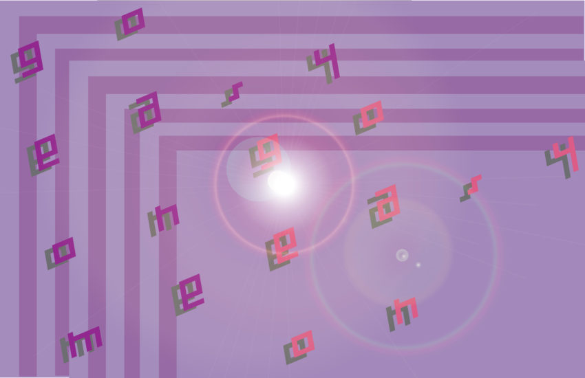
For this week, I did two experiments, one utilizing the entire alphabet and the other with the word “cypher” that I had done last week. For the alphabet, I was heavily influenced by Jordyne Cox’s poster and how they presented their font face, so I wanted to recreate a similar effect with my own font face. I ended up with a silver metallic look, and went in with the 3D effect to make it appear heavier and thicker. Then, I added a simple phrase at the bottom with how the font face originally looked with no added effects. Afterwards, I added the name of the font face and my name in a different font face to create a visual break! As for the background, I initially wanted to add a simple black background, but then I wanted to include a texture that had a similar appearance of a liquid metallic chrome look so I came across this water texture and made it black and white. I also added a slight glow to the alphabet to help blend it into the background a bit more.
https://uncg-my.sharepoint.com/:f:/r/personal/r_riley_uncg_edu/Documents/_Rachele%20Riley/teaching/S25/ART%20341%E2%80%9302/Cindy%20Pham/Week%2015/WEEK%2015_Folder?csf=1&web=1&e=OKtrTW
As for the one with the word “cypher,” I essentially used the same technique with the 3D look from the alphabet but added onto it from the original blue metallic look. Within the process, it somehow distorted the colors but I really liked how it did it? The gradients and variations of the dark blues and the pearly whites was very appealing so I kept it as is. Then, I wanted to look for a textured blue background to create a somewhat y2k esc poster, so I think for next week’s assignment, I’ll definitely build and experiment more with this one and add in more graphics and textures!
https://uncg-my.sharepoint.com/:f:/r/personal/r_riley_uncg_edu/Documents/_Rachele%20Riley/teaching/S25/ART%20341%E2%80%9302/Cindy%20Pham/Week%2015/WEEK%2015%20exp_Folder?csf=1&web=1&e=5iDJc1
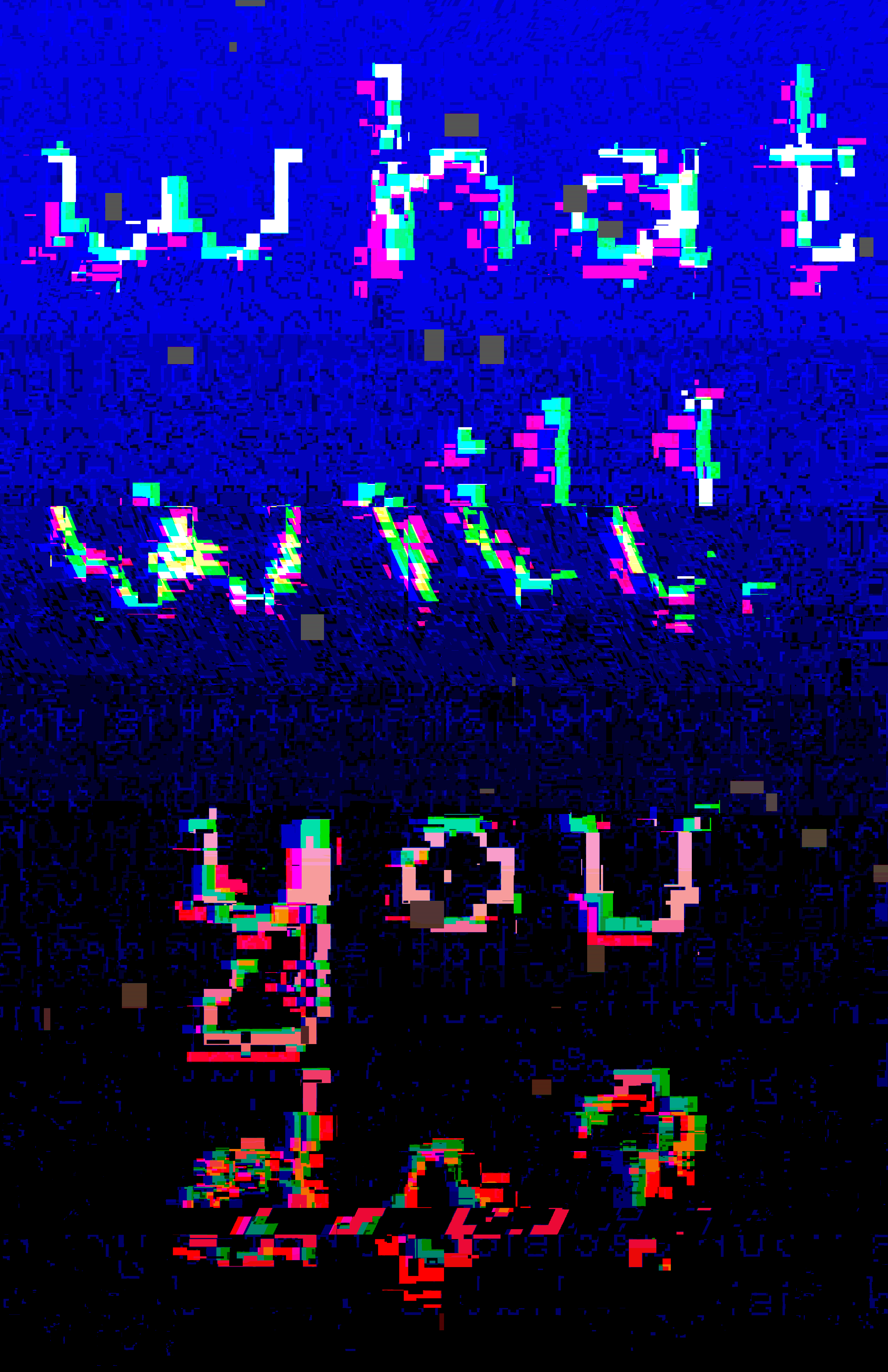
For my poster, I was inspired by the intro animation of the Christian drama series, “The Chosen” that depicts the life and ministry of Jesus Christ. The phrase “Walk on the water” is about the story of Jesus walking on the sea, and it is also a big symbolism of taking a step into faith and trust. I took advantage of the bubble/wavy look of my font to make it look like a pool of water, while also the letter “a” looks like a fish. I added in the fish which was also another detail from the show, the fish turning into a different color and going against the way of the crowd, which represents the changing your life and following Jesus. This is a very personal project for me and my beliefs, and I definitely want to do even more with it.
https://uncg-my.sharepoint.com/shared?listurl=%2Fpersonal%2Fr%5Friley%5Funcg%5Fedu%2FDocuments&id=%2Fpersonal%2Fr%5Friley%5Funcg%5Fedu%2FDocuments%2F%5FRachele%20Riley%2Fteaching%2FS25%2FART%20341%E2%80%9301%2FDebora%20Guevara%2FWeek%2015%2Fwalkon%2Dthewater%2Epdf&parent=%2Fpersonal%2Fr%5Friley%5Funcg%5Fedu%2FDocuments%2F%5FRachele%20Riley%2Fteaching%2FS25%2FART%20341%E2%80%9301%2FDebora%20Guevara%2FWeek%2015%2Fwalkon%2Dthewater%2Epdf