Final version/final revisions due Sunday.
Week 16 — Assignment “Portfolio PDF, Final”
Project 3: Portfolio Project—collecting, presenting your work, and telling the story.
1/
Discuss:
- Write a statement (200 words min) describing what you revised and developed this week for the portfolio project. Things you could work on this week:
rework the descriptions of projects (remove any references to it being a school assignment, for example), or add another project to your presentation, or show multiple pages and screens from sequential works, or include process images (preliminary sketches and earlier versions) that show the ways you worked on a project’s question. Reflect on what you are presenting in the portfolio, and if there are artistic/technical projects you aim to develop to include in the future—what are they? - Provide a direct link to your works in the class folder on the drive.
2/
Studio:
- Refine your portfolio layout/writing/image cropping/adding images and other details to the document (in either Indesign, Google Slides, or Powerpoint, etc). Your portfolio will be viewable online and exist as a PDF.
- As a reminder your text is:
COVER
your name
your contact info (email, website, (and social media links, if relevant)
short bio (50 words)
WORKS INCLUDED
title of project
dimensions
medium/format
project description
PRESENTATION SYSTEM
running header info (your name, portfolio)
page numbers
external links (if relevant — for motion design or web-based works for example)
images - Package your portfolio document (if InDesign) and also make a PDF. Upload all revised and final files to your Week 16 folder and share a direct link.
Onwards!
This week I worked on the formatting of my portfolio and adding extra images. I decided to shift my layout slightly to create more balance. Instead of all of my description being flushed left in the bottom corner of my image, I decided to half it and put the project description to the right. Halving the text balances the layout better, as the margins are now more open and the viewer’s eyes will naturally flow from left to right while reading. I made sure to use better guides this time around, to ensure all the text is lined up, cohesively. For the images that are smaller, there is a lot of empty space. To combat this, I decided to add close up shots of the pieces to fill space and help balance the format even more. In my portfolio, I am focusing on showing my use of bold imagery, intense textures, and overall surreal subject matter. I selected a range of works between still images and videos to show off various skills. I find these works to be some of my best, and they all tie together either stylistically or conceptually. My goal for the future is to add all my works, making a master document that I can pick and choose from depending on the job I’m applying for. I wish to show my streamline of concepts and ideas, while still showing off my various knowledge of different media.
https://uncg-my.sharepoint.com/:f:/r/personal/r_riley_uncg_edu/Documents/_Rachele%20Riley/teaching/S25/ART%20448/Kayla%20Stiles/Week%2016?csf=1&web=1&e=BeBSmo
What I worked on for revising the portfolio off of the comments left I started with the main page. I rearranged the order of the content. Making my name bigger and above the portfolio as well as moving my email over so it looks aligned to the left and correcting some grammar spelling mistakes in the bio. Next, I saw that I needed to remove the references to school work in all of the art and not call them assignments. It felt weird to write from a different perspective and not sound boastful so I struggled with that. Next, I corrected the titles since I had a lot of acronyms such as GPS and DND so I spelled them out. For the work on page 4 and 5 I needed to include images of the links so I tried to screenshot images that showed the scale of the project. I still could not get the date text box to go away off of the slides so I made a white box and placed it over it then went back and added my name plus portfolio at the bottom as a footer. I didn’t mess with the colors since I still wanted it to be simple to not distract and I made sure my layouts on each page were pretty much the same. I also kept the order of the art since I think it worked best with opening up with a project that directly ties to UI/UX and ended with one that is the next best similar.
https://uncg-my.sharepoint.com/:f:/g/personal/r_riley_uncg_edu/EkpuuTo7qA5Pqn739Sh6N94Bhqb3-djW3ZQEpRmICMKxGA?e=tihJij
This week I went ahead on moving to InDesign as with PowerPoint I felt I was not getting enough freedom with the design layout of my portfolio. Along with moving all my information to a new software and file I also took the opportunity to share more of each design work by including additional pictures of the piece for better context as to what I was trying to create or what it meant. There were print and digital works I have in these pages that were missing photos of one or the other, so I made sure to place them to ensure that you can see it in print or digital for example the t-shirt logo that I originally only had shared the logo itself and not the printed shirt with it which would have provided a clearer picture as to why I made the design decision. My overall goal was to continue giving more explanations with the extra photos of the work so you could see the steps taken to getting from digital to print in some of these projects. These are the type of projects I want to continue making in the future in these areas of entertainment such as streaming, content creation, esports, and music.
https://uncg-my.sharepoint.com/:f:/r/personal/r_riley_uncg_edu/Documents/_Rachele%20Riley/teaching/S25/ART%20448/Gerardo%20Gomez-San%20Juan/Week-16?csf=1&web=1&e=UVSDVY
This week, I cleaned up my portfolio to make it more professional. I simplified my title page by removing the busy elements and just keeping my email contact. It looks way cleaner now and lets my work be the star of the show.
I went through all my project descriptions and took out any mentions of them being school assignments. Now they read like more so real-world work that showcases my skills and the thinking process.
I also added the correct credits for all the found images I used in my projects.( Like from magazines and Pinterest).
Looking ahead, I think that adding these projects shows that I am able to do a lot of things regarding graphic design and illustration. I think adding something regarding interaction will definitely be helpful, especially nowadays. As well as motion graphics.
Over the summer, I want to explore more of these programs so I am able to be more confident in what I create. I’ve realized my portfolio needs more process work, sketches and early versions that show how I think and solve problems. I do eventually want to create a “fun” portfolio, then one that is more simple design, like the one we are creating now.
Overall, I’m happy with how my portfolio is going from student work to a professional presentation.
Revised Portfolio:
https://uncg-my.sharepoint.com/:b:/r/personal/r_riley_uncg_edu/Documents/_Rachele%20Riley/teaching/S25/ART%20448/Jayla%20Miles/week%2016/Jayla%27s%20Portfolio_final_revised%20Folder/Jayla%27s%20Portfolio_draft.pdf?csf=1&web=1&e=cO2Dn0
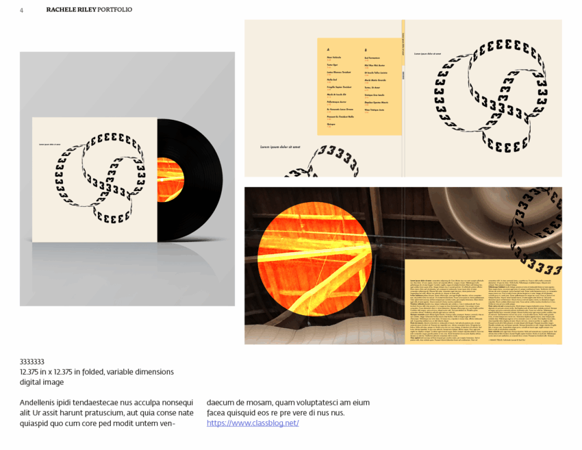
This week, I reviewed my portfolio and listened to Rachele’s notes and critiques of the document. The critics and notes were helpful, and I fixed the entire slide show. Through Canva, I reversed my name and where the title, “Digital Portfolio,” was, so my name is bigger, and my digital portfolio is smaller. It is essential for people who recruit me to their business to know my name more than anything. I felt slightly silly when I got this note because it should have been obvious. I also changed the background of the contact and name cover/page to a lighter blue, as the icons on the inside of the text bubble weren’t the same color as the entire page background. I also made my name bold and darker blue. I also moved the contact blurb and name to the left to be more aligned and organized. Then, moving forward to the bio, I removed my school information and fixed some grammar issues. Then, regarding the art slides, I fixed the grammar and removed the class titles and the dates when the projects were finished. I also added multiple photos to the Vinyl project slide because Rachele helped me realize I only had one photo of the cover vinyl. Also, with the book project I did for Pocket Bringhurst, I only had one page for the book, which has multiple pages. This week was a lot of fun editing and finishing up the portfolio.
This week, I worked a lot on updating and improving my portfolio. The main thing I focused on was rewriting how I described my projects. Before, some descriptions sounded like school assignments or didn’t clearly show what I was trying to say. So, I changed the wording. I to sound more natural, personal, and easier to follow so it makes sense more as a portfolio since I felt like I was a little too casual before. For example, In my “After Laughter” project, I made sure the new description highlighted the idea of how something colorful and happy can hide real struggles underneath. I cut some of the language by using shorter sentences, so it felt genuine and also it would not be a struggle to read through.
I also spent time redoing slides like my “Cupcake” artwork description. Originally, it had extra details that didn’t really add much to the meaning. I cut those out to make the emotion and personal story clearer. Now, it’s easier to see the message about dreams and struggles behind the playful image.
Besides rewriting descriptions, I added extra slides to make my presentation stronger. I introduced new colors (gray and white) and made sure each slide matched better visually. Doing this helped the whole portfolio feel connected and professional.
Revised Portfolio:
https://uncg-my.sharepoint.com/:f:/g/personal/r_riley_uncg_edu/Ej0n-J4ucy9NjJZYnbBkSUABEDpzMRUHXWuPBgOhfQQI4w?e=PddhR4
Great revisions, everyone!
During this week of refining my portfolio, I wanted to add more to include mostly the projects that I have made within online apps like Photoshop, Illustrator, InDesign, etc. since most likely that is the kind of job I would most likely want. I feel there is more freedom and creativity in making projects online and since I have perfected my craft with those apps, I feel that it would be the best step in the right direction. Especially when in this day and age, jobs rely so much on online components that I feel it is very necessary to showcase these skills in a potential job interview. I also chose the projects that would be the best at showing the wide creativity that I have when it comes to creating certain ideas. I did also add some drawings to the portfolio to show my potential I have with just a pencil and paper so that job positions know that I am capable of making both works. I also decided to change the theme of my presentation to make it stand out a bit better and add some color to it for viewers. I also made more of an effort to put more contact information on there.
Overall I liked my portfolio and was happy with the works included, so I spent a lot of this week trying to work on the organization and presentation rather than anything with the content itself. I changed the layout of each page to follow a more consistent style throughout as I felt it was a bit all over the place before and wanted it to look more professional. I also added a new slide to showcase the game I created, although I had to use a screen recording that wasn’t the final version as I can’t run it on my mac to get updated footage and was struggling to find time to get into the lab for that. Still, I’m glad I was able to include it as I’m passionate about game design and feel like the inclusion of a game I created helps to show my interests better. I also did some smaller touch-ups like resizing some images to make it more visually appealing and neat. I also changed the video format of the website preview as I noticed some parts of it were a bit choppy.
https://uncg-my.sharepoint.com/:f:/g/personal/r_riley_uncg_edu/Er-RoGCVTLdIqsqED28iLwIBUyq5QX2Tn_bO4hHgEWHyZg?e=K3KRII
This week, I focused on improving the layout and clarity of my portfolio. I started by shortening my artist statements to make them more direct and easier to read. I also removed any mentions of school assignments so that the work feels more professional and independent. I think it helped make the projects stand out while showing my own creative intentions. I ended up rearranging the order of my projects, instead of by medium, I did them in order of which they were created. This helps viewers to see how my work has developed over time, displaying my artistic growth both conceptual and technical. I also added in another video art project to the portfolio, to provide more variety of what I’ve done in the past couple of years. To make sure that my videos are accessible, I’ve added links, making it easier to access and watch.
Looking ahead, I think that I would definitely want to include more process images, like sketches or project boards to show how each work came together. I’m also thinking about expanding on a couple of the projects or even making more personal work to better reflect who I am as an artist. I think overall, I’m pretty satisfied with my portfolio right now, and I can’t wait to expand on it in the future.
https://uncg-my.sharepoint.com/personal/r_riley_uncg_edu/Documents/_Rachele%20Riley/teaching/S25/ART%20448/Danielle%20Scott/Missing%20Work/Week%2015-16/Portfolio.pdf?CT=1746653969703&OR=ItemsView