Final version/final revisions due Sunday.
Week 16 — Last Assignment!
1/ Discuss:
- Reflect on your work in Typographics I this semester. Write a statement (200 words min) highlighting something or one of your projects, and share what you specifically revised and developed further this week for the last project.
- Provide a direct link to your works in the class folder on the drive.
2/Studio:
- Make one (1) distinct new poster design variation—a variation in color choices, in composition/orientation, a new combination of elements, a different concept, etc.). Submit as final versions for Week 16.
- Upload all packaged design folders for your design files.
This means:
The packaged folder for your InDesign files or Illustrator—upload the entire folder.
Make a PDF.
Upload all three (3) formats of your typeface are uploaded (as per Week 15 assignment: .otf, .ttf, and webfont).

Onwards!
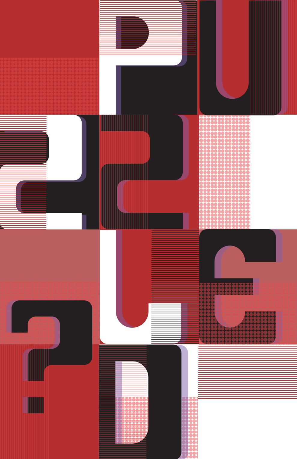
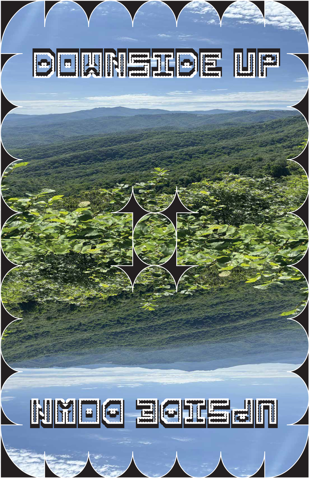
* featured image by Hannah Hill, 2017
-
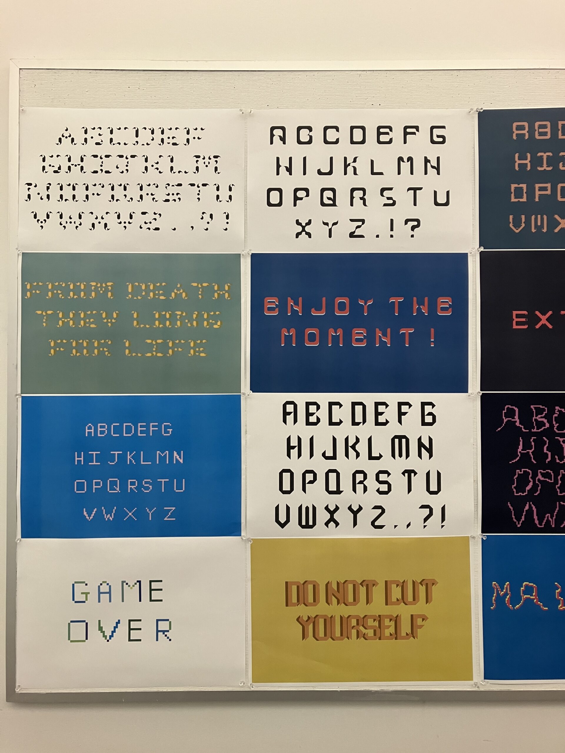
Brian Schultz, 2022
-
Brian Schultz, 2022
-
Brian Schultz, 2022
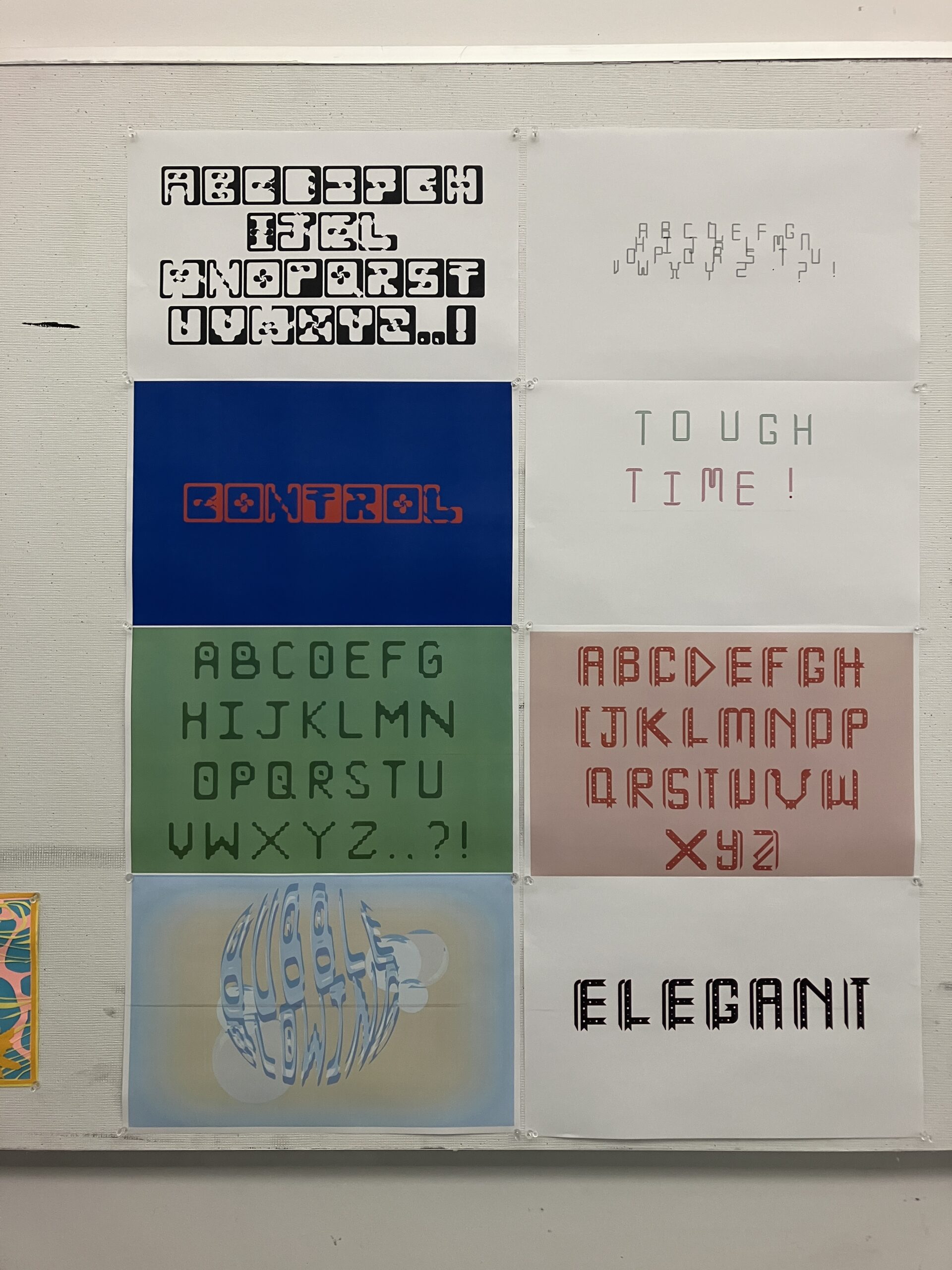
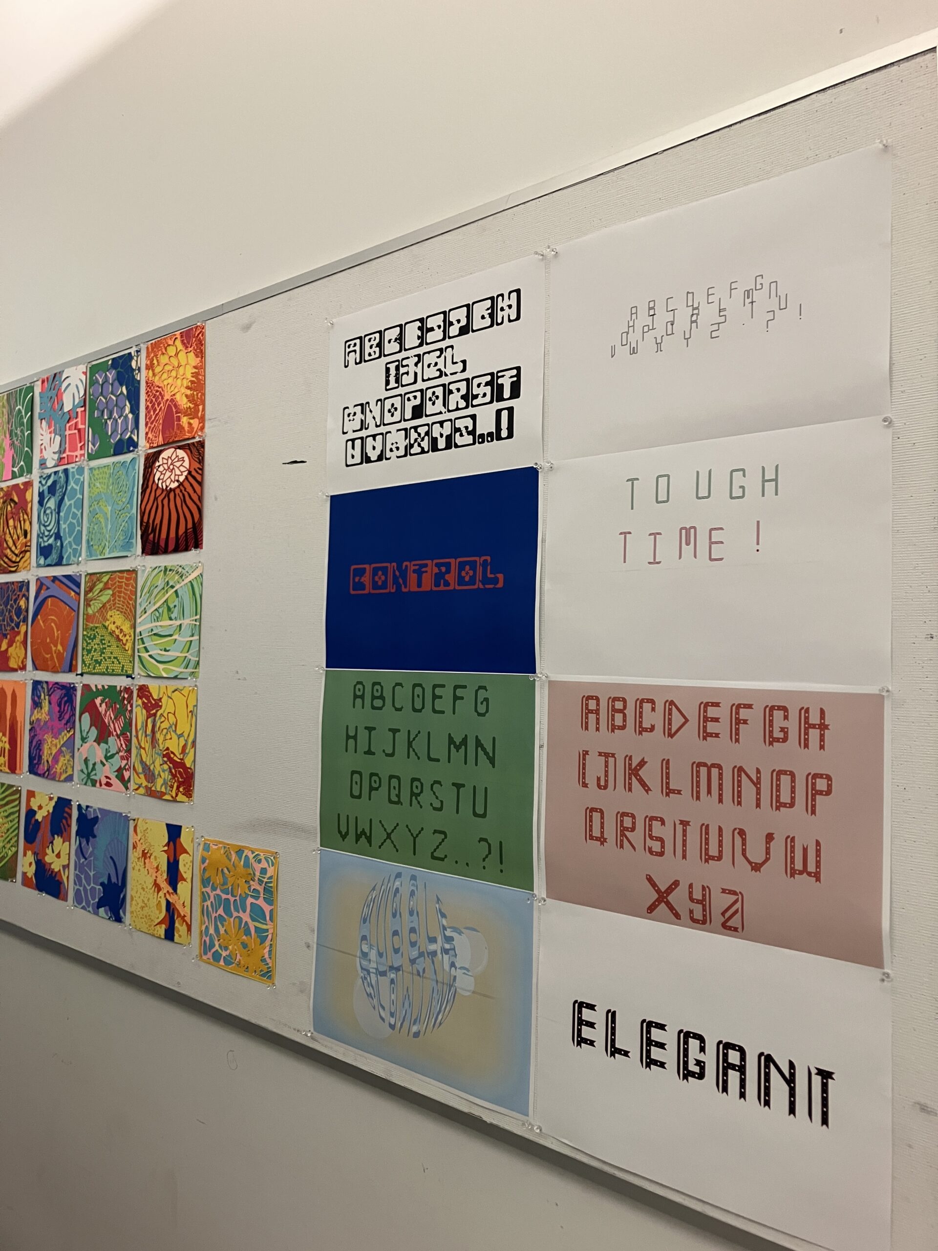
-

Andrea Moyado, 2024
-
Andrea Moyado, 2024
-
Ruthi Temple, 2024
-
Ruthi Temple, 2024
-
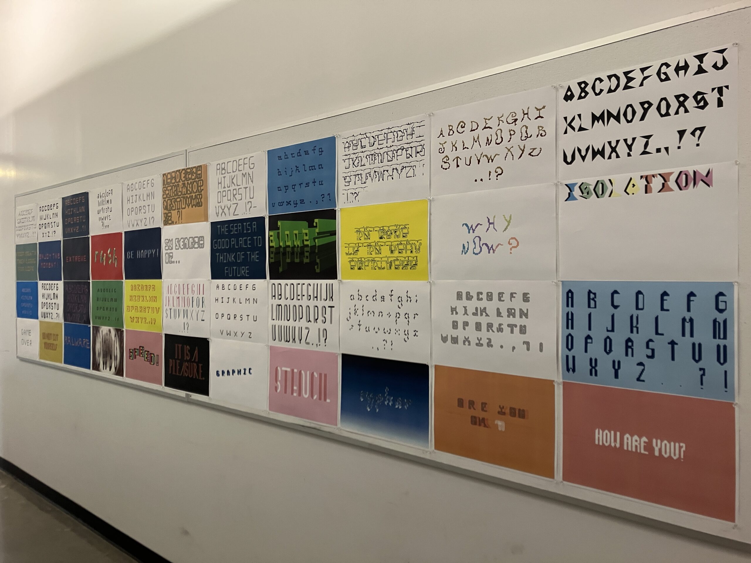
Taylor McDaniel, 2024
-
Taylor McDaniel, 2024
-
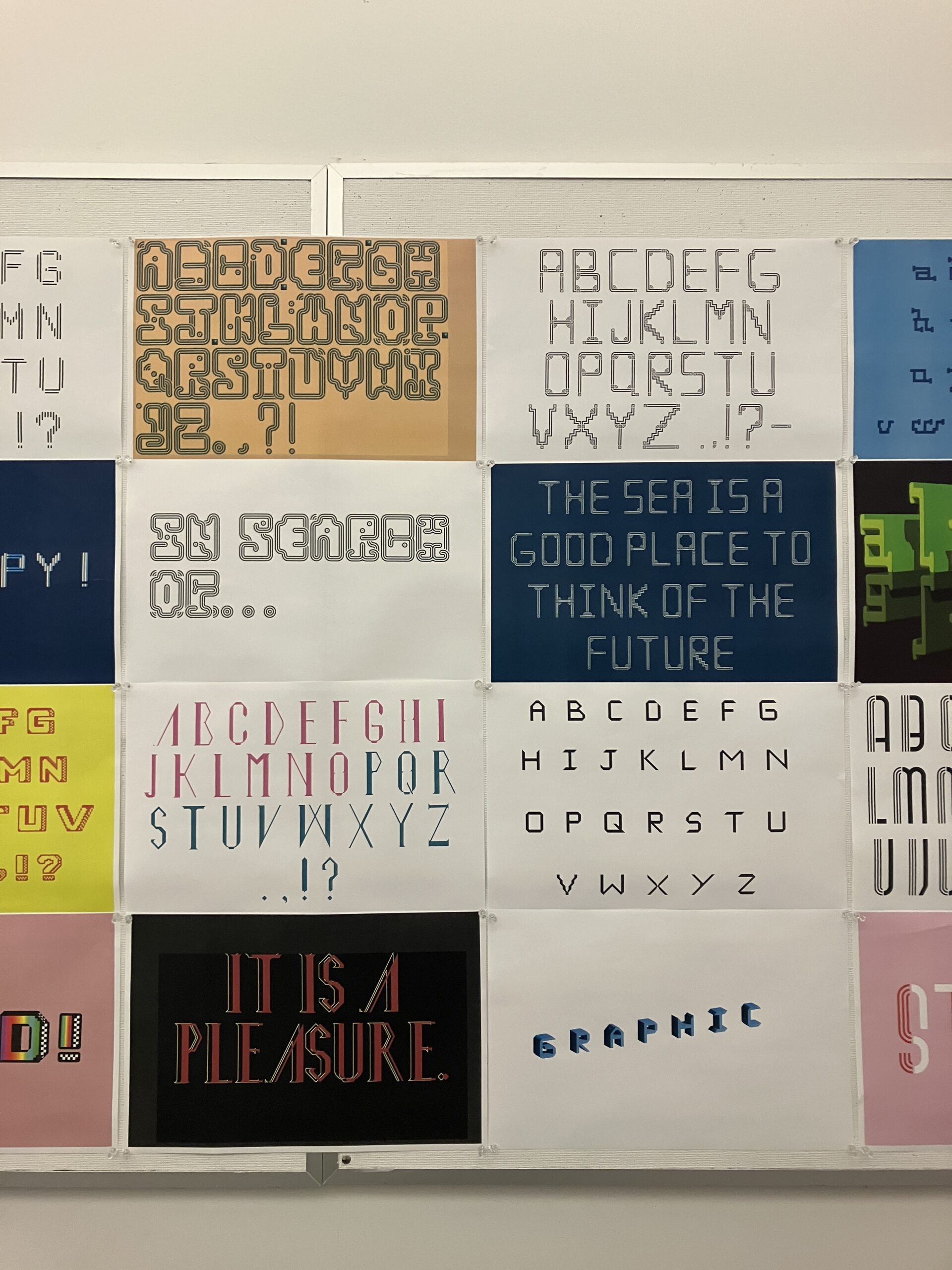
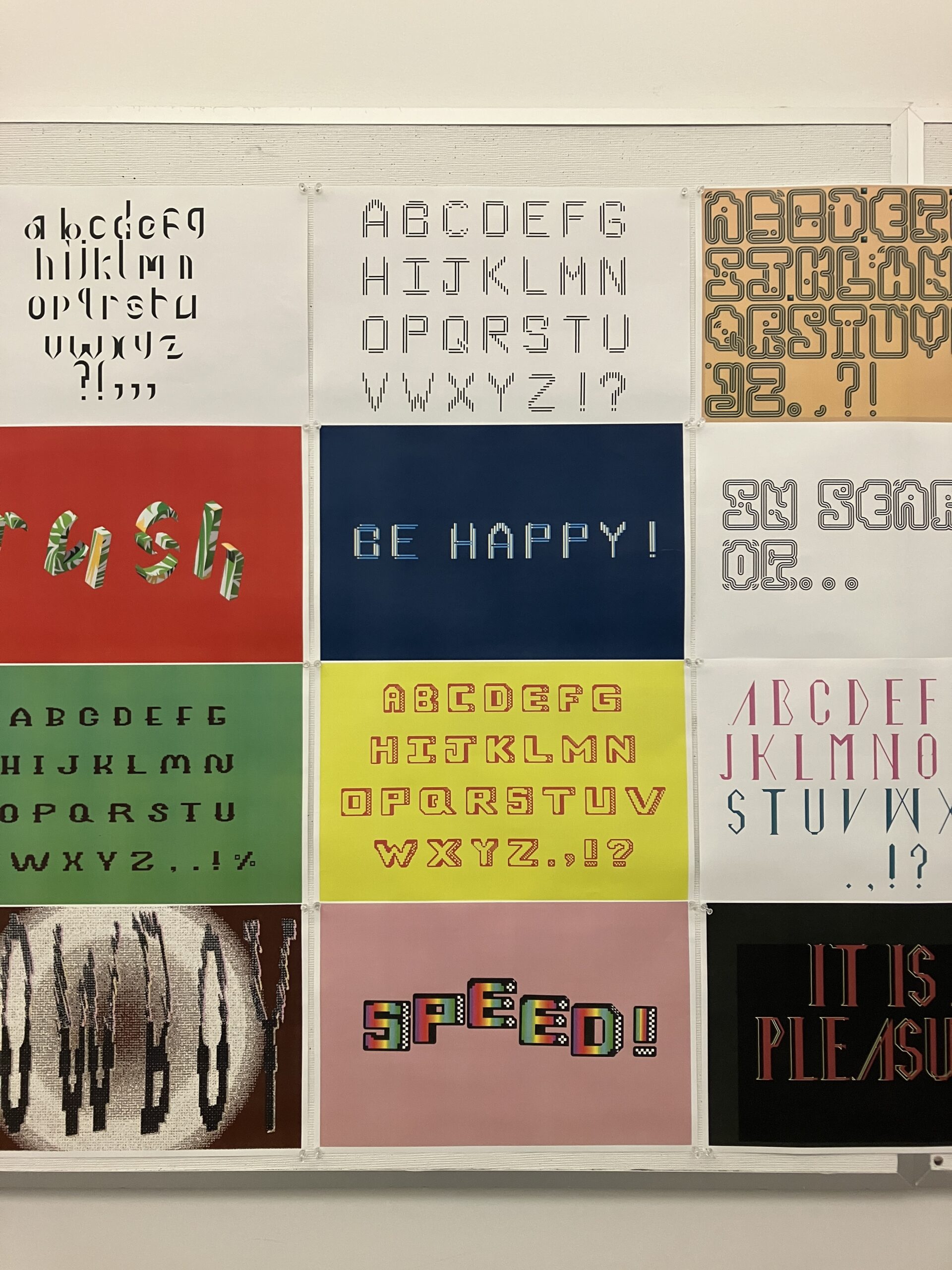
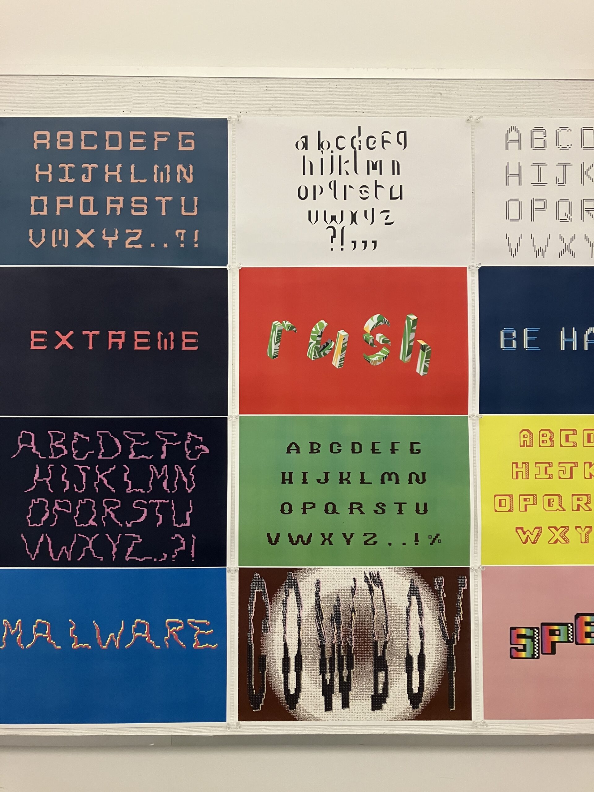
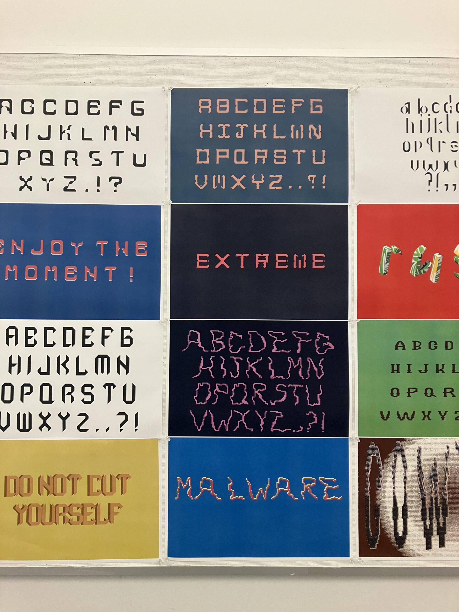
S25 ART 341 Typographics I (Week 14 progress view)
-
-
-
-
-
-
-
-
-
-
Before this class I have never taken a class that fully focused on graphic design or typography design. I have done some pieces that were graphic design centered but I never fully focused on it till this course. I have gained insight into my capabilities with type design and have found joy with it. And I am excited to see what I will create with this medium in the future. For my final I really focused on simple designs for the poster as in week 15 I was struggling to decide if I wanted a more complex design like I have previously done. Or do something really simple and be happy with it. Since my type has more complicated forms, a simple design fits more than a more complex one. I stayed away from using images to challenge myself to use the letters and graphics. Compared to my original three versions I had done a type specimen poster and two posters that focused on phrases, colors, and graphics. For my final I still wanted to use the phrase but a critique for my previous poster was that the lines of the letters are more obscured with layers. I limited the layers and changed the color to a warm yellow to compliment the red. I took a part the letters and added the lines and circles as graphics onto the poster. Spaced out the words and kept it really simple. I wish I did more, but I could not think of anything complex to do with this typeface. But I know in the future I want to experiment with my type soon.
https://uncg-my.sharepoint.com/:f:/r/personal/r_riley_uncg_edu/Documents/_Rachele%20Riley/teaching/S25/ART%20341%E2%80%9302/Sarah%20Hines?csf=1&web=1&e=zrLNbo
This course has been a lot of fun overall which is kind of rare to me if I’m being completely honest. Every assignment in this class had its learning opportunities and even then I was enjoying myself while doing classwork. Professor Rachele really made this class extremely enjoyable, with the types of assignments we were doing, or the overtop effort she wanted us to bring to class it was really beneficial to me and my graphic design and typography career. I learned a lot about the different forms of typography and typefaces as well as the complexity and/or simplicity involved withing this area of design. With all of that being said I also was able to make adjustments I likely wouldn’t have considered on our week sixteen assignment. With the work from the previous week i took the same approach and used the phrase “Pick you poison” and made it into a design. instead of just the 3d letters as i did in week 15 i went with a chrome and inflated typeface using my font. On top of that I also added in some highlights around the letters to make it appear like neon and then stretched an inverted version of the composition across the bottom half of the piece to make it appear like a glare and reflected light.
https://uncg-my.sharepoint.com/shared?id=%2Fpersonal%2Fr%5Friley%5Funcg%5Fedu%2FDocuments%2F%5FRachele%20Riley%2Fteaching%2FS25%2FART%20341%E2%80%9301%2FJon%20Johnson%2FWeek%2D16%2FWeek%2016%20poster%5FFolder&listurl=%2Fpersonal%2Fr%5Friley%5Funcg%5Fedu%2FDocuments&login_hint=JAJOHNSON3%40uncg%2Eedu&source=waffle
I really enjoyed the class. I’ve hand painted some lettering before for album covers but never researched how to do it properly or what “proper” meant in respect to lettering. When I say hand painting, I mean digitally painting on the iPad after sketching things with analog media or free hand airbrushing things. That means no vector tools, no adobe plugins, no overlay filters, very crude working conditions. Being forced to work in Illustrator and InDesign throughout the course helped me realize how much harder I make things on myself for no reason. Yeah, Adobe suite has a lot of idiosyncrasies that drive me nuts. On the other side of the course though, I’ve managed to relearn how I work using these tools and can see a lot of potential in them.
Because of this, I have to highlight our week 15 poster designs we just went through. I only had a day of free time between work, caring for Barry, and other final projects due, but I feel very good about the results. The decollage/graffiti wall edits taught me a lot about how to blend textures convincingly, and being able to paint up the skull tag to match made it feel like a true multimedia piece.
Here is a link to those:
https://uncg-my.sharepoint.com/:b:/g/personal/r_riley_uncg_edu/EahDfm97smpOi4A_cGeT1oMB-K_B_MNU5e58pBU0vgJ89w?e=dzB54g
For this week’s studio I decided to try a version with some element of repetition in it. I’m not a huge fan of these kinds of designs but thought I’d give it a try. I used select > color range to mask out and isolate certain values. This created the light bleed effect on the text. The piece is then blended with a liquid chrome texture image. I manually color blocked between some of the existing lines in the overlay and used adjustments to each color block until I was satisfied with the overall texture. Because the overlay suggests almost a tear, I brought in and blended images of hands parting the overlay. A sidebar of text is used to address readability. The side bar is overlayed with rain covered glass for texture. Gaussian blur and noise applied to overall piece.
Link to studio:
https://uncg-my.sharepoint.com/:f:/g/personal/r_riley_uncg_edu/Ehyd-FNgnmZErPqXwhHTAi8ByE2BPqeTYSip7A_0Y9V1JA?e=qWGlj5
this looks super awesome Zeus!!!
This semester has left a large visual impact on my life as an artist. I have had practice before with working on adobe products but it not much experience with incorporating design elements with adobe products. Week six assignment was a changing point for me in regard to designing in adobe products. Researching other graphic design work, basic layouts in design, fonts, photos, prints and more in combination practice tools in adobe products helped me become a more confident artist.
For my revision I decided to change the colors on the posters to match better with the bubble gum theme. After asking my friends’ opinion for the poster, I decided to keep the slightly lower resolution photo of the stick of gum to better match the lower half of the poster. For the first half of the poster, I decided to readjust the colors for the word POP! In addition to adding more white circles to help make the negative spaces on the font pop out more. For the phrase POP! I went ahead and changed all the colors in addition to adding more layering with using the transparency tool. Finally, I added a background color to the first half of the poster.
https://uncg-my.sharepoint.com/shared?id=%2Fpersonal%2Fr%5Friley%5Funcg%5Fedu%2FDocuments%2F%5FRachele%20Riley%2Fteaching%2FS25%2FART%20341%E2%80%9301%2FKarla%20S%20Morga%2FWeek%20Sixteen&listurl=%2Fpersonal%2Fr%5Friley%5Funcg%5Fedu%2FDocuments&login_hint=KSMORGA%40uncg%2Eedu&source=waffle
I got the opportunity to learn about typography through the whole semester. I have developed new skills. One of the projects that stood out the most to me was the typographic poster assignment, where I was challenged to use only type to convey a powerful visual message. Initially, I struggled with layout and hierarchy; my compositions felt either too busy or too empty. However, through critiques, I learned to improve and work in different ways that would allow me to design better projects during this class. One of my favorite things was being able to view everyone’s final design when it came to the project. It was nice, and it motivated me to capture new design ideas. For the final project, I chose to revisit and expand on this poster by turning it into one with more colors and simply playing with the typography. My original poster just had certain colors, which did not convince me. Now, for my final, I got the opportunity to experiment more, which allowed me to play around with colors. These revisions helped create a cohesive, professional look across all formats. Overall, I’ve grown more confident in my ability to communicate visually through type, and I’m excited to carry these skills into other future classes.
https://uncg-my.sharepoint.com/:b:/r/personal/r_riley_uncg_edu/Documents/_Rachele%20Riley/teaching/S25/ART%20341%E2%80%9302/Cindy%20Ortiz/week%2016/POSTER%20.pdf?csf=1&web=1&e=bfmkeq
https://uncg-my.sharepoint.com/:f:/g/personal/r_riley_uncg_edu/EsdgvKzFFE1Jv4PEnPLOgUsB-39K1I_DDafPRyc9Tux8rQ?e=xeqrJP
This semester in Typographics I, I’ve really loved getting to collaborate with my peers and push myself to be more experimental, especially with how I approach type. One of my favorite parts of the class was getting to use FontStruct to create my final concept lettering design. I’d never made my own font before, and the hands-on, puzzle-like nature of it was so satisfying. It helped me think differently about how letterforms are built and how small tweaks can totally shift the mood or tone of a word.
For this last project, I revisited my Week 15 work and took a more experimental approach with how I stretched and distorted my letters. I also chose to bring in a concept that I’ve explored before and really enjoy working with: repetition. I leaned into this concept in my screen printing class last semester, so it felt natural to carry it into this piece and continue upon it. I also stuck with a monochromatic color scheme; I’m drawn to how focused and impactful it can be, but this time, I layered in more texture through filters and warping to give the piece more movement and energy while still keeping my dystopian type theme for this final poster. Overall, this week was about taking risks and making it more personal.
LINK: https://uncg-my.sharepoint.com/:f:/g/personal/r_riley_uncg_edu/ErVQmrB0KCNMh4Jcv_8h7ZQBsYqUfwCUAnowc1fCJwkoSg?e=5zQ5M1
–
For this last project, I made several adjustments to my poster. First, I made everything a lot brighter so it’s easier to see and would show up better when printing. I made the main text all the same size so it flows better, and I also added smaller text at the bottom and top. The top has the full alphabet in my typeface, and the bottom has credits for both the typeface and lyrics of the song that I used. I also made the color scheme slightly more blue.
Reflecting on this class, I have really enjoyed it! As someone who is planning on being a graphic designer but still doesn’t have much actual experience, it was really great working on these different projects and becoming more familiar with the various software. I definitely feel like I have a much better understanding of it than I did before. I think I improved over the course of the semester, and I made a lot of work that I’m really proud of! It was also really great getting to see other people’s projects, it showed me just how many different ways you can do an assignment and definitely helped inspire me. Overall, I really enjoyed this class and I hope everyone has a great summer!
Well we’ve reached it, the final assignment! I’ll admit, despite me not really enjoying the format of having a class via video call, I certainly enjoyed the skills and new tools I got to use this semester, as well as the resources and inspiration I was put in contact with. And the fruits of my labor? Two different fonts derived from a singular concept font. I give you, Terra Fissue and Terra Fragment, A font duology born of vintage hippie vibes and a connection to the concept of “the earth” as both an element and a place of creation from destruction. Or something else very profound and meaningful like that that speaks to you personally. Anyways, I redesigned the poster! ditching the more heavily graphic look I slapped together while working on other finals, instead I embraced photographic textures and the 3D tools in illustrator (even though its slow running gave me a headache) to make a poster that furthers the “earthly treasure” feel of the taglines written into it. Overall I had a great time learning new ways to curve my creative thinking in new ways that I hope to employ in the future!
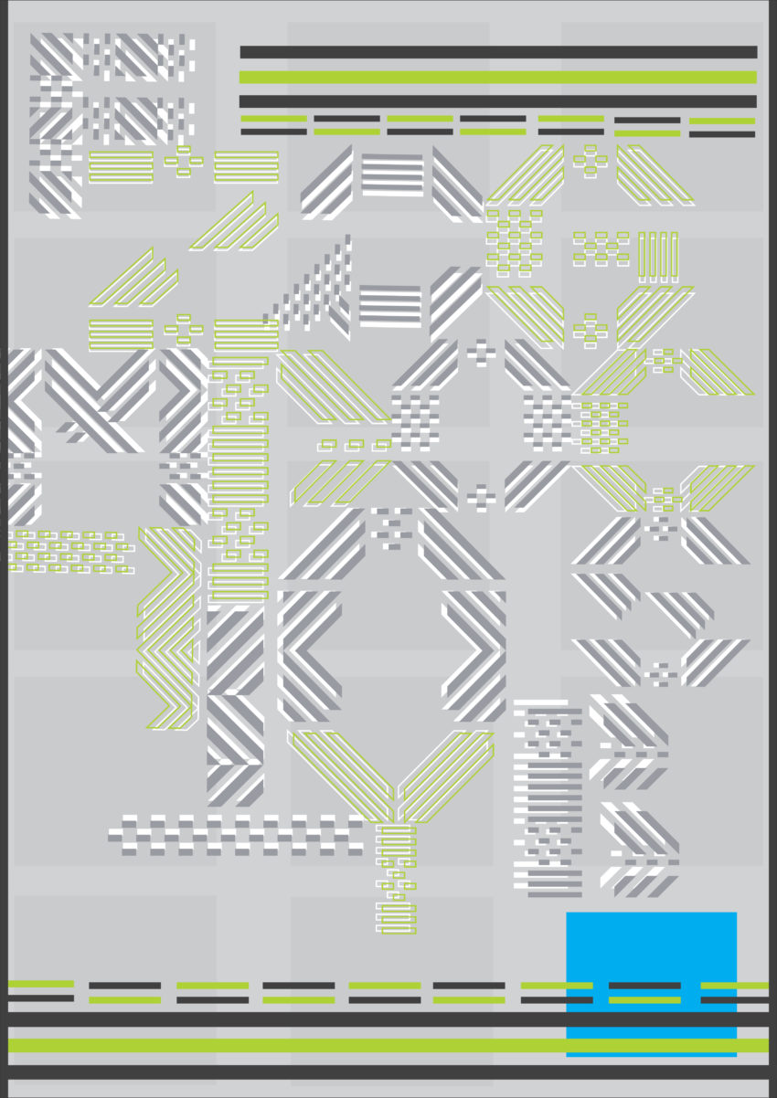
One of the pieces that I’m most fond of from this semester is my Visual Culture assignment. It’s one of the only pieces where I didn’t utilize a lot of color which made the addition of singular color feel more impactful for those pieces. I also appreciate the use of movement throughout each piece. The movement conveyed almost has a musical aspect to it which ties back into one of my initial images. I also like my use of leading lines as a way to manipulate the eye to different pieces of the compositions. My incorporation of the star-like figure was an element used to create movement. Looking back at them, they sort of look like dancers or parade marchers. What I did for this final project that took influence from the Visual Culture assignment was movement. My typeface is made up of ‘tadpoles’ which are multiple moving parts. Because of this, I wanted to create more movement throughout the piece. The background, for example, is a pattern made up of the tadpoles which implies that they are living and moving in water. With the main title, I wanted to try something different, so I created 3D versions of the letters. To me they look as if they are drifting on top of the water in the background. I also wanted to include lily pads as they are commonly associated with frogs, and they can also help imply that there is a surface to the background. I intentionally lowered the opacity of the patterns in the background to imply that they were visible but muddy like objects in water.
Studio Link: https://uncg-my.sharepoint.com/:f:/r/personal/r_riley_uncg_edu/Documents/_Rachele%20Riley/teaching/S25/ART%20341%E2%80%9301/Mar%20Alvarado-Escobar/Week%2016?csf=1&web=1&e=zihytq
Inspiration Link: https://uncg-my.sharepoint.com/:b:/r/personal/r_riley_uncg_edu/Documents/_Rachele%20Riley/teaching/S25/ART%20341%E2%80%9301/Mar%20Alvarado-Escobar/Week%207/mar_image_series.pdf?csf=1&web=1&e=IpdF8d
Looking back on my experience in Typographics I this semester, I feel like I’ve learned a lot about the role of typography in design. At the start, I only knew about fonts and how to use them in basic ways. But as the semester went on, I realized how much more there is to typography—it’s not just about choosing a pretty font, but about how type can communicate a message.
The class taught me a lot about the history of typefaces, how they evolved, and how important things like letter spacing (kerning) and line height (leading) are for making text clear and easy to read. Working on assignments helped me experiment with different types of fonts and layouts, and I learned how small changes in typography can completely change the feel of a design.
The feedback from my classmates and instructor was really helpful. It pushed me to think more carefully about my choices and helped me improve my designs. I now understand that typography is more than just decoration—it’s a key part of any design that can influence how the message is received.
This semester has sparked a deeper interest in typography, and I’m excited to keep learning and improving my skills in future design projects. What I revised this week for the assigned studio work was I stayed on theme with what I originally did as far as playing around with the gradient and 3D tools, but I simplified it just a tad bit. I changed the color scheme, took away certain elements, and changed my wording. I wanted to seem as if I was creating cover art for a new single from one of my favorite artists, Mariah The Scientist, so I created cover art for her new single “Burning Blue”. I can honestly say that less is more when it comes to certain instances in design, so I made multiple posters (one in photoshop and the other in adobe illustrator), and I favor the poster that was created in photoshop due to it matching my personal aesthetic and being able to play around with new tools in that program.
https://uncg-my.sharepoint.com/:f:/r/personal/r_riley_uncg_edu/Documents/_Rachele%20Riley/teaching/S25/ART%20341%E2%80%9302/Chris%20Pierce?csf=1&web=1&e=bPr5nk
This has been my favorite class I have taken during my time at UNCG, I love doing this type of work, and I truly find it interesting to learn about. However, this semester I have been particularly busy between other classes and working, and I felt I did not have as much time as I would have liked to create super successful pieces. One piece I did find super successful was the first assignment we did this semester. I felt I had enough time to put in an adequate amount of work, and I felt it represented me and the things I find interesting. I also enjoyed making my own font and I think with more time and experimenting with the font struct program I could create something I am super proud of. I also enjoyed getting to see and discuss everyone’s work throughout the semester.
For my revision of my poster this week, I changed the orientation of the poster to landscape as well as added a photo background, a race car illustration, and changed the layout of the letters on the page. I like this version much better.
Here is a link to my studio project,
https://uncg-my.sharepoint.com/shared?id=%2Fpersonal%2Fr%5Friley%5Funcg%5Fedu%2FDocuments%2F%5FRachele%20Riley%2Fteaching%2FS25%2FART%20341%E2%80%9301%2FVictoria%20McPherson&listurl=%2Fpersonal%2Fr%5Friley%5Funcg%5Fedu%2FDocuments
https://uncg-my.sharepoint.com/:f:/g/personal/r_riley_uncg_edu/ErSBTVMJY2lEqhrT-UYJKVoBJEg_ikhee9GUJ5IyZt-38Q?e=qih6Nc
.
.
.
I enjoyed this course! This class has helped me understand the concept of typography more deeply than simply placing text on a canvas and moving it around. My work has progressively improved over the semester. Although I am not the biggest fan of Illustrator, this course has helped me gain more skills with the application. Throughout the semester, my work has consistently explored the lines of perspective. In my week 4 assignment, I experimented with perspective by positioning my phrase flatter, as if it were placed on the ground. Each week, I noticed a progression in the use of depth and perspective. This contributed to my final assignments, leading me to experiment with 3D.
While working on my final project, I felt some struggle. During weeks 14 and 15, I extensively explored the 3D effects in Illustrator, resulting in a variety of outcomes, which inspired more concepts and ideas for the final product. I approached my final by contrasting it with more 2D work. I am unsure why I was so focused on 2D after working in 3D for those two weeks. However, after meeting with the professor and brainstorming more ideas for the composition, I decided to combine the two.
This semester, learning about typography really opened my eyes to how much type can say without even using words. At first, I didn’t really think about fonts or spacing that much—I just picked whatever looked good. But now, I understand how different typefaces have different moods and meanings. I learned about things like hierarchy, kerning, tracking, and how spacing affects the way people read and feel about the design. One of the biggest things I improved on was paying attention to alignment and how letters sit next to each other. Before, I would just eyeball everything, but now I take the time to adjust it and make sure everything feels balanced. I also got better at using bold fonts to make a strong statement and mixing type styles without making the layout look messy. I messed up a few times with colors and font pairings, but those mistakes helped me figure out what works and what doesn’t. Overall, I feel way more confident in how I use type now. It’s not just about looking cool—it’s about making people feel something when they read it. That’s something I didn’t really get at the beginning, but I definitely do now.
https://uncg-my.sharepoint.com/:f:/r/personal/r_riley_uncg_edu/Documents/_Rachele%20Riley/teaching/S25/ART%20341%E2%80%9301/Tre%20Leach?csf=1&web=1&e=X0pK3h
From where I started in this class, making a poster about what inspired me to create – I’d never thought I’d end up where I am today. I’ve learned so much in this class about creating art online. I use it in my physical art classes and my graphic design job. This class has taught me so much about Illustrator, InDesign, and Photoshop. In moments where I’ve felt stuck, I’ve remembered to try things out and experiment as much as I can. Thank you for giving me the tools and resources to try anything I can.
Leading from that, my final assignment is where I noticed I’ve developed my skills even further. My “alone” poster and this one have been the most out of my comfort zone, which makes me really excited. I was nervous about the last project, but it made a pathway for me to excel in this one. Going into this project I knew I wanted to make a product that had a purpose… an ad? a movie poster? This music festival poster is what I decided on. I started with the title and worked my way from there. “Robo Fest.” I experimented more with the extrude and inflate tools and the materials it was made out of. I used more colors this time – I feel like this class has really helped me color code things and understand how it helps out the final product. This class has really helped me grow as an artist. Thank you. I’m looking forward to and excited for typography two!!
https://uncg-my.sharepoint.com/personal/r_riley_uncg_edu/_layouts/15/onedrive.aspx?id=%2Fpersonal%2Fr%5Friley%5Funcg%5Fedu%2FDocuments%2F%5FRachele%20Riley%2Fteaching%2FS25%2FART%20341–02%2FChristina%20Kibler%2FWeek%2016&ga=1
Typographics I this semester has been one of my favorite courses that I have taken here at UNCG. It allowed for a formal structure to a class load while still allowing for individual creativity and desires to shine through. I thoroughly enjoyed seeing various design tactics and learning new terms to help improve my design skills. I found it very helpful to present my work weekly and allowed me to get much more comfortable commenting on my own work and explaining what I create in words. I also thought the feedback that was received weekly helped to guide me into more successful projects throughout this course. I really appreciated the multi-week setup in which we were given chances to continue to improve design choices and/or try out new techniques. Overall, I think my favorite project/design is this very last week in week 16 as both of the poster I made are very close to who I am as a person and reflect my personality whole still showcasing my typeface in a cool way. For week 16 in specific, my revisions consisted of going two completely different routes and exploring some different posters that could make use of my font.
Link to my Week 16 One Drive Folder:
https://uncgmy.sharepoint.com/:f:/g/personal/r_riley_uncg_edu/EvtU7GWxgk9Lo0uq__5WBVQBTbJpmy8JmmswqtddeaO93Q?e=sf5g6C
When it comes to reflecting on a specific work that we’ve done from over the course of the semester, I can say with confidence that Week 15 is my favorite that I’ve done. With that being said, the creation of fonts that we were able to do with Fonstruct is a very close tie with Week 15. The “Cloud Storage” work I did really challenged me to explore different compositions and shapes to play with that are available in Illustrator, which made it all the more satisfying to see the end product. I had originally made the font for the video game capstone that I was a part of, but then wondered to myself what phrases I could use for what subjects, other than just what it was originally intended for. I knew it should be a digital subject, but just didn’t know what it should be exactly. For unknown reasons, I came up with the idea of cloud storage, and wondered how I could turn it into a poster that visually depicts the subject at hand. I eventually landed on a box that contains “data”, with some of it leaking out from the front due to it not being “updated”.
Discussion:
For my revised poster for this week’s assignment I took a lot of inspiration from one of our classmate’s posters from last week. I wanted to take it in a more visually grabbing direction, using a lot of poppy colors and effects to help grab people’s attention.
I think this course has helped me in my efficiency with a lot of the adobe programs, specifically indesign. As well as, has helped me sharpen the composition of my pieces. I would love to continue making fonts using fontstruct, and I think this course has encouraged me to look at a lot of daily examples of typeography and graphic design in more detail, which is exciting!
Studio:
https://uncg-my.sharepoint.com/:f:/r/personal/r_riley_uncg_edu/Documents/_Rachele%20Riley/teaching/S25/ART%20341%E2%80%9301/Johnny%20Monroe/Week%2016?csf=1&web=1&e=es3ADM
Of all of my projects this semester, my favorite piece I created was my project for week 11. I used my funny face alphabet from the previous week to create a lettering design that could be featured in a fashion-related New York Times book review. My letters were made using a patterned tie I have, behind each letter is white fur from a coat that helped make the dark fabric of the tie pop out. The background behind the letters is a collage made of different clothing items from multiple designer brands in Vogue’s Ready-to-Wear Collection.
For this week’s assignment, I revised my project from last week by creating a similar concept and design with a different color palette. I did the same concept of a screenshot from a device with multiple tabs open; a tab with screen time analytics, google chrome, notes, and an error message. Instead of just choosing bright/neon colors, I chose to use purple, orange, magenta, and pink.
Links:
Week 11:
https://uncg-my.sharepoint.com/:i:/r/personal/r_riley_uncg_edu/Documents/_Rachele%20Riley/teaching/S25/ART%20341%E2%80%9301/Rory%20Bohn/Week%2011/Rory%20Bohn%20Week%2011.jpg?csf=1&web=1&e=BBmohG
Week 15:
https://uncg-my.sharepoint.com/:b:/r/personal/r_riley_uncg_edu/Documents/_Rachele%20Riley/teaching/S25/ART%20341%E2%80%9301/Rory%20Bohn/Week%2015/WEEK%2015_Folder/WEEK%2015.pdf?csf=1&web=1&e=ecYs5V
Week 16:
https://uncg-my.sharepoint.com/:f:/r/personal/r_riley_uncg_edu/Documents/_Rachele%20Riley/teaching/S25/ART%20341%E2%80%9301/Rory%20Bohn/Week%2016?csf=1&web=1&e=F3JRQN
All of my works in this class:
https://uncg-my.sharepoint.com/:f:/r/personal/r_riley_uncg_edu/Documents/_Rachele%20Riley/teaching/S25/ART%20341%E2%80%9301/Rory%20Bohn?csf=1&web=1&e=HR2h3Y
PROJECT LINK:
https://uncg-my.sharepoint.com/:f:/g/personal/r_riley_uncg_edu/ElOPgTZqVfZCjO1z7hG0S6YBrszjliyIHaWdRsXZWMw9rQ?e=Fbf1ME
Taking typographics this semester exposed me to a lot of new methods of making this such as using InDesign and FontStruct for editing and creating fonts. There’s a lot of work and intention that goes into crafting typography. I think my favorite project is this one, the Week 16 poster. It features the phrase “IT ALL COMES FULL CIRCLE” spiraling from the outside in. The background is purple, darkening at the edges and lightening at the center. If you zoom in, it’s like you’re being sucked in, which is kind of fun. I applied a text warp to both the brighter words and dimmer words, both of them going in opposite directions of each other. The only way the poster differs from week 15 is that I made the words center spiral in all the way. I felt that the original poster was a strong concept and didn’t tweak anything else. The color choice in combination with my font makes the poster feel futuristic and techy.
For my font variations I had my original Block Future and built upon that through adding some circles in some places where lines connect in the letters. I like my font a lot and didn’t want to change too many aspects of it.
For my final project I wanted to show more of my font in a simplistic way. I did this by changing the format and style of my poster. I chose to use simpler and more aesthetic colors for this design. I also added the word “Graphix“ on the bottom in order to add more characters of my font. I believe the other version was a bit too vibrant for what I wanted to show. I think this version shows more of what I was trying to create. Overall this course was very interesting to take. I believe this project was one of my favorite parts of this class. Being able to acting create your one font was something I’ve thought absolute doing for some time now. I enjoyed being able to have creative freedom, and I am happy with my final result. I am beginning to wonder how I this class could be in person. I think this class would be really interesting to do hands-on projects in a classroom on campus in the Art building. If I had to take this class again I would want to take it in person. I struggled with being able to collaborate with others online, and this could be easier if we were in person in my opinion. Overall this class was very artistic and helped me understand more about the kinds of fonts and typographies I need to be using in my own work.
https://uncg-my.sharepoint.com/my?remoteItem=%7B%22mp%22%3A%7B%22webAbsoluteUrl%22%3A%22https%3A%2F%2Funcg%2Dmy%2Esharepoint%2Ecom%2Fpersonal%2Fwagentry%5Funcg%5Fedu%22%2C%22listFullUrl%22%3A%22https%3A%2F%2Funcg%2Dmy%2Esharepoint%2Ecom%2Fpersonal%2Fwagentry%5Funcg%5Fedu%2FDocuments%22%2C%22rootFolder%22%3A%22%2Fpersonal%2Fwagentry%5Funcg%5Fedu%2FDocuments%2FART%20341%E2%80%9302%22%7D%2C%22rsi%22%3A%7B%22webAbsoluteUrl%22%3A%22https%3A%2F%2Funcg%2Dmy%2Esharepoint%2Ecom%2Fpersonal%2Fr%5Friley%5Funcg%5Fedu%22%2C%22listFullUrl%22%3A%22https%3A%2F%2Funcg%2Dmy%2Esharepoint%2Ecom%2Fpersonal%2Fr%5Friley%5Funcg%5Fedu%2FDocuments%22%2C%22rootFolder%22%3A%22%2Fpersonal%2Fr%5Friley%5Funcg%5Fedu%2FDocuments%2F%5FRachele%20Riley%2Fteaching%2FS25%2FART%20341%E2%80%9302%2FAlex%20Gentry%2FWeek%2016%22%7D%7D&id=%2Fpersonal%2Fr%5Friley%5Funcg%5Fedu%2FDocuments%2F%5FRachele%20Riley%2Fteaching%2FS25%2FART%20341%E2%80%9302%2FAlex%20Gentry%2FWeek%2016&listurl=%2Fpersonal%2Fr%5Friley%5Funcg%5Fedu%2FDocuments
This semester has been such an elevation of my work that I’m really glad to have taken this class. I want to highlight the project I did where we had to make a word with images we took. The font was used with a clipping mask of images. I really like to reflect on that because I feel like it was the beginning of really pushing the envelope of what I wanted to do. I think that the use of images and creating something that wasn’t really visible was something that opened an avenue of creation for me. I think compared to the work I did now at the end of the semester is a total 180. Compared to the work I did for this week the poster was definitely a more maximalist approach. I think I started to focus more on geometric and a happy medium of pattern and toned down elements. For this week variations I wanted to do something different compared to what I did last week and the week before. Due to continuous variations I wanted to create something that I would find visually intriguing and pleasing. I made a duo logy and a poster that was totally different. Compared to last week where I shadowed a previous publication, this was closer to my modern style.
Hey rocky, looking at your design I can really not only see your improvements with the concept, but additionally your confidence in your idea as a whole! Looks great!
Discuss:
Out of all of the assignments, my favorite assignments were both the first and the last. The first assignment we created a collage of our interests in Canva, which was a smooth introduction to this course. I enjoyed arranging the images in Canva and felt satisfied with the end result. This was a simple and manageable task, but left me feeling accomplished. On the other hand, I really enjoyed experimenting in Adobe Illustrator for the last few projects. I especially felt as though the last assignment was one of my strongest works. The poster utilized my font in a way that is both creative yet still legible. The renewed design is like a fresh breath of air in comparison to the initial design. That being said, it was the perfect assignment to conclude the semester. I have learned a lot from all of the projects in both Adobe Illustrator and Photoshop throughout this course. I look forward to utilizing my newfound knowledge in future projects, as prior to this class I was much less tech savvy. By the last project, I felt significantly more confident using Adobe software. I will continue to develop my skills even further, and challenge myself more in future projects.
Link to all projects:
https://uncg-my.sharepoint.com/:f:/g/personal/r_riley_uncg_edu/EqeaQOFMDehArM5so5ELqoMB6LcIxMjWleo52qZ8L38Xjg?e=k6klEC
Studio:
Link to Final Poster:
https://uncg-my.sharepoint.com/:b:/g/personal/r_riley_uncg_edu/EZcgcMu5wk9Clb2mHBX94J0BQW74T2bP1fszZEkb5Pcj0w?e=LmeE6B
Overall I really really enjoyed this course, all of the things I was able to learn and the concepts I was able to grasp payed off very well. Super excited to move forward with the additional knowledge of elements of typography, design, and Illustrator and indesign!! I would say this last project has been my absolute favorite, from getting to create our fonts from scratch to applying them in the sense of using them as a designer I really have enjoyed myself. I focused on bringing my poster to the world of color. In addition to that, I also deconstructed and then remade the pixel background, I wanted to add more detail and spacial awareness, which I explored through using layers, and different tones of the same color. I have really enjoyed every project we’ve had this semester and I think this class really helped develop my skills as an artist and designer, more confident in my ability to create text!!! Super excited for Typography II, I am more than prepared with the information and confidence gained through this semester.
Forgot to share the link to my final pdf!
https://uncg-my.sharepoint.com/:f:/r/personal/r_riley_uncg_edu/Documents/_Rachele%20Riley/teaching/S25/ART%20341%E2%80%9302/Jackson%20Highshaw/week%2016/WEEK%2016%20_Folder?csf=1&web=1&e=QohlDR
Starting this class, I didn’t really know what to expect. I came into it thinking, “How is class going to work online?” Well, I really believed I could learn graphic design online, but after some time, I started to really enjoy this class. I really started to look forward to it and really get into the assignments. I feel like this was one of the first actual classes where I felt like I was actually doing some graphic design, and it made me create some really strong pieces. One of the pieces that I really loved was probably the ones I made in week 6 which was my favorite week because we had the chance to create multiple designs using pieces that we found. I felt like those were one of my strongest pieces, and as we went more into the class, I felt like my typography skills really changed. For this week, I wanted to do something a little more simpler than I would usually do and I wanted to create a strong piece using a city landscape with bright lights, neon colors and a simple use of my type I felt like it was not my strongest, but it was one that I was comfortable with making and ending typographic 1 with this piece. I felt like I really improved a lot, and I could see myself improving a lot in this class. I can’t wait to take typographics 2 and hopefully see myself grow even more and more as I saw during this class.
Thank you everyone for a great semester. I enjoyed working with you all. Great work!
During this semester of Typographics I, I did not know what to expect when it came to what we would learn or do in terms of projects. But over time, with much learning and experience, I was able to get a better grasp on what was needed to be done. Out of all of the projects that we did over the last 16 weeks, I think that the one that I am the proudest of in terms of innovation and execution would have to be the project that spanned over weeks 8 and 10 where we started by creating letters out of different objects and then chose one object as our medium and started creating words and phrases out of those letters. I feel that this project was one of the first ones in this class where I could truly flesh out my creative mindset and come up with my own original idea that I was actually proud of and had some depth to it. It was also very interesting to see the multiple different mediums and ideas that my other classmates had came up with for their words and phrases. Overall this class taught me a lot about the world of typographics and I will always have a deeper understanding of its importance because of it.
This semester in Typographics I was both challenging and eye-opening. Although I didn’t complete every assignment exactly on time as I hoped, I still learned a lot and genuinely enjoyed the class. It helped me see typography through new lenses and noo see it as just as letters on a page, but as visual communication with meaning and emotion. One of my favorite projects was making an alphabet out of physical materials. That process stood out to me because it created a direct connection between real world of touch and the digital space of manipulation. It reminded me that type can come from anything and with digital manipulation, I can transform everyday textures, even my own photos, into my digital artwork.
Over the semester, I also became more comfortable with the tools of InDesign and Illustrator, and I started to understand the importance of contrast and spacing, composition in general. For my final project, I explored repetition in the background and using type not only as content but as texture.
I find that Now, I pay more attention to details like font choice and their structure , and how designers use fonts intentionally to communicate. This class has changed the way I see and use type creatively.
This semester in Typographics I was both challenging and eye-opening. Although I didn’t complete every assignment exactly on time as I hoped, I still learned a lot and genuinely enjoyed the class. It helped me see typography through new lenses and noo see it as just as letters on a page, but as visual communication with meaning and emotion. One of my favorite projects was making an alphabet out of physical materials. That process stood out to me because it created a direct connection between real world of touch and the digital space of manipulation. It reminded me that type can come from anything and with digital manipulation, I can transform everyday textures, even my own photos, into my digital artwork.
My Final Project:
https://uncg-my.sharepoint.com/:f:/r/personal/r_riley_uncg_edu/Documents/_Rachele%20Riley/teaching/S25/ART%20341%E2%80%9301/Debora%20Guevara/Week%2016?csf=1&web=1&e=SsdmF4
My other projects:
https://uncg-my.sharepoint.com/:f:/r/personal/r_riley_uncg_edu/Documents/_Rachele%20Riley/teaching/S25/ART%20341%E2%80%9301/Debora%20Guevara/All%20Projects?csf=1&web=1&e=ZMmL6D
I loved taking this class this semester. I love working with text in my art but I’ve never actually had the chance to do it in any way other than just with a pen or pencil. I love any opportunity I get to work with the Adobe Suite and the projects from this class were all such a great way to learn. I loved seeing the work that everyone did and it really helped me gain more ideas. I also loved sharing work in groups because of the many great discussions I had throughout the entire semester. I definitely have a much better understanding of typography as a whole instead of just a surface level enjoyment like I did before. For my revision, I’d struggled so much in week 15 that I decided to make my poster very loosely based on my work from the past week. I finally was able to work easily with my text and decided to use the lyrics “No matter how it ends, no matter how it starts.” from the song House of Cards by Radiohead. I played with colors and effects to make my text stand out. In the end, I wanted more contrast so I added even more text to the background to make my original lyrics stand out even more.
https://uncg-my.sharepoint.com/personal/r_riley_uncg_edu/_layouts/15/onedrive.aspx?id=%2Fpersonal%2Fr%5Friley%5Funcg%5Fedu%2FDocuments%2F%5FRachele%20Riley%2Fteaching%2FS25%2FART%20341%E2%80%9301%2FIsabella%20Galvan%2Fweek%2016
This class was by far my absolute favorite out of all the classes I’ve taken throughout my college experience. I’ve always had an interest in typography and didn’t know how and where to start on exploring it so this class really solidified my new love for the art. I’ve had somewhat of an initial experience with typography in terms of experimenting with lettering (such as calligraphy/lettering) but never in terms of going beyond the form in which it isn’t legible and is more perceived as an abstract art. I have made posters before and played around with formatting and composition and the balance/contrast between thick and thin letter forms. However, never have I thought about creating my own typefaces with physical and digital media, which I will gladly do again when I have the chance. I’ve also had very SMALL experience in working with InDesign and Illustrator, so this class honestly taught me a lot, and made me realize how I easily make things harder on myself without realizing… Regardless, it made me appreciate the world of typography and honestly inspired me more to go towards working with typography!
As for this week’s work, I unfortunately had very little time to work on it due to other final projects coming up and other personal private issues but nonetheless, I wanted to retweak/refine the initial poster I made from last week. I fixed the spacing issues I had with the alphabet as it felt tight and confined in certain areas, especially toward the bottom. Then, I had changed the font with the name of the typeface and my name to create that contrast and also elevate the futuristic/metallic theme I was going for with this piece.
https://uncg-my.sharepoint.com/:b:/r/personal/r_riley_uncg_edu/Documents/_Rachele%20Riley/teaching/S25/ART%20341%E2%80%9302/Cindy%20Pham/Week%2016/WEEK%2016_Folder/WEEK%2016.pdf?csf=1&web=1&e=iSpCLf
Before taking this class I had never touched inDesign or Illustrator. Although some things were confusing at first, nearing the end I was able to pick things up quickly and have fun coming up with unique designs. In the beginning of the semester, I was not confident in my skills since it was the first time I ever did something like this. Thankfully, everyone in the class was so nice and always gave helpful ideas or tips on how to improve my work. For my final poster I decided to do something colorful and something you would see in a comic book. I draw inspiration from comic books for my own art style, so I wanted my final poster to have something to do with me. I decided to do a gradient background and an eight pointed star to give it a dramatic effect. When working on the poster I made sure to include the effects or colors I liked or didn’t use in my previous works to basically some up everything. I also put the word “LOUD” in my work since it was the first word that popped into my head and it really stuck with me. I decided to use a 7 x 7 frame because I really like how even the sides are, and for me personally I think it looks better!
https://uncg-my.sharepoint.com/shared?id=%2Fpersonal%2Fr%5Friley%5Funcg%5Fedu%2FDocuments%2F%5FRachele%20Riley%2Fteaching%2FS25%2FART%20341%E2%80%9302%2FXimena%20Perez%2DChavarria%2FWeek%2016&listurl=%2Fpersonal%2Fr%5Friley%5Funcg%5Fedu%2FDocuments