Due end-of-day Sunday. Comments on other people’s posts, due Tuesday.
Week 14— Assignment “Typeface Application (Type Specimen)”
Project 4 Fontstruct— design a typeface (all the letters of the alphabet and some punctuation—period, question mark, etc.) using the modular design system in fontstruct. Expand into design applications.
1/ Discuss:
Do your studio assignment first, and then write about your project below (200 words minimum) and post a link to your work uploaded to folder on the drive.
Reply to others comments.
2/ Studio:
- Refine one (1/3) design concept from Week 13, and develop it into one full alphabet system—either UPPERCASE or lowercase, but not both. Also create some punctuation marks too: “.”, “,”, “?”, “!”
*Remember to save your work continuously. The work is web-based until you download it.
In-class demo (see video for):
In Fonstruct “preview”, set spacing of your Fonstruct typeface to “0,” and decrease/increase if needed for future use with setting words.
How to download and install the typeface you are creating. How to set up type specimen document in Indesign and variations in Illustrator—converting to outlines…use the Pathfinder tool>”Divide” (to isolate shapes from one another). Using the direct selection arrow>select a newly-isolated shape>and (for example) change color … - Create an InDesign document—a type specimen presentation to test and experiment with your typeface, language, settings. Follow the steps below for setting up your document in Indesign.
—> ten (10) pages
—> 17 (w) x 11 (h) inch InDesign file (landscape orientation)
—>not facing pages - Use Illustrator, create two (2) variations on your letter forms. Copy and paste these variations into the Indesign document.
- You must package all design files, make PDFs, and upload the packaged folder and all PDFs to the drive. Upload your typeface font file.
Your document’s pages should include:
- page 1 — Set your full alphabet in B/W
- page 2 — Set your full alphabet in two-colors
- page 3 — Set one word in B/W
- page 4 — Set one word in two-colors
- page 5 — Set one word in two or more colors
- page 6 — Set one phrase in B/W
- page 7 — Set one phrase in two-colors
- page 8 — Set one phrase in two-colors (or more colors)
- page 9 — Show Illustrator variations #1 (open)
- page 10 — Show Illustrator variations #2 (open)
Links
Research type specimen books: Emigre, Typotheque, Vocal, Noah Lee, Lynne Yun
Phillipe Appeloig Carte de vœux Silium
36 Days of Type
Emigre: Lo Res Monospaced type specimen PDF
*featured image: typeface design by Haley Brock, 2019
-
Gaby Mena Pacheco, 2017
-

-
-
-
-
Suzanne Bradshaw, 2021
-
Thien Le, 2017
-
Thien Le, 2017
My project has been quite the roller coaster so far. In the week prior to this one I spent time making images that reflected the letters that I had previously done out of floss picks, I then turned those letters into even more letters in font struct. So this week i built off of my two organic variations of letters and made them into what i have this week. After a few hours of designing and fooling around i came out with geometric letters that can be read using the line work as well as reading the negative space. This allowed for me to make a versatile combination of varying letter forms that make 2 of the same exact letter as it is being read. With all of this the coloring and variation that came with that was a bit of a challenge because without a solid background my letters would not be legible. Due to this a lot of the color switching and variations i made ended up having a lot to do with the backgrounds as well as the letters themselves. So it ended up being pretty simple in the end as the letters themselves are already leaning over the line of abstraction vs real.
https://uncg-my.sharepoint.com/shared?id=%2Fpersonal%2Fr%5Friley%5Funcg%5Fedu%2FDocuments%2F%5FRachele%20Riley%2Fteaching%2FS25%2FART%20341%E2%80%9301%2FJon%20Johnson%2FWeek%2D14&listurl=%2Fpersonal%2Fr%5Friley%5Funcg%5Fedu%2FDocuments&login_hint=JAJOHNSON3%40uncg%2Eedu&source=waffle
Hi Jon! I think it’ so cool that you decided to further develop your negative-space font. Your original iterations were already so interesting, but you’ve really taken them and went a lot further! They’re clearer to read and have more visual interest while still keeping to the theme of negative space. Your color combinations are also very pleasing to look at!
Hey Jon, I think you choosing to represent the negatives of your letters is increadibly unique. I really appreciate the look of the ‘x’ as the form has so much movement eminating from the center.
With my typeface I really wanted to play up the idea of irregularity, almost to a hilarious degree. I love seeing these fonts that are beautifully intricate and thought out, but I wanted to make something so low quality it was almost comical. I made sure that none of the letters were the same size, that letters that looked like they should bend one way don’t, and trying to keep in mind the childhood wonder we used to have when we’d write, no matter how bad our handwriting was. I think in the pursuit of beauty and high quality we often forget about where we started, and how far we’ve come. I tasked myself with making something to commemorate that, while still playing up the idea of “professionalism” and keeping everything a little too wonky for anything serious. On Tuesday I was in my group with people who were creating complex, fully smooth fonts, which made me want to push mine even further to the extreme of silly. In a world full of polished pieces, a choppy, childish piece will stand out.
Word count: 201
Hi Lucio! I love the way you did your font! It’s very unique and still readable. I especially live the way you did the gradient in your alphabet, looks very interesting!
Hey Lucio, I really enjoyed seeing your font and I can tell that you really pushed the envelope on the font structure. Great work I think that it does really well with the intended look you were going for.
Hi Lucio! I love how your alphabet typeface came out! It gives a gothic, Nightmare Before Christmas feeling, and I also love the experimentations you did along with your text 🙂
Week 14 1-10.pdf
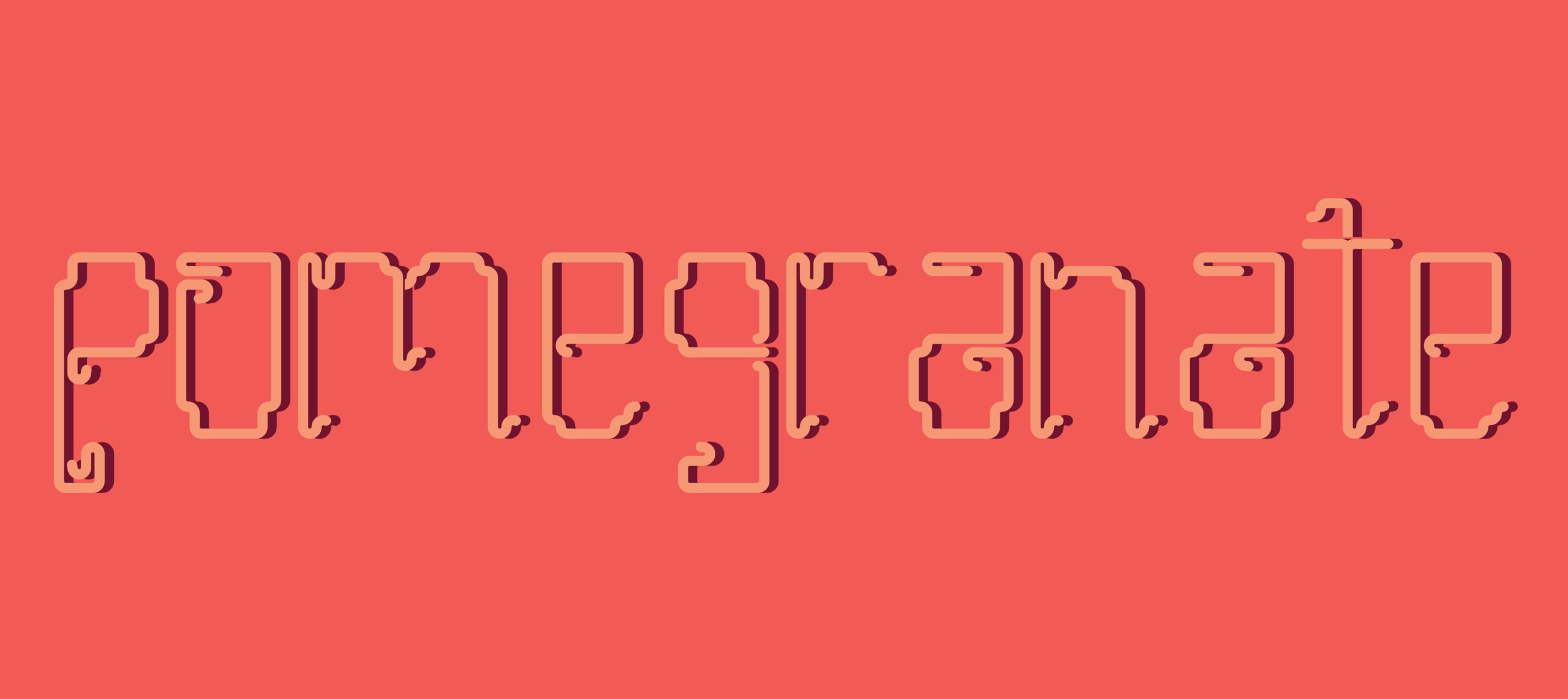
For my project I decided to go with my concept 1 redo as this was the most interesting out of all my concepts. As well as the most fun to do, I named the typeface “Tangled” as I honestly could not think of another name for it. It is still fitting with the nature of type. Before, in my first version of this type I had some letters that were slimmer than others. This was a dilemma I had as I did not know if I wanted to keep these letters slimmer or expand them. As I really liked the expanded look of the preexisting letters, because of that I switched the slimmer letters to more thick and complex designs. I went back on a couple of letters to change the look and feel. It was fun and challenging to come up with designs that feel that they go well with everything. I really like the look of the thicker letters compared to the slimmer ones. How the letters loop around and that many have circles or half circles within their design. For the color experimentation’s I wanted to see how the letters felt with both bold and subdued colors. For the illustration experiments I wish I could’ve done a bit more. But I really enjoyed my second experiment, seeing how the letters look with different effects and colors on one board.
Hi Sarah!!
I really enjoyed your font and I love how each letter has its own form of movement and intertwinment. There’s such a strong sense of direction of lines and how it carries your eyes to create the form of the letter. It’s very reminiscent of Avatar and the theme of elementals, especially air! I also liked your illustrator work, especially how you turned the circular and curvature of your letters to the complete opposite, to something angular and sharp. Wonderful job!
LINK: https://uncg-my.sharepoint.com/:f:/g/personal/r_riley_uncg_edu/EidfVtNXBjBMnQsptcV2KpMBrm2LWQb0qvvdC_3P55U9Mg?e=BopTV0
–
I completed my full alphabet, as well as a period, comma, exclamation point, question mark, and hyphen. The process went fairly smoothly for the most part, and I’m very proud of my final product. I still struggled with how to represent diagonal lines as I couldn’t figure out a way to make them in Fontstruct, but I think that pushed me to get more creative and really play around with my forms. For my full alphabet color variation, I went with my favorite shade of green with white text. For my word, I simply did “design” as a reminder of my focus. For my phrase, I went with the title of another song by my favorite band, Los Campesinos!, “The Sea is A Good Place to Think of the Future.” After my color variations, I did my two Illustrator variations. For the first one, I used the 3D effects and rotated and transformed my letters in various ways, as well as changed the colors, to produce a playful composition. I did something similar for the second one, using color gradients instead and using a regular free transform to warp the letters. Unfortunately with how my letters are, I wasn’t able to play around with making them outlines, but I still really like my compositions, especially the 3D one.
Hi Simon! I think you did an awesome job making this font. Some letters, especially the “I,” remind me of Classical statues but with a more modern twist, if that makes sense. They letters are very consistent with each other, blending well. I also think it’s so interesting how you went with a 3D effect for one of your Illustrator experiments! Great work.
Hi Simon, your work is really interesting. I love the colors you chose for your multiple color options.
Hey Simon, I think your typeface is very interesting. I can defintely relate to the struggle with diagonal lines but I feel like your execution is unique and pleasantly unexpected. I think your typeface works incredibly well in color, especially with overlapping shapes.
Hi Simon, I think your 3D vacation design looks amazing, and the colors you chose work really well!
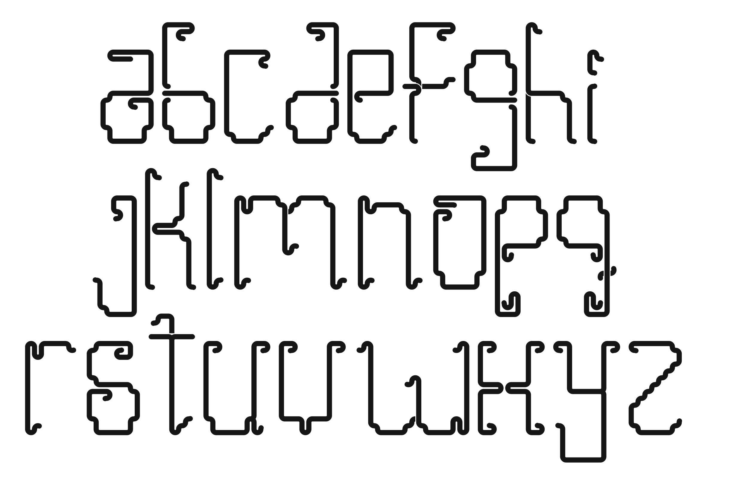
The typeface I created is called “You’re a Robot.” It has a doubled-up, block-like form with rounded edges. This is an all-lowercase typeface, and I chose this intentionally since my last font was all-uppercase – so I saw this as a new challenge.
Throughout my ten pages, I wanted everything to feel unified. On page two with my full alphabet, I started with dark blue letters with a lighter blue background. Other unified colors I used within my project include pinks, reds, oranges, and yellows – so they all tie together. On page five, I created my own shadow using three different colors pulsating behind each letter. I kept the shadow tight and close to the original letters. The colors I chose for the shadows are aligned with the background color, so everything feels connected. The same goes for the sixth page with the pink and orange. The yellowed checkered background on pages seven and eight brings in a pattern that adds to the overall understanding. I also spaced out the words and letters on those two pages to add some variety – along with more shadowed letters behind the original ones.
The word I chose was “alone?” I came to this by thinking about robots and AI – if they could feel emotions, what would they feel? And if they did start to feel, what would they question? That’s when I came up with the phrase, “Am I real.” A question, but stated almost like realization or shock.
For pages nine and ten, I started playing around with the extrude and inflate tool on Illustrator. I created two very different ideas from my previous pages – one where the word arches, all pointing down to the same spot. The other has the word trailing off to the background, while also being reflected below. Because when you’re alone, all you really have is the reflection of yourself.
https://uncg-my.sharepoint.com/personal/r_riley_uncg_edu/_layouts/15/onedrive.aspx?ga=1&id=%2Fpersonal%2Fr%5Friley%5Funcg%5Fedu%2FDocuments%2F%5FRachele%20Riley%2Fteaching%2FS25%2FART%20341–02%2FChristina%20Kibler%2FWeek%2014%2FYou%27reARobotTypefaceFolder%2Fyou%27rearobottypeface%20%282%29%2Epdf&parent=%2Fpersonal%2Fr%5Friley%5Funcg%5Fedu%2FDocuments%2F%5FRachele%20Riley%2Fteaching%2FS25%2FART%20341–02%2FChristina%20Kibler%2FWeek%2014%2FYou%27reARobotTypefaceFolder
Hi Christina! I really like your font! The forms are really interesting. I like your second Illustrator variation, the 3D effect and reflection is really cool! It looks like it could be a graphic for a magazine article or something.
Your first illustrator alt is really good, the 3d extruded one with the arc. It completely transforms the feel of the font. The choice of using a gradient adds a lot of interest as well.
Hi Christina! Your work is really strong, the specific 3D element to your work really pushes your work to be so strong. Good job!
For this weeks assignment I decided to develop a font that had a stencil type of style to it. Last week it was the last typeface I made and I liked it most as I had the opportunity to get used to the software before creating it which I think made it more fun. I used that font to then create the rest of the projects this week. I lek how the type wasn’t just one simple block, it was separated into lines which gave me more opportunities to create different effects and colours with the type. I particularly liked the final illustrator variation I came up with as I think it was fun to play around with different parts of the type being different colours, different parts being made to look three dimensional and also incorporated a symbol in. The colours and phrases I used were random. I chose the colours purely because I liked them and just found a phrase that I thought could be fun to use online. In the end I think the use of the word power with the colours of pink and red emphasised the strength of the word/phrase. The use of pink and the phrase ‘Power is Progress’ could also be looked at as a cool feminist design I guess.
https://uncg-my.sharepoint.com/:f:/r/personal/r_riley_uncg_edu/Documents/_Rachele%20Riley/teaching/S25/ART%20341%E2%80%9301/Hannah%20Hind/Week%2014?csf=1&web=1&e=RrQypw
Hey Hannnah , I love that you leaned into the stencil style; those kinds of fonts can be so dynamic, especially when you play around with color and layering like you did. It’s cool how you used your favorite typeface from last week and built everything else off of it; you can really tell when someone’s having fun with their work, and it sounds like that came through in your designs. After all, great job!
For my studio assignment, I explored typographic composition by creating a visual sequence with custom-designed alphabet characters. I created each letter of the alphabet and downloaded the font. The main focus was on completing/experimenting with layouts, such as positive and negative space. I decided to experiment with different ones, and “ENJOY” caught my attention. I wanted something that would allow me to enjoy that week; therefore, “ENJOY” was perfect. After all, I began by presenting a full alphabet set, along with some basic punctuation, in a custom typeface. This served as both a reference and a toolkit for the project’s later compositions. I then used this set to build progressively more expressive arrangements of the phrase ”“ENJOY THE MOMENT! For my final two pieces, I decided to use different effects in Adobe Illustrator. I wanted to make something simple but nice at the same time. I also played around with color with my text “ENJOY” and the background as well. When I think of the word “ENJOY,” the colors I think of are colorful. This is the reason that I used bright colors or simply colors that remind me of “ENJOY.” This project allowed me to think beyond letterforms as just text, treating them as design elements with shape, weight, and emotional tone that caught the reader’s attention or matched the word in general.
https://uncg-my.sharepoint.com/:b:/r/personal/r_riley_uncg_edu/Documents/_Rachele%20Riley/teaching/S25/ART%20341%E2%80%9302/Cindy%20Ortiz/week%2014/Alphabet.pdf?csf=1&web=1&e=TPDC0F
Hi Cindy! I love how smooth your font looks. It’s very satisfying to look at which I find interesting. The last picture is my favorite because you were able to play with your font in such a fun way!
The typeface that I created in FontStruct is very similar to the typeface that is seen used for the 8-bit style used for video games. I wanted to replicate a version of it because I have not seen that type of font style as one that is accessible to use to make words. When making the words and phrases for the studio assignment, I wanted to use phrases and words that are commonly used in the realm of video games such as “game over” and “restart” to see how well the font would work in that setting. I tried using different color schemes with the words and the background to create them to see what works well with each other. I had some trouble at first trying to get the size of the font right because I did not know how big to make the letters and how well it would look once they are all together on the page. Thankfully, I did not make them too big so that they all fit when put together and they were all about the same in size so when put together as words and phrases they did not look out of place next to each other.
https://uncg-my.sharepoint.com/:f:/r/personal/r_riley_uncg_edu/Documents/_Rachele%20Riley/teaching/S25/ART%20341%E2%80%9301/Anthony%20Valentine/Week%2014/8-BIT%20type%20%20Folder?csf=1&web=1&e=jnyP4m
Link to week 14 studio:
https://uncg-my.sharepoint.com/:f:/g/personal/r_riley_uncg_edu/EoBEK_dPgl5Pjie0WzhKNusB4OWpgfDhAszk8enG5PmSlg?e=Fep3zh
I decided to move on with the mechanical factory font. I decided to script font for the space bar as well to keep the feel of the font from being interrupted between words. In the future I will attempt to design a standalone line break glyph to allow for vertical continuity as well.
For the actual interations within ID I went with a hazard yellow for a reoccurring background color. In some I experimented with using a stroke color to alter the silhouette and allow for ultra low contrast color combinations without losing readability.
For the final 2 illustrator alts, I went with a simple color change as well as a 3d piece with a quick background treatment. For the color change, I simply direct selected multiple elements and used path>average to allow color fill within hollow forms. I also used a radial gradient to quickly imitate the reflectivity of something like steel to fit the mechanical theme.
In the final 3d art board, I used extrude and adjusted the cap texture and lighting until it felt right. After enabling shadows, I got the idea to build in a planar frame using the pen tool and try to imitate some joined surfaces. As a final touch I used the brush tool and path smoothing to create wires with different angles of gradient fill and hit the whole thing with film grain and gaussian blur in places to make it feel more like a risograph thing.
Hey Zeus! I find your work to be very interesting and the way that you connect each letter in this “factory” environment is super cool! I really enjoy the little details that make each letter unique yet still unify your overall typeface. I think designing for the space bar also served you well and allowed for a very cohesive feeling. I really enjoy your variations that you created and find your final page of your PDF to be extremely engaging and very visually intriguing! Great work!
Hi Zeus! I really like your mechanical factory font and the space bar method is really interesting, and the colors you picked go with the theme of font. I especially love your last slide working with illustrator the colors of the text and background go well together!
Hey Zeus! Your font is very intriguing and unique. I like that each letter has its own personality, and the colors you used throughout your project work well with this font. I really enjoy your second 3d illustration. I think the “room” feel in the background really connects with the idea of a factory within your typeface.
For my studio assignment for week 14, I decided to further develop “Concept 3” from last week. This concept was my thicker of the three concepts and relied on the sharp edges at the ends of the letters to make them unique. I also adjusted the crossing line that connected letters such as the H, G, B, etc. Instead of having this be an entirely different shape that I did last week, I decided to embrace the sharp feature yet again and place that as the connecting section in the middle. This change made the whole alphabet feel a whole lot more cohesive. I decided to name my font “Vamp”. This is because of the inspiration that I mentioned in last weeks post which was I was thinking about supernatural creatures and in particular vampires which got my mind on sharp objects. I went through many design changes as each day went by, but ultimately think that I was able to create a design that allowed for the letters to each relate to the greater design while still have an individuality to the forms themselves.
As I began to experiment with the colors and letters in InDesign, I wanted to get a wide variety of colors to see how the font came across. When experimenting with the letterforms in Illustrator, I also wanted to experiment with a wide variety of effects and see how far I could push the font in some cases. Overall, I am very happy with how this week went.
Hello Hayden! Without even looking at your title first, I immediately thought about vampires. I think that you did a really great job experimenting with colors, shapes, and outlines throughout your project. I think my favorite letter is the “A” in your first illustration. That design adds really well to the word you used for it, and it just touches the tip of the letters next to it, which also adds an alarming feel. Great job.
Okay, so here we are once again. For the expansion of my various fontstructor ideas, I decided to lock in on my very sharp angular type. I had some difficulty, but mostly I tried to find SOME fun in the restrictive tools offered by Fontstructer, though I still hate the program’s lack of a Ctrl + Z undo function, now that is quite the oversight on their part. But eventually, I had a whole font completed, including lowercase and all the punctuation, because seeing only uppercase when I went to install it really bugged me. For the InDesign document, I utilized a quote from the song “From the Sun” by the band Unknown Mortal Orchestra that has been resounding with me since I heard it, which is “isolation can put a gun in your hand.” It kinda speaks for itself. And for the illustrator portion, I tried to curve out some of the sharp angles. For the first pass, I focused on interior angles, and for the second pass I brought some curvature to the outside.
For this art piece, I wanted to bring two things together: my love for graphic design and my passion for wrestling. I started by picking a bold, heavy font that would grab attention, then I played around with spacing and layout to make the text feel strong—just like the subject of the piece. The phrase “THE LAST REAL CHAMPION” was something I added because it reflects how I feel about the golden era of wrestling, and how wrestlers like the one in the image (John Cena) represented something real and respected. I like how the type sits right on top of the image—it’s loud, confident, and unmissable. I also outlined the text in white with a pink inner color to give it a pop look, something that matches the energy of wrestling culture.
One thing I wish I could’ve done better was change the saturation of the background image. I think adjusting the tones—maybe making it more muted—could’ve helped the text stand out even more or given the whole piece a more dramatic vibe. Still, I like how it turned out. It feels like a poster or a tribute—something that celebrates what I grew up loving while letting me have fun with design.
Hello Tre, I believe the phrase “THE LAST REAL CHAMPION” really hits, especially with someone like John Cena as the focus. It totally gives off that nostalgic, larger than life energy from the golden era. I love the choice to put the text right on top of the image. I get et what you mean about the background saturation sometimes those little tweaks can make a big difference, but honestly, it sounds like it still works really well as a tribute piece.
For this project, I started by refining one of my design concepts from Week 13, originally inspired by 1970s letter aesthetics. My goal was to capture that retro vibe while adding a twist—rounded, curved ends to soften the overall look and give it a more modern, playful feel. As the typeface came together, I noticed that it started to shift away from the 70s influence. Once I brought the font into InDesign, I had a realization: the typeface reminded me more of something out of Dexter’s Laboratory—techy, a little quirky, and very computer-generated. It took on a futuristic, digital-gaming aesthetic that I didn’t initially plan for, but really liked. That unexpected transformation became part of the fun and discovery process. That said, the InDesign phase was the most difficult part of the project for me. I ran into glitches where my letters would randomly repeat or appear sliced in half. It was frustrating and time-consuming, but in the end, I learned how to troubleshoot my font and push through those issues. I’m proud of what I created, and even more proud that I now know how to build and install my own font from scratch. This project gave me a new appreciation for the complexity behind type design and layout—and how much personality a typeface can hold, even when it surprises you.
https://uncg-my.sharepoint.com/:f:/r/personal/r_riley_uncg_edu/Documents/_Rachele%20Riley/teaching/S25/ART%20341%E2%80%9302/Chris%20Pierce/Week%2014?csf=1&web=1&e=oHkyBR
https://uncg-my.sharepoint.com/:f:/g/personal/r_riley_uncg_edu/Eua5M0tchRBMlKvsdTdlvl4BI6aN_WELFB6LBpTvd1277Q?e=CYvh5x
For this project, I decided to take my second font and turn it into a full alphabet. I really liked how bold and thick the lines were in the letters I made last week, and I wanted to carry that style through the whole set. It felt way easier to build off the letters I had already made rather than starting from scratch. I had a lot of fun figuring out the shapes for the rest of the alphabet and playing around with the spacing to make it all feel balanced and intentional.
For the final InDesign pages, I picked a few complementary and contrasting colors to try out some one- and two-color layouts. I wanted the colors to feel bold without being too loud, and I played with combinations that helped the letters stand out. For the Illustrator part, I leaned more into experimenting. I chose a few textures that I thought paired nicely with the font and started layering them in. I also played around with stretching and shrinking the letters, just to see how far I could push them without losing the original feel of the design.
Overall, this project helped me get more comfortable working with type and seeing how small changes, like spacing, size, or texture, can make a big impact. It also made me realize how much I enjoy the process of building out a full set and thinking through all the details that make a typeface come together.
For this next step in the “Typeface Application” I wanted to move forward with my second proposal. I liked this proposal because of the contrast between weights in each glyph. When I went about constructing the other glyphs, I reused a lot of assets from the previously established six letters. I also edited a few things from the originals such as the serifs and the way the individual elements create curves. I also adjusted the size of letters like ‘m’ because of the need for space to make it legible. Another aspect I wanted to focus on is the distribution of weight amongst letters. Originally my ‘a’, v’, w’, x’, and ‘y’ were extremely light whereas my other letters are more on the heavier side. This created discord within my alphabet as some glyphs looked more within the same family than others. To re-harmonize my alphabet, I went in and added weight to some of the letters that felt too light. Another element that I was considering in this piece was the addition of the center circle. Initially I had a circle within the center of each letter. By doing this, many of the circles were disconnected from the letters which looked off. I went back in to remove any unnecessary circles which opened many shapes like the ‘o’ and ‘d’. In terms of how I wanted to format these forms on InDesign, I knew I wanted an intense color scheme as the forms were largely disconnected and I wanted to make them challenge to read. I also played with implied shadows as they also make my form intense to look at. I did this to add interest in my piece and a sort of satisfaction when deciphering what has been written.
Link: https://uncg-my.sharepoint.com/:f:/r/personal/r_riley_uncg_edu/Documents/_Rachele%20Riley/teaching/S25/ART%20341%E2%80%9301/Mar%20Alvarado-Escobar/mar_alvarado_tadpole_final_typeface%20Folder?csf=1&web=1&e=jUj136
For this week’s project, I refined my third concept into a more cybersigilstic look. Before, it was much more abstract and difficult to read honestly, so I decided to completely change the typeface while still maintaining the same shapes I used prior. It’s much more legible and definitely took some time and a lot of blood, sweat, and tears, to redo everything but, I’m very satisfied with how it turned out! I struggled the most on creating the letter forms for “e,” “k,” “s,” “x,” and “z,” essentially anything with curves. As for the word, I chose to use “zephyr,” since the curves of my typeface is similar to the movement of wind. Thus, I chose a blue color palette to build on that concept. As for the phrase, I chose “dice and roll it” which was some lyrics I pulled from a song that I was listening to while working. Then, I went along the concept of dice or checkers, and went for that iconic red, green, and black color palette that’s associated with it. Then for my first variation, I wanted to go for a blue metallic chrome look with the word “cypher.” Whenever I listen to cyphers or rap, I always associate it with metals (like gold or silver) which was why I chose that certain look. As for the second variation, I thought about how I haven’t experimented with the 3D sculpted look, so I went for the term, “hydrophobic” and wanted to imitate the movement/appearance of water streams encircling around the word. Since for those who are hydrophobic, the idea of water or being in a body of water for example, makes them feel trapped.
https://uncg-my.sharepoint.com/:f:/r/personal/r_riley_uncg_edu/Documents/_Rachele%20Riley/teaching/S25/ART%20341%E2%80%9302/Cindy%20Pham/Week%2014/WEEK%2014%20Folder?csf=1&web=1&e=bA0pYn
Hey Cindy! I really enjoy seeing your fully developed font and find it to be super cool how you were able to keep your blocks that you used to a very minimal amount. This makes your letters feel very connected and although some letters wouldn’t function well alone, they all function extremely well together which makes this type face interesting. Your font is very strong in keeping elements connected between the letters and it’s cool that you did a lower case alphabet. Overall I really enjoy your variations and seeing how you experimented. Great work!
Hi Cindy! So far I haven’t seen anyone do lowercase lettering and the way you struggled to make these letters work is worth it! It is a nice abstracted font but flows well together! I loved the colors you picked and your reasonings for them. I really love your 9th slide!
Hey Cindy I really enjoyed how you refined your alphabet. I think that the use of the element in the Font and making it more legible elevates the font so much more. I think having a lowercase font in a class of uppercase worked well in your case to add visual interest.
Hello Cindy,
I find your font to be unique and well-formed. I particularly how you executed the blue chrome and metallic look. The second variation was also very flattering to the font.
For this studio project (Week 14), I created a full experimental alphabet based on the idea of digital errors, glitches, and computer viruses. My goal was to make something that felt alive and broken at the same time. I wanted the letters to look pixelated, messy, and a little unstable, almost like they were wiggling or falling apart. I named the font “Alaskan Bullworm” at first because the text type reminded me of that spongebob episode. But later, I thought a lot about old computers, error messages, and weird bugs that make your screen go crazy. That’s the feeling I wanted my type to have when it came to the ideas.
For the words and phrases, I used words like “void,” “malware,” and “you have a virus” in my designs because I thought about the overall theme, and i wanted to fit them the glitchy digital theme. Those are phrases you might see during a computer crash or when something has gone wrong, and that’s the mood I was going for. I also wanted to play with color to create strong contrast and movement too. I used bright neon colors, and offset text to make things look like they were shifting or vibrating. I really felt like that helped bring the letters to life, and made the whole alphabet feel more active/intense.
I had a lot of fun with this project. This project, I wasn’t trying to make it clean or perfect. I wanted it to feel broken in a cool type of way.
https://uncg-my.sharepoint.com/:f:/g/personal/r_riley_uncg_edu/Eh8G-7zqMnpIh8JPcqDVyhABUJN-t8WeGc2mVa8myNyreQ?e=JcJgdH
I think the first illustrator alt, where it has a kind of wave effect on the white patterned background, is pretty strong. The font definitely fits the computer virus feel on that one perfectly. I cant tell if you used the 3D tool to do it, but the doubled up silhouette makes the letters look like they are melting in some places. Really cool effect.
For this assignment I wanted to try to get closer to the experimentation I did last week but still keep the feel of the font I decided to go with. The font I decided to refine was a simplified version of an experimental script I tried last week. It kept the curves but had a more cohesive look to it. When I looked at the letters I created last time I wanted the font to look more related I knew that the all the letters needed to match the curvature and bubble like nature of the “M” and “S” I did. I started with the “A” and after dissecting the “S” I really enjoyed the curve that the top part had and it wasn’t something letters like “A” and “B” couldn’t adapt and lose its readability. For the most part I would just cut up the letter to create the new letter. I was sad some letters such as “H,I, and J” were not more visually interesting but the constraints of the software didn’t allow for it. Some issues that arose were that some letters like the “M” and the “X” ended up much bigger than the measurements of other characters. I was able to combat that with keeping the same height and the width be variable. Overall I really love the font and I enjoy that while it does have some artistic element its a very solid and readable font.
HIIII Rocki! Looking at your font I really can tell that you researched and put effort into the composition of your letters. they feel very you and I love that considering your frustrations with specific letters and troubleshooting issues. Awesome work girlie!
Hi Raquel! I love how your final alphabet came out, and how there are motifs that are consistent within your text! Your experimentations also came out fantastic and have a very poster-esque feel to them!!
For my project this week, I decided to expand upon the first test font I did. I was going fora sort of pixelated, retro game that would be seen in older arcade racing games. For my capstone, I’m working on a video game with 3 others that is a racing game called “Turbo Takeout”, a low-poly racing game with the goal of delivering food in a timely manner. With that in consideration, I figured the font can share a name with the very thing it is inspired by. While making the font, I ran into some difficulties, not only from some letters being hard in general to create, but also technical difficulties within Illustrator. I tried to manipulate the outside of the letters with the direct selection tool, but ended up distorting more than I would have liked to. I also attempted to fill the inside of the letters with color, but would only do the outer edge of the letter. Since I could not get it to do it correctly, I ended up just using the rectangle tool and coloring them in with it. Despite these challenges, overall I’m pretty satisfied with how my font and project turned out.
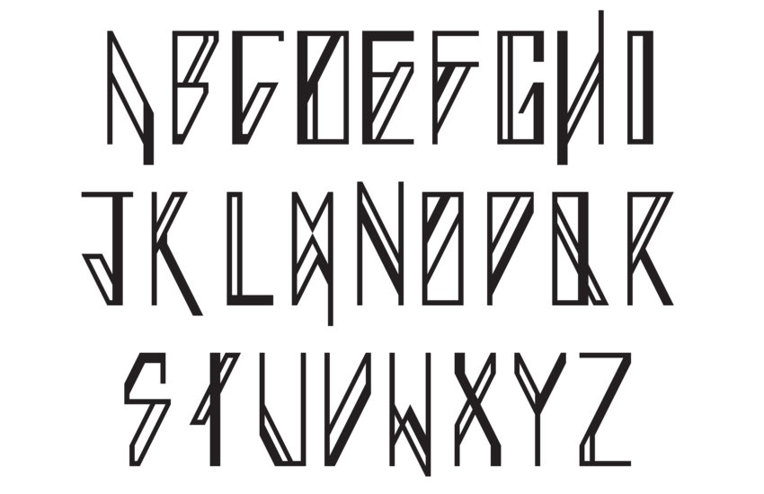
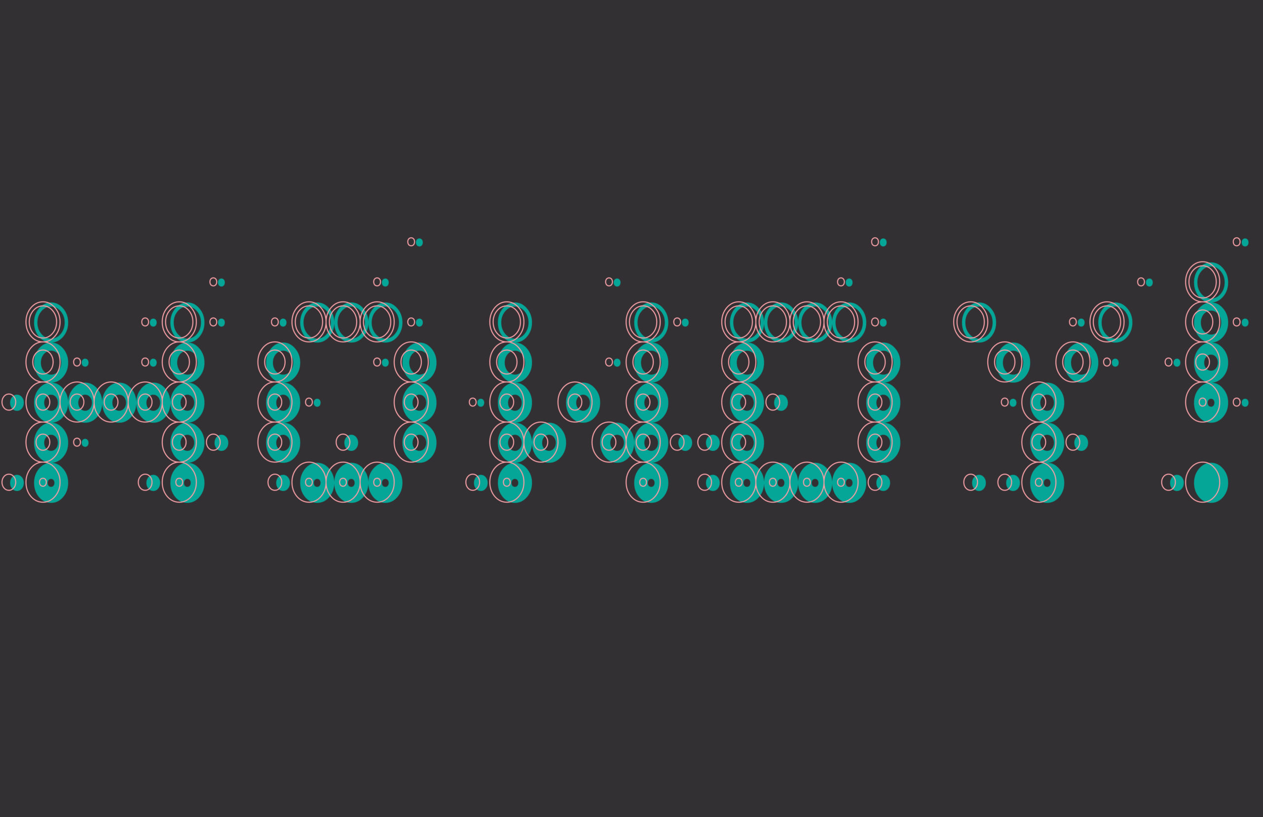
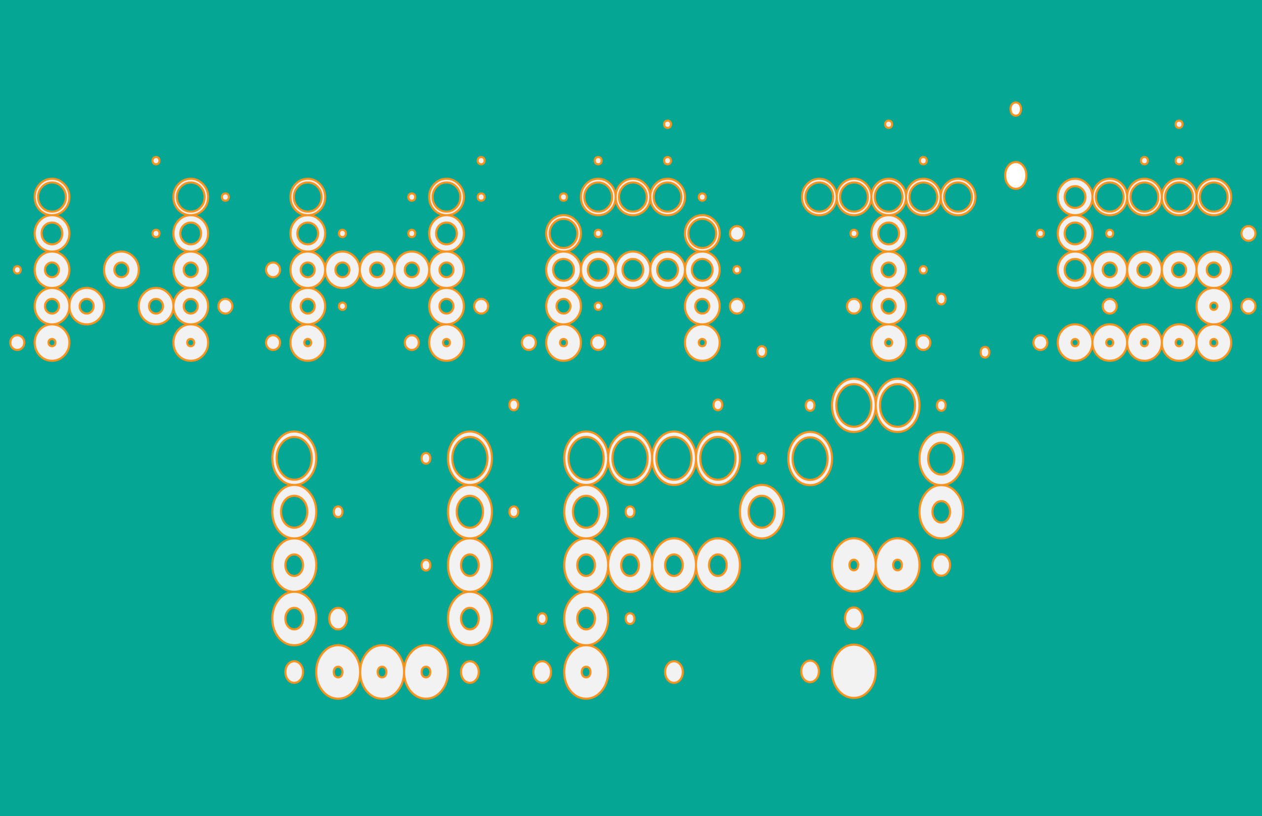
For my alphabet I wanted to stick with circles as a design concept. Last week I took the time to experiment with spacing, letter size, and types of circles I would be using. I think the placement is important in making typographic especially when shapes are used to sculpt a letter or word. A minor placement of a shape can drastically alter a letter, changing it’s size, style, or how it might convey a certain mood. For mine concept I did a cluster of open and closed circles. I used closed circles for the majority of the body of the letters and used open circles to stylize them. Such as making a significant part of a letter an open circle. An example being the line in a capital “Q”, which plays such an important role to allow the letter to be recognizable. In terms of scale I found myself struggling a little. Most uppercase letters has a consistency of being vertically straight. When I got to letters that require round edges like the O’s, U’s, etc. I had to figure out how to match and compliment these with the other letters. Spacing was also important with this because the letters were more prone to run into each other and merge.
Overall this project took a lot longer than expected. I wanted to make a unique font that I could potentially use in the future. My end result didn’t come out the way I wanted it to. I felt like it really could have been more readable in my opinion. Some of the characters I created didn’t come out the way I really wanted them too. I did enjoy this project as I got to explore more things with Indesign and Illustrator. I did forget to make a question mark with my characters, but making the period and coma were harder to create in a unique way. I did enjoy making a couple of the letters like the A, B, G, and H. Those characters were my favorites out of all the ones I made. If I were to redo this project, I would like to make the characters more bold and easier to read. A few of the characters don’t look like real letters which I would like to revise again. I did like being able to set up the documents with multiple versions of our fonts in different ways. I believe my presentation came out well in my opinion, and I am excited to see what others think.
https://uncg-my.sharepoint.com/my?remoteItem=%7B%22mp%22%3A%7B%22webAbsoluteUrl%22%3A%22https%3A%2F%2Funcg%2Dmy%2Esharepoint%2Ecom%2Fpersonal%2Fwagentry%5Funcg%5Fedu%22%2C%22listFullUrl%22%3A%22https%3A%2F%2Funcg%2Dmy%2Esharepoint%2Ecom%2Fpersonal%2Fwagentry%5Funcg%5Fedu%2FDocuments%22%2C%22rootFolder%22%3A%22%2Fpersonal%2Fwagentry%5Funcg%5Fedu%2FDocuments%2FART%20341%E2%80%9302%22%7D%2C%22rsi%22%3A%7B%22webAbsoluteUrl%22%3A%22https%3A%2F%2Funcg%2Dmy%2Esharepoint%2Ecom%2Fpersonal%2Fr%5Friley%5Funcg%5Fedu%22%2C%22listFullUrl%22%3A%22https%3A%2F%2Funcg%2Dmy%2Esharepoint%2Ecom%2Fpersonal%2Fr%5Friley%5Funcg%5Fedu%2FDocuments%22%2C%22rootFolder%22%3A%22%2Fpersonal%2Fr%5Friley%5Funcg%5Fedu%2FDocuments%2F%5FRachele%20Riley%2Fteaching%2FS25%2FART%20341%E2%80%9302%2FAlex%20Gentry%2FWeek%2D14%2FTypography%2DWeek%2D14%22%7D%7D&id=%2Fpersonal%2Fr%5Friley%5Funcg%5Fedu%2FDocuments%2F%5FRachele%20Riley%2Fteaching%2FS25%2FART%20341%E2%80%9302%2FAlex%20Gentry%2FWeek%2D14%2FTypography%2DWeek%2D14&listurl=%2Fpersonal%2Fr%5Friley%5Funcg%5Fedu%2FDocuments
For my typeface designs I tried most of the things we were shown in the demo. I mostly played with color and in Illustrator I tried playing around with the 3D effects. I tried using a variety of colors so I could see what combinations worked best. For my word I used “paint” because my sister recommended that word! As for the phrase I chose “be happy!”. Both the word and the phrase are things that are meaningful to me, paint is an artform that I love doing when I have free time (although I’m not good), and “be happy!” is something I try being everyday. As for my type face itself, I went for my 3rd concept since I liked the simplicity to it and I felt that it was something I would actually use in conversations. I also felt like it would have been the most interesting out of all the concepts I made to play around with. The whole process all together was fun and entertaining. I enjoyed coming up with typeface ideas and would love to make more in the future just for fun. Since I tried going for a more simple typeface look, next time I would like to try something with more details!
https://uncg-my.sharepoint.com/shared?id=%2Fpersonal%2Fr%5Friley%5Funcg%5Fedu%2FDocuments%2F%5FRachele%20Riley%2Fteaching%2FS25%2FART%20341%E2%80%9302%2FXimena%20Perez%2DChavarria%2FWeek%2014%2FTypeface%20Application%20Folder&listurl=%2Fpersonal%2Fr%5Friley%5Funcg%5Fedu%2FDocuments
Hi Ximena! Your font is really great! It’s simple but I think it looks really clean. I like your variations as well. I almost wonder what your font would look like if you only used lines going in one direction for the entire thing – maybe something to try if you wanna keep playing around with it? But I think it looks great as is!
Hi Ximena! I really enjoy your font. There is a striped element happening that I really gravitate to, I wish it was repeated more as Ann element throughout the lettering to keep them feeling more like a family. In all awesome work!!
Ah, a classic font reminiscent of 8-bit. I love your gray and green “Paint” experimentations.
https://uncg-my.sharepoint.com/:f:/g/personal/r_riley_uncg_edu/EoF718wHmdNJtuQettvI184BNrP8ktEyfdb3WTA3tejcAA?e=t040jr
This week, while creating my studio project, I created a typeface that has curves as well as sharp, pointy edges. As well as a lined and polka dot detail. While working on this in FontStruct, I found myself getting quite frustrated as I had many ideas but could not get them to look right within the program. I feel that if I had more time to experiment with the program, I could have produced a more interesting and creative font. Another problem I ran across was changing the colors within Adobe InDesign. I couldn’t get the colors quite right, so I’m not totally satisfied with the final product. When working with the font in Adobe Illustrator, I experimented with layering, changing the size and scale of the letters, as well as experimenting with the colors. I am much happier with the color of the ones made within Adobe Illustrator. Overall, I had a good experience doing this and would love to further explore creating typefaces within font struct. I am excited to discuss and see my peers’ work this week.
Here is a link to my studio project. https://uncg-my.sharepoint.com/:f:/r/personal/r_riley_uncg_edu/Documents/_Rachele%20Riley/teaching/S25/ART%20341%E2%80%9301/Victoria%20McPherson/Week%2014/week%2014%20typeface%20Folder?csf=1&web=1&e=zV0acd
Hey Victoria,
My favorite of yours is definitely the pink! It gives me cowgirl at the bar and I love it, I like how your font looks with it and I think the choices of curvature, design, and phrase goes well together.
Hello Victoria,
I also found FontStruct to be a little difficult. I agree that more time would allow one to fully master the medium. Despite struggling with the colors, I still really enjoyed to see what you created. I struggled with that as well. We just need to keep experimenting with Adobe InDesign. Good job!
Hi Victoria,
Love the outer patterns of the typeface it kind of reminds me of flags. I also like the addition of white patterns on the typeface.
For my Font, I ended up choosing one of my more simplest options for sake of time, when I went to refine, I focused on making the forms a family, making sure the details added up in the long run when I could see all of my letters together. What I had to do in retrospect was evening out the pixels, making sure elements that repeat in my forms were balanced and equal in comparison to each other. I really like my font, I feel it has a slightly western moment happening with the shape and detailing on the ends, with an arcade like retro twist that I personally enjoy, If I had more time I would have went with my star font and went and added more stars and such, but I wanted to still have fun while Iu worked so I made Sur en=to not only bridge the connection of what my font resembles and the weight it carries as a finished complete font, with me enjoying myself as I manipulate it. Here is the link to my folder.
https://uncg-my.sharepoint.com/:b:/g/personal/r_riley_uncg_edu/Ef0a1fpmDF1OuRyxwmUl-EABd_yXiEIkXnBUSUvU4JkgfQ?e=asooyd
Hey Jackson!!
Absolutely enjoyed looking at your work for this week! Your font type reminded me of old retro arcades and it definitely gives off a western cowboy feel! I loved the detail of the small line indents throughout your letters. I think if you wanted to build off that western cowboy theme, if you were to make your “U” to look more like a horseshoe which I’m pretty sure you can pull off, it’ll definitely tie in that theme all together. As I said before, I would love to see you build and expand more on that last abstract illustrator design that you did with the 3D effect, you have such a great foundation to start with, especially with your original intent of how you wanted your font-face to appear, and creating that old-timey wanted poster would be great to see!
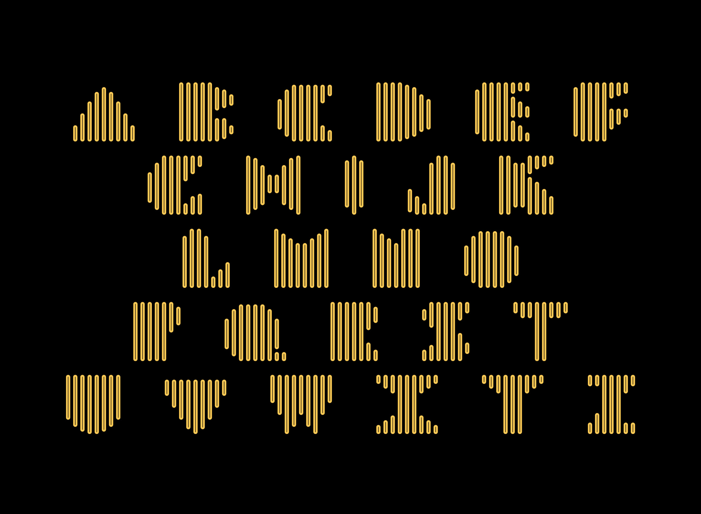
For my project this week I continued with the first set of letters I made last week. I made all of my letters 12 blocks tall and 8 blocks wide to keep them consistent with one another. I made my letters using multiple small tile-like boxes of varying sizes. Each vertical line in the letters is two blocks wide, the most of the horizontal lines are one block high and are made with different sized boxes, starting with the smallest on the left and going up as they move right. I did the first set of letters in black and white and the second has purple text on a pink background. Next, I wrote the word “Pixel” in black and white, then I created a version that is red text on a green background and another that was pink text on a light blue background. I then wrote the phrase “On my computer” in black and white, pink and yellow, and orange with dark blue. Lastly, I wrote the phrase again and created two variations. The first variation was pink and blue with the phrase in the bottom left corner, the second was the same phrase in the middle of the page in red against a light pink background.
For my font, I ended up making something completely different from my experiments from last week. I was inspired by this magazine cover headline I found on Pinterest and attempted to create something similar, but utilizing more straight lines. Through this font, I certainly learned a lot more about the process of creating a typeface that works together, though it was also a struggle for me. I generally like how most of my letters turned out, though the spacing between some of them turned out a little wonkier than I had expected (my “A” for example). If I were to do this project again, I would be more careful of spacing issues like that, as well as figuring out better ways of connecting lines and curves, as that was something I equally struggled with. When I played with the Illustrator experiments, I did really like how the outlined version of “PLEASURE” turned out!
Link to my project: https://uncg-my.sharepoint.com/:f:/r/personal/r_riley_uncg_edu/Documents/_Rachele%20Riley/teaching/S25/ART%20341%E2%80%9301/Callie%20Roberts/Week%2014/Roberts_Typeface?csf=1&web=1&e=jSS9Pr
Hey Callie,
I love the contrasts of the colors you chose between red and black, I think it matches well with your font and statement. You did a good job!
Hi Callie Love, the variation in line thickness with your typeface. in Addition, the variation of experimentation with Lines within the color.
I’m planning to continue with my font 1 from week 13
https://uncg-my.sharepoint.com/:f:/r/personal/r_riley_uncg_edu/Documents/_Rachele%20Riley/teaching/S25/ART%20341%E2%80%9301/Debora%20Guevara/Week%2014?csf=1&web=1&e=mKHdJH
Discuss:
While my font has its own unique distinctive qualities, it shares many characteristics with digital clocks. The letters are sharp, geometric, and easily legible. The process of creating them was fun, however, I did experience some challenges along the way. I particularly struggled when attempting to make the letter ‘V’ fit within the style of the other letters. Unfortunately, I don’t believe I was successful, as it looks completely different from the others. This problem recurred in any letters with diagonals. I only noticed how severe this issue was in the latter half of the alphabet. A rather enjoyable part of the project was getting to choose colors to show the contrast. I enjoyed going through the wide variety of options, as they changed the whole mood completely. When moving to Adobe Indesign, I had no troubles. When moving to Illustrator, however, I made the mistake of accidentally locking both layers so I couldn’t copy and paste the word into the document. Once I figured out my error, I was able to continue editing the word “Graphic”. I felt as though this word suited the font best. Packaging the file was quite straightforward, and overall I really enjoyed this project!
Studio:
https://uncg-my.sharepoint.com/:b:/g/personal/r_riley_uncg_edu/EXN4lnJLddVMrrYNEmPVPdcBorzQ2PGdoaURVmlmYYnS6Q?e=jr6eBT
Saige,
I like your tenth “Graphic” experimentation. The simple typeface combined with the flat 3d and motion path make it very visually interesting. I like the pink color as well.
For this assignment, I went with my second concept because out of the three, it was the one I felt most drawn to. It stood out to me and just felt more fun and worth exploring. I decided to create a full alphabet using this style because it had a cool vibe and I saw a lot of potential in it. I chose the word extreme since the type gave off an intense, kind of wild energy even though the design itself was on the simpler side. For the phrase, I picked that’s crazy because the type looked kind of crazy in a good way and I thought it matched the overall theme really well. I tried to make sure each page had its own personality, but still stayed consistent with the overall look. I used colors that popped and helped bring out the chaotic and bold feeling I was going for. Even though I started with something pretty simple, I ended up creating a type style that felt unique and loud. It was cool seeing how a few design changes here and there could turn something basic into something with a lot of character.
https://outlook.office.com/host/377c982d-9686-450e-9a7c-22aeaf1bc162/7211f19f-262a-42eb-a02e-289956491741
For this week’s Assignments was kind of a struggle. Balancing finals exams and projects. For this assignment I decided to work with the first type face I worked with except with making multiple adjustments. I made the original type face on one page, so it took me a minute to go back to make sure each character was separate. This project took longer than expected since there was multiple troubling shooting stuff with all three software’s. I kind of want to keep working on the project in the future since I was on such a crunch time. Some of the text didn’t really work out how I expected on adobe illustrator and InDesign. But overall, I liked how the end produced looks. This assignment was a new experience. I enjoyed the process of breaking everything down into smaller steps. Then using the same elements from the previous project to create some new. I also had a fun time playing around with different colors and attempting to mess with layering, 3D effects in Adobe illustrator, and colors. It was also fun learning how Fonts are made and exported.
LINK TO PROJECT: https://uncg-my.sharepoint.com/:f:/g/personal/r_riley_uncg_edu/Em1DBF_8zuhCnFimzH9XJGEBPqotXjn5ciBsHu9D2tisRQ?e=H1b2GC
This project was very time consuming for me as it had many parts: the building of the typeface and punctuation, the formatting of the InDesign and Illustrator documents, and experimentation. Although there was much to do, I like how it all came together.
I expanded my concept 3 of last week (week 13) which consisted of many lines, a blocky aesthetic, and looping detail. I expanded upon this due to it being atypical to what’s typical for me. I thought methodically about where I wanted the wrapping detail to be for each letter (and omitted it for others) and made sure that each letter was recognizable. It was like solving a puzzle with how much brain power it took – sometimes, it can take a lot of effort to make something look simple. I titled this font “Block Future.”
For my experimentations in InDesign, I played with simplicity. I implemented cool colors and sometimes warm. I used the word “arcade” because that’s something my typeface reminded me of. For my phrase I typed out “Hello Darling!” and played with the colors. For my Illustrator experimentations, I played with pastel purples and yellows and inverted them for my 10th experimentation.
I like this typeface and can’t wait to experiment with it further.