Due weekly on Sundays. Responses to others’ posts due Tuesdays.
Week 11 — Assignment “Album Mockup Graphic”
Project 2: Experiments in Typographics Applied—a series of directed projects in which Project 1’s design exercises/experiments can be further explored and used with purpose. Continue to refine digital design elements, text composition, typographic settings, and image systems. This week you will continue to refine your design for the printed album covers/sleeves/labels, as needed, and also create motion sketches — ideas for a 16-second moving graphic to accompany the album art system.
1/
Discuss:
- Discuss your Week 11 studio project progress (200 word minimum) as a comment below. Reply to at least two other people’s posts (below) by Tuesday.
2/
Studio:
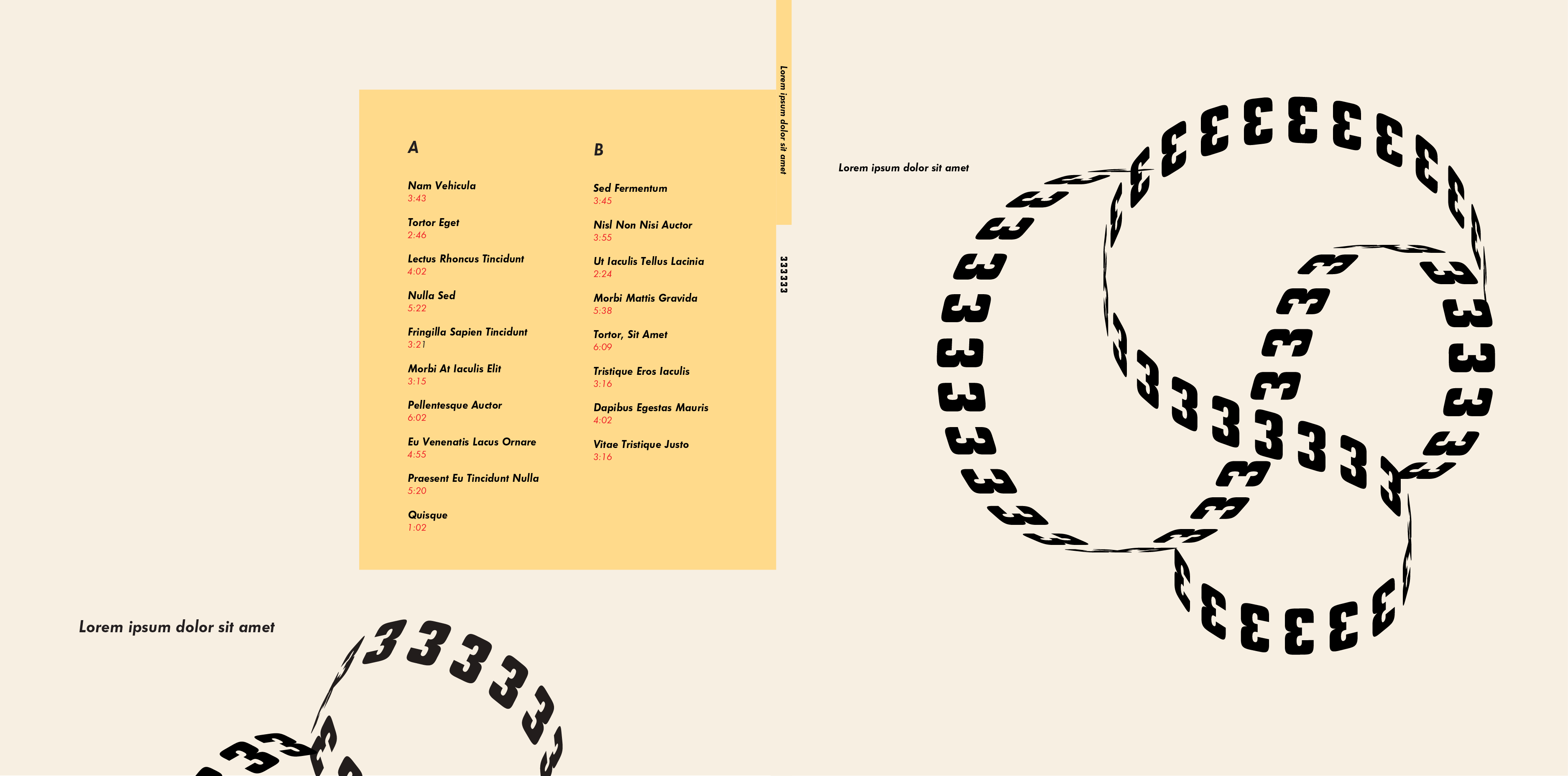
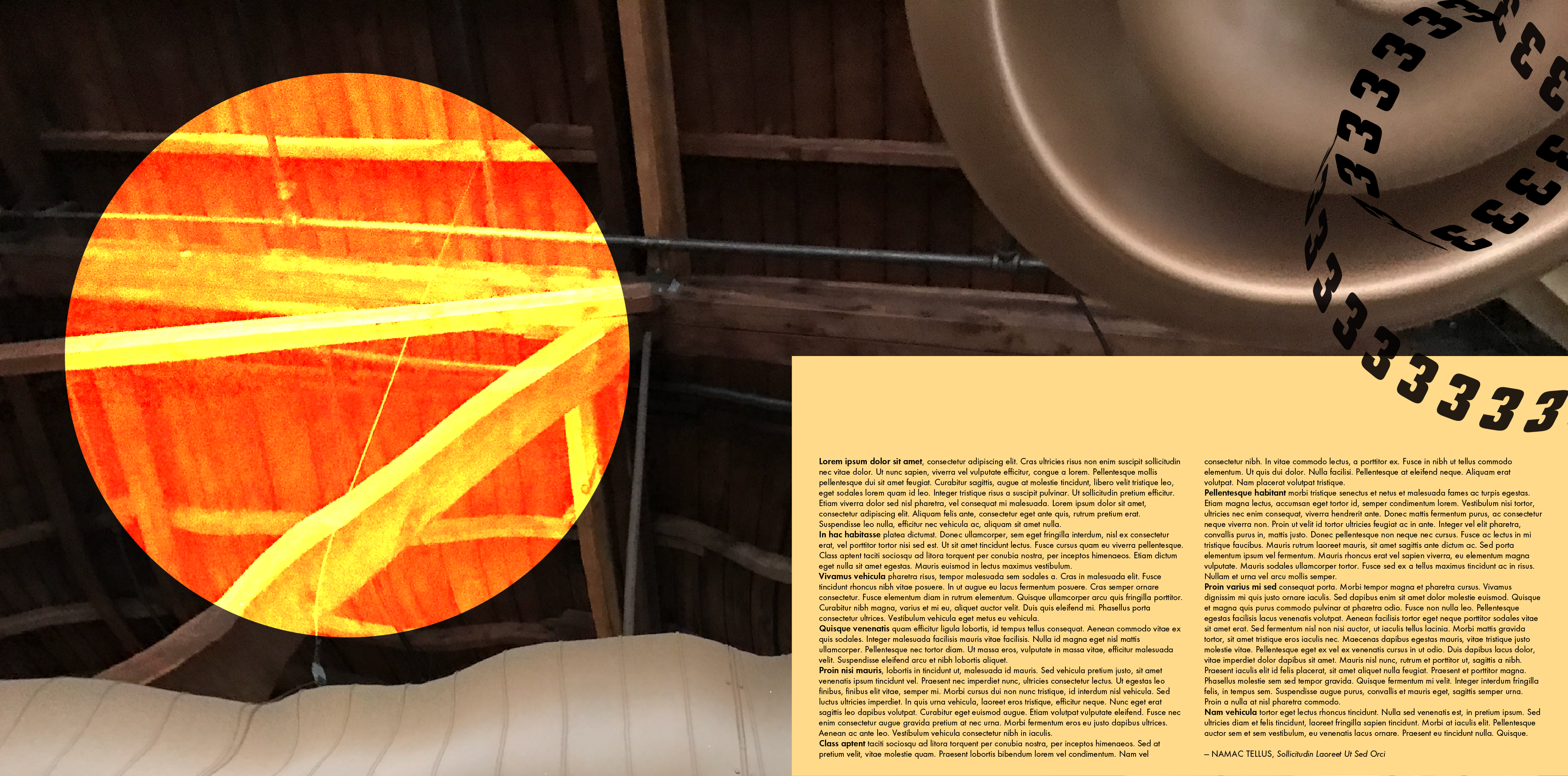
- Refine the typography and design for the album cover (front and back) and interior record sleeve (front and back), the album spine, and the two-sided circular label for the vinyl record—Side A and Side B. See dimensions listed on Week 10.
- Sketch ideas and plan ahead to make a motion graphic using partial lyrics of a song (or select a text) to accompany a 16-second clip of one of the musical tracks. Upload images of your sketches and notes/storyboarding ideas.
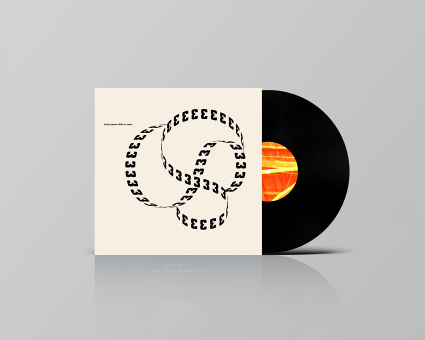
- Create a mockup of your album design (for print). Create 1. one that presents a realistic view (like the featured image above) and 2. other versions in which the parts of the layout are put together to show the printed spread (front and back covers and spine together, and the front and back cover of the sleeve).
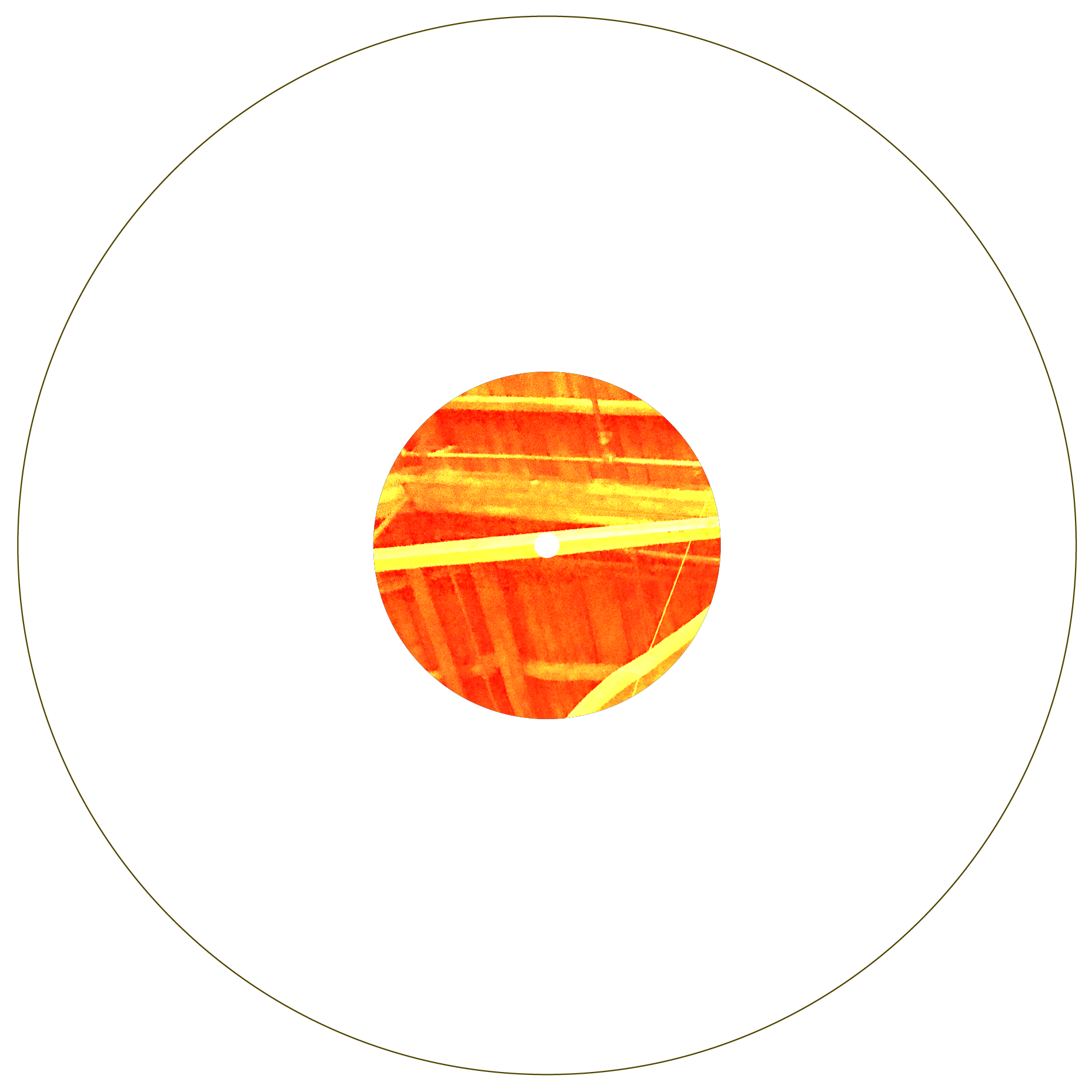
** To make the mockup for the record label (the diagram version) — draw a circle for the record at 12 in (not 12.375 as I misspoke in the demo). See examples below.
To see the final product of what it would all look like together:
—> Mockups in Photoshop
—> Mockups in Illustrator
—> Images of Vinyls records, and other packaging
—> Free images of record packaging
—> Direct link to the image I use - Additional questions:
What is a good ratio of fonts to have per design layout? How much is too much?
—> Thinking with Type by Ellen Lupton
—> The Elements of Typographic Style by Robert BringhurstHow to do pop art-style work?
—> Pop art effect in Photoshop
For the little small hole in the center of the vinyl (where there is supposed to be a cutout), I didn’t know how to cut the hole out.
—> Trim objects using Pathfinder effects -
Package your refined design and mockup design file. Upload the packaged folder with a PDF or .psd from Photoshop plus a PDF.
Demo example:

https://uncg-my.sharepoint.com/shared?id=%2Fpersonal%2Fr%5Friley%5Funcg%5Fedu%2FDocuments%2F%5FRachele%20Riley%2Fteaching%2FS25%2FART%20448%2FKayla%20Stiles%2FWeek%2011&listurl=%2Fpersonal%2Fr%5Friley%5Funcg%5Fedu%2FDocuments
After refining a few details on my album project, I decided to follow the same mockup template. It was fairly easy to edit it, and I think it turned out great! It’s crazy to see what the final product looks like as a mockup, after seeing it only in Illustrator all this time. For my motion graphic, I decided to sketch out the concept through a digital animatic. It is very rudimentary and simple, but it focuses on my general ideas. I brought in a key component of my album designs, which was the horned-monkey character I created, to create a level of cohesiveness. I didn’t want to show every lyric, so I chose the most important ones. The song I chose is El Manana, which is a key turning point not only in the album’s tone but also the lore of the band. It’s also one of my favorite songs on the album. I used an eye and an hourglass as additional elements that tie to the lyrics being sung. The last part, with the sand flowing from the monkey’s hand, seems to be the coolest visual, so hopefully I can incorporate that into my motion graphic. I have never really made a motion graphic before, so I am excited to see what all I can do with this visual format!
Hi Kayla,
I really like this version of the album cover and your idea of the moving graphic is very cool; the sand coming out of the hand is a really smart plan to do.
This week I tried to simplify once again showing the three different designs that I have been working on for the past few weeks. The first one focuses on black and white, while the second one focuses on green and white with accents of black, and the last one focuses on black and green with an accent of white. I decided to keep the vinyl design very simple (just using black and white) due to the amount of movement taking place on each of the album designs. I did not want it to be too busy to where it looks overwhelming. Out of the three designs I have done, I am personally drawn to the black and white. I think even though the cover is very dynamic, the simplification of the black and white personally makes it easier for me to digest it. Or I could just be biased because I like black-and-white designs.
I showed each one of them as a mockup of the vinyl cover with the vinyl itself. ( I would want the vinyl itself to be clear, rather than having design to keep it simple as well.
If it was to be printed for it to be a matte finished rather than glossy. I feel like the glossy it wouldn’t have a as strong as an impact as the matte.
I went ahead and did a storyboard with sketches for my motion graphic video. Since my soundtrack does not have lyrics I made sure to sketch my idea around the sounds. Based on the futuristic, 8-bit, techno elements of the songs I will be including effects that sync with the beat. My idea is like the intros played in arcade machines. Flashing lights grabbing your attention to insert a coin and play. For my album cover I did some minor adjustments as I really liked the overhaul I did last week with the color palette and new designs. I added some depth with the title of the album by making it 3D. Trying to balance the idea of including early box designs for video games while also keeping it as updated to modern design. Lastly making the mockup and cleaning up my vinyl record design to make the letters slightly more readable.
https://uncg-my.sharepoint.com/:f:/r/personal/r_riley_uncg_edu/Documents/_Rachele%20Riley/teaching/S25/ART%20448/Gerardo%20Gomez-San%20Juan/Week-11?csf=1&web=1&e=6CiCFo
This turned out great! I love the black and orange color scheme that you used, it goes well with the 8-bit texture of the design. I think you did a great job reflecting the arcade, retro-style you were going for. the design is super cohesive and well-made!
I love the 8-bit design! The set up of everything is very clean and cohesive.
For the week 11 studio, I refined some of the text on the sleeve since the first draft I felt was a bit plain. I decided to add some blocks of color (two of the colors from the color scheme I chose) and have them overlap each other and the text. I also extended the text to go from one side of the page to the other instead of just 2/3 of the way to create a more “whole” feeling to the page. This required me to adjust the text side and leading to fill the whole page and look even. On the back of the sleeve I deleted half of the repeating “Khalid” rows to make it feel less crowded/overwhelming which I think worked. The last thing that I refined was the back of the main album cover, I changed the font to be something in lower case, since the rest of the album cover was in lower case and I ended up liking it a lot better than anticipated. I didn’t adjust the font on the front or spine since I enjoyed the typeface and colors I had used.
When doing the mockup, I was having a bit of trouble getting things to work the way that they were intended but I believe it turned out well. Although you can’t see the entire album cover and sleeve the concept is nice to see since it appears how it would in a display case or on the shelf at the store. I did have trouble packaging the mockup for some reason (I attached a SS of the issue in my week 11 onedrive).
https://uncg-my.sharepoint.com/:i:/r/personal/r_riley_uncg_edu/Documents/_Rachele%20Riley/teaching/S25/ART%20448/Aniston%20Spradley/Wweek%2011/Can%27t%20Package%20Mockup%20-%20Unsure%20what%20to%20do.png?csf=1&web=1&e=SYeh66
For this week I didn’t change too much when refining my designs. I fixed the spine gradient when I added the pages together. And on the back cover, I made the pattern design a different pattern and made the opacity lower so it doesn’t distract from the words. For the inside cover where it is the two page spread, I changed the photo as I have done in past weeks trying to figure out which looks right, this one has more color to it which is nice instead of going straight blue or green. Then for the actual vinyl the front version, I added the same pattern as on the back page and made it a different color. Then I added it to the mock up design and had to adjust the front of the vinyl disc even more so that you could see the handwritten word but still in a similar placement then before. When I went to export the file as a pdf it wouldn’t export it with the pattern I used so I had to upload screenshots of the mockup. As for sketching the motion graphic I went with the song Sober from the album and with the lyrics I chose it will be 18 seconds long instead of 16 so it doesn’t just end in a half sentence.
https://uncg-my.sharepoint.com/:f:/g/personal/r_riley_uncg_edu/EiMybTkUOcRMu1ICnjUucpoBx-owWQ5PyjT_y5YJWtJyFw?e=hS8Ybb
This design is really cool! I love the hand-written style of typography you used, as it seems to fit the dark colored theme very well. I have listened to Lorde’s music, and it definitely reflects the style you are creating here. I love the contrast of blues and greens as they work with the orange tones. It balances well! Love it!
Hello everyone!
I enjoy updating everything I had originally form week 10 and changing minimal things such as the side B vinyl art and making it more simpler. I decided ti change this because the other one, I realized did not need to be so wordy and I like the sleeker new version with a nice purple circle and some random tear drops that look like ying and yang. For next week, when I have more time, I want to make the side A and B more simple and have more abstract patterns. I also enjoyed creating more mockups and I chose to do the one Rachele had suggested in this weeks video and I completed it through PhotoShop and then transferred it to Illustrator. I noticed in the video there was not much mention towards our sketches so I was a little confused and did not complete this. I do understand we are making a motion graphic of a song from our album and artists we picked. If I were to do this, I would use the song “Paul,” by Big Thief and have the marketing side of vinyls incorporated with the vinyl coming our of the cover and moving smoothly and have some rhythm with some drawings. The drawings would represent the emotions and motive behind the album and the deeper aspects to this. I have attached my one drive link below! Thank you!
—————————————————————————
One Drive link: https://uncg-my.sharepoint.com/personal/r_riley_uncg_edu/_layouts/15/onedrive.aspx?id=%2Fpersonal%2Fr%5Friley%5Funcg%5Fedu%2FDocuments%2F%5FRachele%20Riley%2Fteaching%2FS25%2FART%20448%2FHannah%20Belk%2FWeek%5F11&FolderCTID=0x0120005F6136034E7C2C4EB4818F10597156FA&view=0
Hi Hannah,
I like your idea of making side A and B of your vinyls more simple and having more abstract patterns, although I do think you’re making good progress with what you’ve done. I can’t wait to see more!
So for this week for my week 11 studio project, I altered my front cover by switching the typography from white fill and a black stroke to a black fill with a white stroke. I also made the font bigger and gave both letters more arc so that it went more around the planet and around the shirt collar. I did the same thing for the typography for the middle of the vinyls and the back of the album cover to make the letters stand out more to the viewer. For the inside cover, I made the text a bit bigger and I inverted the background image just to add a different look to it. For the image of her next to the liner notes, I added a reddish orange stroke to it so that it has a defining border. For the spine of the album cover, I switched the spine from a plain color associated with the album, I decided to give it a pattern that is similar to the planet in the front album cover so that it makes it pop more. I also switched the text from red to white so it is easier to see. Overall, I think I’m more satisfied with this version of the album cover and how it turned out.
https://uncg-my.sharepoint.com/:b:/r/personal/r_riley_uncg_edu/Documents/_Rachele%20Riley/teaching/S25/ART%20448/Anthony%20Valentine/Week%2011/PrintMockup.pdf?csf=1&web=1&e=FWoK8F
I love this design, it reminds me of the early 2000’s design, which I am also drawn to. I also really think the colors used throughout the mock up go together really well.