Week 2 — Assignment “Sunbursts”
Discuss + Studio due Sunday (end-of-day). Reply to other people’s posts by Tuesday.
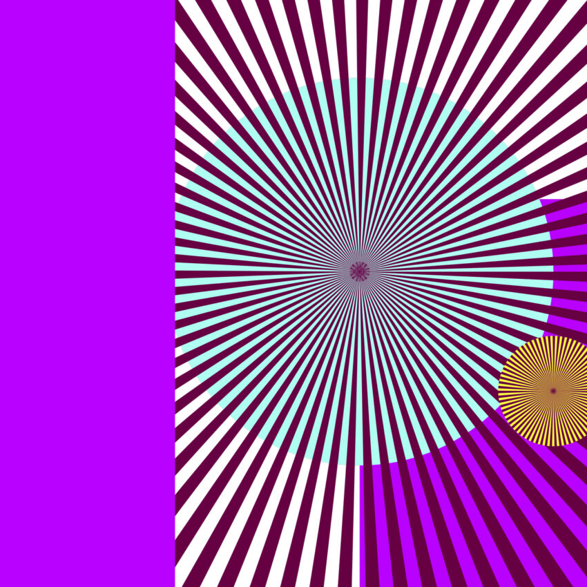
Project 1: Experiments in Typographics—a series of tutorials in Adobe software. The design exercises explore digital drawing and typographic design, and are assigned weekly over the course of five weeks. (We will apply these experiments in Project 2.)
1/ Discuss:
- Complete your Studio assignment first—and then return to write a comment below describing your project (200 words). What did you explore? What did you try out? Include a direct link to your class folder for Week 2 (on onedrive) where you have uploaded your work (the PDFs and Illustrator files).
- Reply to at least two others’ works by Tuesday.
2/ Studio:
- In Illustrator, create a 10 in x 10 in artboard. You will make several artboards at this size in the same file.
- Follow along with the “Week 2” tutorial video. On (1) one artboard, go through the steps and get the hang of the skill. Then —> create (9) nine additional artboards / design variations (or more) building upon the preliminary ideas and steps of the demonstration, and making the visuals your own. Open direction. Imagine a context for the work if you like (it could be an album cover or a card, for example). Explore and expand your visual language. Try making different decisions from one variation to the next to see what happens. You should have at least 10 artboards/10 pages in your PDF submission, or more.
—> Explore: color, layering, text/typography, photographic images, asymmetry/symmetry, additional shapes, etc. - Save and package your Illustrator file and upload the packaged folder to onedrive. Also export your Illustrator artboards as a PDF. (See video for steps on how to do this).
- Optional: see the additional links below for related instagram tutorials—some focus on scripts you can add to Illustrator for advanced work.
+
Links:
Sunburst
Scripts randomizing line lengths
Averaging points
Scripts joining shapes
https://uncg-my.sharepoint.com/:f:/g/personal/r_riley_uncg_edu/Eg8aTiiuq39PgdkyzgcZlMIB34IjpK6vEZ3dgKlHZ_43Qg?e=BwMfmX
In my project for this week, I experimented with many different compositions, textures, colors, and patterns. I used photographic elements to enhance the sunburst patterns, creating strange, uneasy, and oversaturated visuals. I felt free to express my personal interests, due to the open-ended nature of this assignment, while also experimenting with this new technique.
Throughout this I though it was fun! I honestly was just testing the radical feature out. I thought it was cool seeing a shape. I would make the paint brush and see if it creates a cool shape using the radical feature. I like this assignment because it was not restricted to just lines. I tried to just use the tools within illustrator rather than inserting other images just to see what I could do with it. I was mainly trying to see if I could make the shapes into a cohesive picture, then I switched to trying to make patterns and at the end, I was mainly messing with the paint tool, then creating the radius. I think I focused more on symmetry with the actual shape, then I made the artboard asymmetrical. I think the one I like the most I made was the pattern one with the green, orange, and tan. It is just fun to look at. I think I am just a fan of repetition. I will say it was getting more difficult towards the end to think about different ideas due to it being kind of the same shape, but overall, I really thought this was a fun exercise.
https://uncg-my.sharepoint.com/:f:/r/personal/r_riley_uncg_edu/Documents/_Rachele%20Riley/teaching/S25/ART%20448/Jayla%20Miles/Week%202?csf=1&web=1&e=qUJRn4
Hi Jayla, I really like your work! I agree it got harder towards the end trying to find new ideas but you did great. I personally really like page 8 with the blue background, how you did the spirals was really fun.
Creating shapes that were spikey was very fun. But also, I learned some great digital design tools to be creative with the overall outcome of each artboard. The first artboard was mainly the tutorial and learning what tools to use to create different kinds of sunburst which was helpful for the next few artboards. For the second artboard, I wanted to explore text while also having the sunburst center this text. The term “wake up,” correlates to the colors scheme and sunburst shape referring to the sun. What we see when we wake up. I designed the letters with the pin tool to give an abstract look. The third artboard is my favorite with the purples, reds, blues, it is giving the show Arcane and The Spider verse movie. This one was also so fun to manipulate and transform. The fourth one, I wanted to focus on the color green and mess around with different tools that warped. At the end of the design, it sort of reminded me of a path in a pond with lily pads and fun pink flowers. The fifth one, I focused on the dashed line and used a spiral line to radiate, which created this interesting pattern. I also used multiple shapes in the background and used the multiply tool to get black and blue dashed lines. The sixth one, with an image of my sister’s cat Remi that I took on my camera, I used a lightning tool and put a colored box behind him to get this effect. I wanted to make this one kind of funny hence the funny direction of lines and the text. For the seventh one, I kept the design simple and been really into red lately. I wanted a letter that was multi-use for multiple words. For example, the word “WOW” is used here 4 times. For the eighth one, I don’t really like this one. I tried to radiate an angled line and it just came out crappy, but I tried it at least. For the ninth one, I used a previous pattern and overlaid it to see what that could look like. The overlapping made it dark so I added white words on top that reminded me of the song “no surprises,” by Radiohead. The last one is a little creepy but funny to me personally. My sister has a facial mask on in this photo I took and I thought it would be kinda retro or techno to add a red hue. Along with heart sunbursts. A little spooky. Hope y’all had fun with this assignment too!
One drive link to sunburst:
https://uncg-my.sharepoint.com/:f:/r/personal/r_riley_uncg_edu/Documents/_Rachele%20Riley/teaching/S25/ART%20448/Hannah%20Belk/Week_2?csf=1&web=1&e=m47ffh
Hi Hannah! I was looking through your pieces and you have a lot of strong work with some really interesting color palettes. My personal favorite was page 9 with the “No surprises” text, I found the patterning created by all the sunbursts to be very attention grabbing and despite what it said, it did surprise me to see so many sunbursts lol. Great work!
Hi Hannah!
I really love the use of shape in each piece, especially the one with the cat! The cat one reminds me of printmaking. The shape that is wrapped around it is so intriguing and the others ones have a lot of movement going on which is very engaging. I think the last one is my personal favorite, it reminds me of poster art.
https://uncg-my.sharepoint.com/:f:/g/personal/r_riley_uncg_edu/EqCil-829WJKnjGc5EhPFUcB660x7NcU2r_w7uvxTBuEFg?e=59YPBP
For my project this week, I did a lot of experimenting with the tapered sunbursts since those were my favorite. I tried to incorporate some of the simple line sunbursts as well as other shapes such as circles and rectangles to create variation in the background of the art board. I experimented on the first few just trying to figure out what I could do to the shapes and how I could layer them, specifically with the setting that changed the color of the sunburst depending on the background color (I forgot what this was called.) For the second set of experiments I used a color palette creator called “Coolors” where I messed around with varying palettes with the sunbursts and background shapes.
I tried out different ways of shaping the sunbursts which was fun especially with background shapes (like I mentioned). I tried to incorporate a photograph of a crow that I did last semester in a photography class and it wasn’t my favorite art board I did but it turned out better than I had anticipated. I think if I were to try to incorporate a photograph again I would do a smaller photo in the shape of a circle and do the sunburst around it with background shapes/colors as well.
Hey Aniston!! Your work turned out great, I like how you messed with different color palettes that worked well together and all of them seem very cohesive. I like page 4 the best, the way the spirals blend together in the middle and the use of color really makes it pop and I enjoy it.
Hi Aniston,
I love how your work is diverse and how you experiment with different sunburst sizes and placements. You also did a good job of choosing colors and contrasting them with each other.
Hey Aniston!
I really enjoyed your color choices. While having some pops of color, you also included intriguing neutrals that differed from the rest of the class. I loved the diversity. I love numbers 3, 4, and 7. Number 3 includes imagery, and the blue wispy sunburst gives a motion of wind or clouds, which is neat! I love the glitch effects with number 4, and number 7 has beautiful neutrals.
Mainly what I messed around with was different colors and opacities with the two ways of making the sunburst pattern. On the second page, I messed around with black-and-white values and the width tool to see different shapes. On the next page, I messed around with the line and object duplicate to make different styles of the lines and messed with warmer tones and opacity and it is in a circular shape around the page. Next page I made one that looks like a leaf to me so I did a green page of messing around with the circles to make different iterations of the green leaf and I like how it turned out. On the next page, I decided to mess around with the patterns that it has, I made a bunch of different circles with different line sizes to have a variety then went and put two textures around on different ones, one being a brown swirl and the other being a green and yellow floral pattern, This page is very messy but I like that you can see the overlap and different textures mixing. After that I made a page that kind of looks like fireworks, I messed with ombre-type colors and changed the thicknesses and lines to get a hodgepodge of the circles. Next, I decided to try using a picture in the background so I found one that already had circles through it and I overlayed the circle with a small thickness so you have these short lines going around in a circle through the page following the picture’s circles. After this I decided to try something different and use the shapes to make a scene, its not great but I tried to make a sky. I have a yellow moon that I made with the width tool then stars as the white lines and a variety of shapes and blues at the bottom as clouds. I wanted to mess with an image again so I chose this photo with different hues and laid circles over them with different thicknesses and opacity to get a cool effect. Finally, the last one is another photo since I liked the layered effect I got last time, I tried to make it less full but with different colors.
https://uncg-my.sharepoint.com/:f:/g/personal/r_riley_uncg_edu/EnY3mregWw5AqIcBpBFSOGsB8XYl3tivSY3w7Fb4fuxLSA?e=Timxyk
Hi! I really enjoyed page 6 and 10 of your PDF, the one with the mountain was really cool. I enjoyed how you have all the different sunbursts overlapping with various colors. I hadn’t done them directly on top of one another like that and it definitely makes the composition more interesting.
Hey Skye!
While I was looking through the ones you made all I could say was wow. All of your compositions were very strong throughout the 10! I think my favorite two are definitely 5 and 9. Five I love the overlapping with the patterns and the mix of warm colors. Then 9 I love the mix of media where the image in the background is meshing with the two colors overlapping each other as well. Overall, this is beautiful work, keep it up!
For my project on creating designs with sunbursts, I wanted to try and create as many different designs and concepts as possible. I wanted to experiment with different colors, shapes, sizes, forms and placements of the sunbursts to try and create different pieces. There were some artboards where I wanted to try to use the sunbursts to create and resemble real life elements like snow, fireworks, the sun and flowers to create a familiar scene for the viewer. But I also wanted to play around and create different patterns within the artboards by using different sizes of sunbursts and placing them in certain ways. I also thought about which colors to use for not only the sunbursts but also the background colors. I wanted to try and see what colors matched and what colors contrasted well together to make there be more synergy within the artboard. There were many ways to create different styles of sunbursts; with changing the size, edges, spacing and other elements it was very easy to try out and make different sunbursts and use them in different ways. It did get a bit difficult coming up with different creative ideas so I started just playing around and trying to create innovative artboards out of random placement.
Hello Anthony,
I enjoyed your choice of pops of color. There are interesting contrasts in some of your designs, like for 2 and 4. Number 6 has a sleek business kind of feel to it; I could see it on a brochure because it looks very professional. Number 9 reminds me of a peppermint kind of vibe, which is interesting. Great job!
These works are great! I enjoy seeing the different colors you experimented with. The style of your sunbursts is cohesive, as you added new elements with each artboard. I think the simplistic, graphic nature of the sunbursts work very well!
https://uncg-my.sharepoint.com/:b:/r/personal/r_riley_uncg_edu/Documents/_Rachele%20Riley/teaching/S25/ART%20448/Anthony%20Valentine/Week%202/Sunburst%20Week%202.pdf?csf=1&web=1&e=s3If8Y
this is a link to my work
For this project I tried to play with typography and combining shapes with the words. I downloaded a couple scripts for the shapes to fuse better with the letters such as the ‘metaball’ script which bridges two circles to have a drip effect between them which I used to credit a “The End” title screen. I also created shapes to form unique borders for cover arts. I made sure to play with color to elevate these practices such as the one I did that is honey themed. I used yellows, browns, hexagons for the honeycomb design. As well as having the honey be done with the ‘metaball’ script.
https://uncg-my.sharepoint.com/:f:/r/personal/r_riley_uncg_edu/Documents/_Rachele%20Riley/teaching/S25/ART%20448/Gerardo%20Gomez-San%20Juan/Week%202?csf=1&web=1&e=dECbAo
Hi Gerardo,
I like the innovation that you used in your artboards; using the different shapes and colors worked really well with what you were trying to do. The unique borders also were a good touch to make them different than the others.
I really enjoy your style choice here! Each of your pieces remind me of corporate/commercial logos, which are modern, clean, and visually pleasing. Your creative use of manipulation is super clever, especially with the “apple” work, as you created round, organic shapes that reflect what an apple looks like. Great work!
For this week’s assignment, I started by experimenting with different ways to create sunburst patterns. I wanted to try as many options as possible to see what effects I could create using different colors, tools, and techniques in Illustrator. I had a lot of fun mixing different types of sunbursts together to make cool and interesting patterns. What I found most exciting about this project were the “mistakes” that ended up being my favorite designs. One of these was when I tried the stained glass effect out of curiosity. I loved how it created a soft gradient in the sunburst that I wasn’t expecting. Another “happy accident” happened when I used the rounded tapered sunburst, which I created by using the “width profile 4” and selecting a rounded cap. I turned it into a flower-like shape and added a feather effect in the center, which turned out really nice. The sunburst I liked most, though, was the seventh one. This one happened by accident when I made a regular sunburst and then clicked the radial repeat option. This created a cool geometric pattern that I hadn’t planned, but it ended up being my favorite. Overall, I enjoyed how some of my unintentional choices led to the most interesting results and showed me how experimenting can lead to great results.
https://uncg-my.sharepoint.com/:f:/r/personal/r_riley_uncg_edu/Documents/_Rachele%20Riley/teaching/S25/ART%20448/Danielle%20Scott/WeekTwoSunbursts_ScottD_Folder?csf=1&web=1&e=aOsLkZ